
Shelf Self-Service Portal User Guide
Document Version History
Version number | Modified by | Modifications made | Date modified | Status |
1.0 | Shelf | Initial release of the document. | 11 June 2022 | Expired |
1.1 | Shelf | The document was updated to include the section on custom slugs and their setting up. New graphics have been added. | 14 September 2022 | Active |
| 1.2 | Shelf | The document was updated to reflect multiple changes/modifications/improvements to the Self-Service Portals feature and its capabilities. | 13 January 2026 | Active |
What is the Shelf Self-Service Portal?
Prerequisites
Enabling Self-Service Library feature
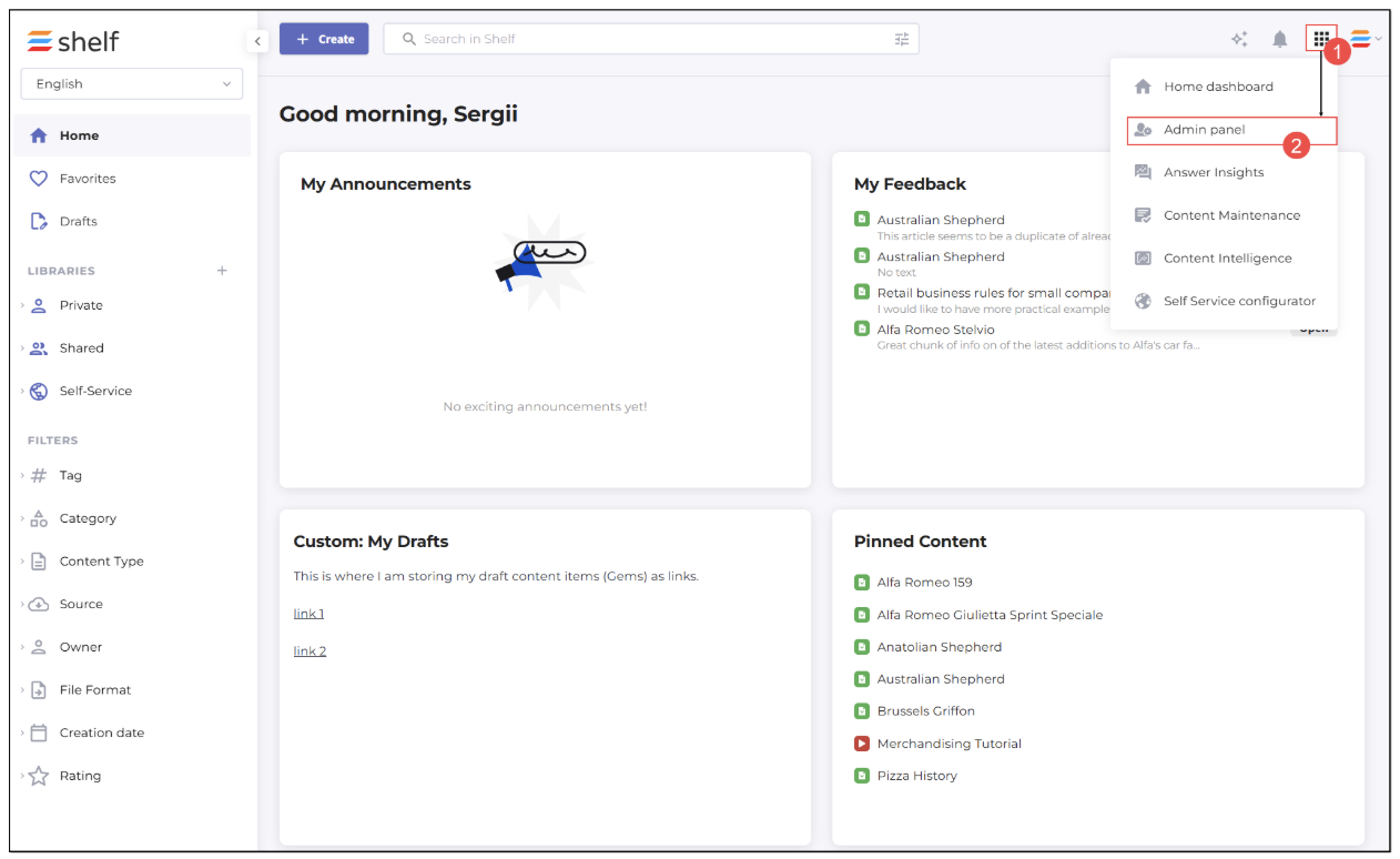
Figure 1. Accessing Admin panel in Shelf
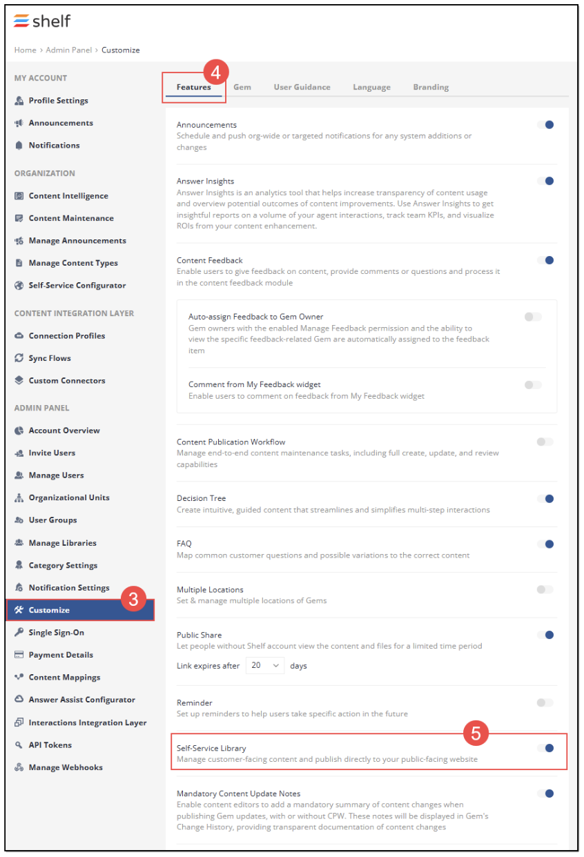
Figure 2. Enabling Self-Service Library feature
Creating self-service libraries
- To start creating the Self-Service Library, go to the Home page by clicking the Homelink button in the breadcrumbs.
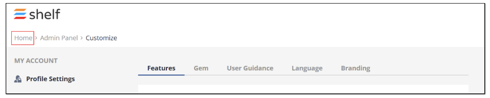
Figure 3. Jumping to Home dashboard in Shelf
- On the Home dashboard, find and click the + Create button. Then select the Create library option in the dropdown menu that appears.
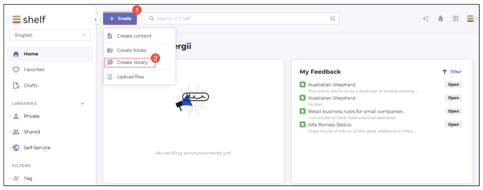
Figure 4. Finding library creation option
- In the Create new library modal window that appears, select the Self-Service library checkbox and then enter some name for your self-service library and set its language.
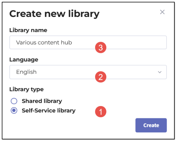
Figure 5. Creating new Self-Service library
- Next, click the Create button, and your new self-service library becomes created and appears in the navigation panel.
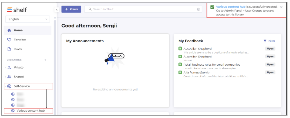
Figure 6. Viewing self-service libraries in navigation panel
Once your new self-service library is created, you can add the needed content (Gems) to it similarly to adding content to standard libraries in Shelf. Note that folders, including the nested ones, and Gems of the Wiki type are allowed to serve as content for self-service libraries.
Self-Service Portal Setup
 Figure 7. Starting self-service portal setup
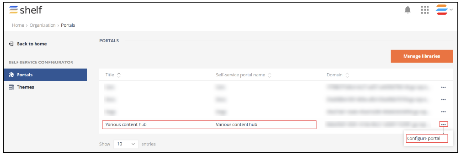
Figure 8. Accessing self-service portal configuration page
Once done, you are redirected to the new window where you can start configuring your self-service portal settings.
Basic Settings
The Self-Service Portal configuration window by defaults opens with the Basic settings tab active.
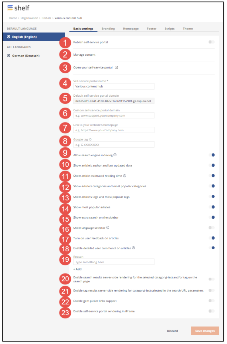
Figure 9. Accessing and understanding Basic settings tab
In this tab, you can configure all the basic settings for your self-service portal. Refer to the table below in order to get the understanding of each of these settings.
Table 1. Basic settings for self-service portal
Item | Setting Name | Requirement | Description |
1 | Publish Self-Service Portal | Optional | This switch allows you to publish SSP once all the needed settings are configured. |
2 | Manage Content | Optional | This link button when clicked redirects you to your Self-Service Library in Shelf, where you can manage or edit content stored in that library. |
3 | Open your self-service Portal | Optional | This link button when clicked redirects you to your published SSP. However, this works only when your SSP has been already published. If it hasn’t yet been published, then after clicking this link button, you are redirected to the 404 page. |
4 | Self-service portal name | Required | You can enter any desired name for your SSP in this field. It cannot be left blank. The maximum number of characters in your SSP name cannot exceed 255. |
5 | Default self-service portal domain | Required | This is a non-editable text field that is autopopulated by Shelf and displays the system-assigned URL address of your SSP. |
6 | Custom self-service portal domain | Optional | This is an editable field where you can enter any custom URL address that has to point to the domain you own and plan to use for your SSP publishing. This URL can contain a custom path that cannot contain any query strings or alike other than schemes, hostnames, or paths. Note that the maximum number of characters of this URL address cannot exceed 253. More details about the custom domain and its setup are provided in the respective Self-Service Portal Custom Domain Setup Guide. At this stage of SSP configuration you can leave this field blank. |
7 | Link to your website’s homepage | Optional | In case your website homepage has some specific address, you can enter its URL in this field. Based on the template, the link to your website can be displayed as a clickable logo or a simple link, both redirecting the user to your website homepage. |
8 | Google tag ID | Optional | In this field, you can indicate a dedicated Google tag ID. A tag ID is a string like UA-00000001. It must be included in your tracking code to tell Google Analytics which account and property to send data to. |
9 | Allow search engine indexing | Optional | You can toggle this switch on in order to make your SSP visible for indexing by search engines. Toggling it off hides your SSP from such indexing, respectively. |
10 | Show article's author and last updated date | Optional | If this switch is toggled on, users of your SSP are able to see the author of any article on your SSP and understand how fresh the article is. |
11 | Show article estimated reading time | Optional | If this switch is toggled on, users of your SSP are able to understand how much time they need to read some article. Note that if the article is less than 200 words, the estimation is not displayed. |
12 | Show article's categories and most popular categories | Optional | If this switch is toggled on, users of your SSP are able to see categories assigned to the content published on your SSP and also understand which categories are the most popular among other users. For this option to work, you need to assign categories to your content (Gems) in Shelf first. |
13 | Show article's tags and most popular tags | Optional | Same as above but with tags instead of categories. |
14 | Show most popular articles | Optional | If this switch is toggled on, users of your SSP are able to see which articles are the most popular among other users/visitors. Note that the time period for which the most popular articles are displayed is 90 days and not the entire SSP history. |
15 | Show extra search on the sidebar | Optional | If this switch is toggled on, your SSP gets a search field in the sidebar in addition to the usual search field on top of the page. |
16 | Show language selector | Optional | In case the content in your Self-Service Library is multilanguage, that is the Gems have two language variants, switching this toggle on allows users of your SSP to select in which language they can read the content. |
| 17 | Turn on user feedback on articles | Optional | This switch, if toggled on, lets you improve your SSP content by enabling users’ feedback for it. Users of your SSP become able to select the respective emojis to evaluate articles on SSP. |
| 18 | Enable detailed user comments on articles | Optional | This toggle allows you to turn on and off detailed user feedback for articles on your SSP. |
| 19 | Reason | Optional | If the Enable detailed user comments on articles toggle is enabled, this field allows you to set such detailed feedback reasoning. |
| 20 | Enable search results server-side rendering for the selected category(-ies) and/or tag on the search page | Optional | When this setting is enabled, it returns the search results filtered by category and tag on the search page. In their turn, users become able to filter tags by category and can avoid creating separate articles for each product. Instead, they can create one article and categorize it accordingly. |
| 21 | Enable tag results server-side rendering for category(-ies) selected in the search URL parameters | Optional | This setting allows you to configure the server to return tags filtered by category when the category is specified in the search URL parameters. This enables users to create one article and categorize it accordingly and, additionally, use tags to determine which articles should be displayed on the page. |
| 22 | Enable gem picker links support | Optional | This toggle enables adding links to public Shelf articles (in SSL) via Gem picker. |
| 23 | Enable self-service portal rendering in iFrame | Optional | This setting allows the rendering of the SSP in iFrame; however it is not applied/disregarded if the SSP is not built in as an iFrame. |
Once you have configured all the needed basic settings in accordance with the table above, you can proceed to the advanced settings, for example - configure the branding for your Self-Service Portal.
Branding Settings
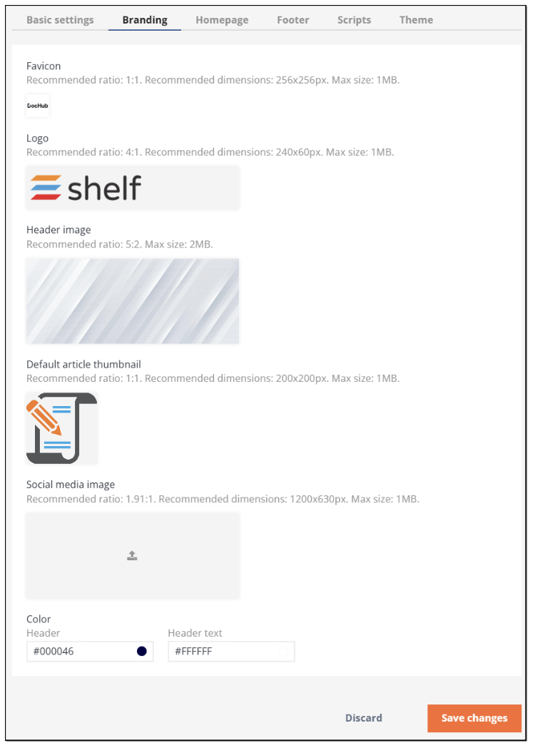
Figure 10. Viewing Branding settings
Table 2. Branding Settings for Self-Service Portal
Item | Setting Name | Description |
1 | Favicon | This option lets you set a custom image for your SSP favicon. Favicon is a small image displayed next to the page title in the browser tab. |
2 | Logo | Here you can add a custom logo for your SSP. |
3 | Header image | Using this option, you can add a custom image to be used as the header image on your SSP. |
4 | Default article thumbnail | In case you haven’t set any custom preview image for your articles on the Shelf side, you can use this option to add a custom image that is to be used as a default thumbnail for the articles on your SSP. |
5 | Social media image | This option allows you to set a custom image for social media. |
6 | Color Header | Header text | This option enables you to select and set a custom color for your header and its text. |
Once done with configuring your SSP Branding settings, click the SAVE button to save these settings and proceed to the next stage of the SSP configuration, which is the Homepage settings.
Homepage Settings
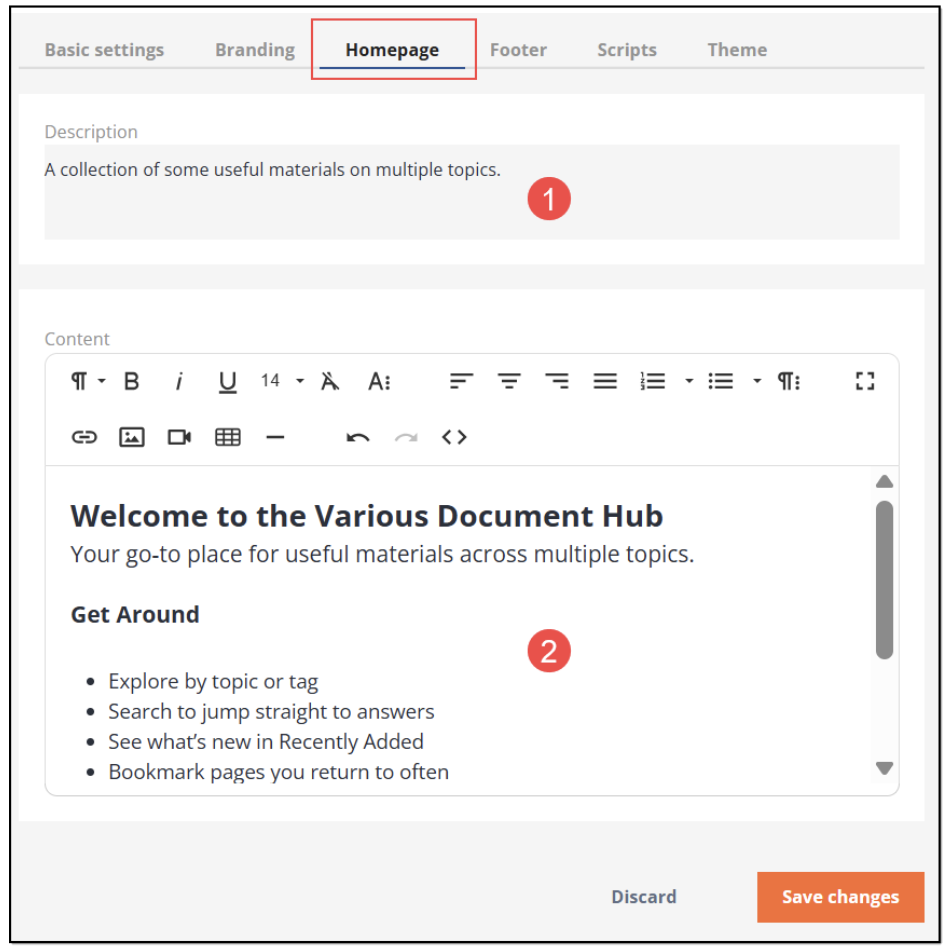
Figure 11. Configuring your SSP homepage
Footer Settings
Select the Footer tab and start setting how the footer on your SSP is going to look.
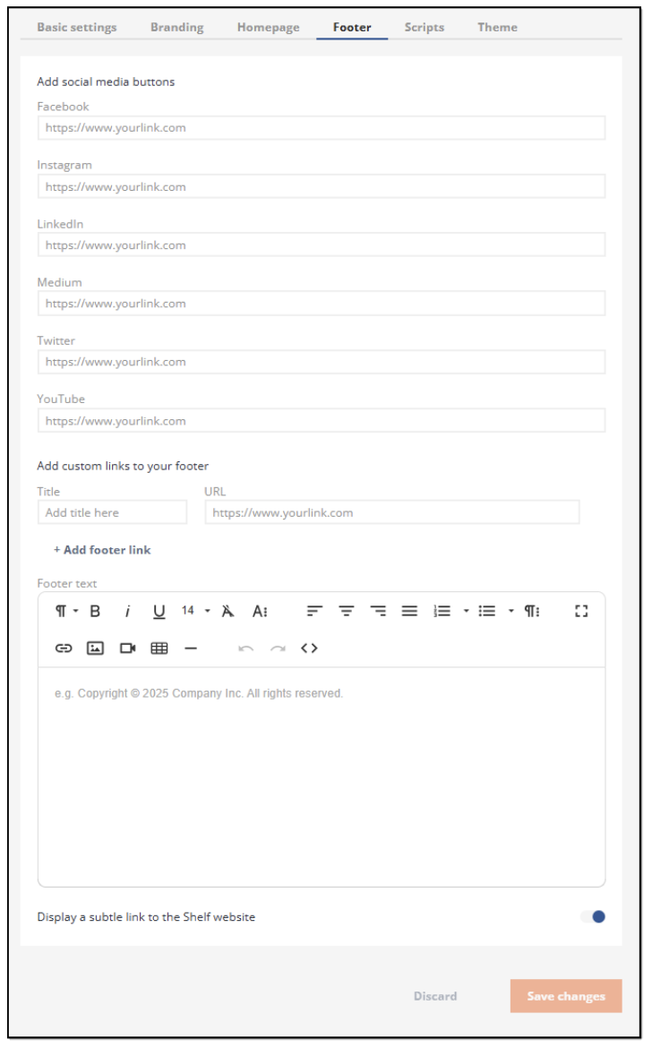 Figure 12. Setting SSP footer
- Facebook social media link button
- Instagram social media link button
- LinkedIn social media link button
- Medium blog platform link button
- Twitter microblog platform link button
- Youtube video channel link button
Scripts Settings
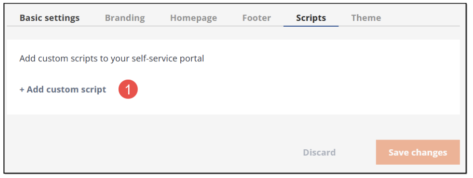
Figure 13. Starting to add custom script
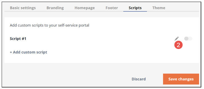
Figure 14. Adding custom script
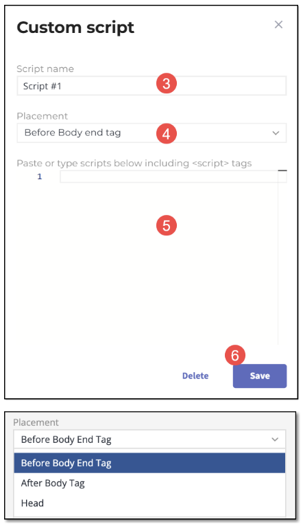
Figure 15. Adding script and its details
Theme Settings
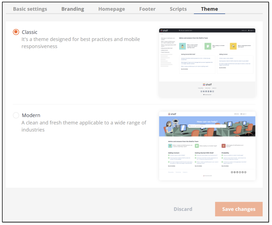
Figure 16. Selecting SSP theme
Publishing Your Self-Service Portal
| Publishing your SSP usually takes some time. Therefore, after completing the below steps to publish your self-service portal, give it one minute to finalize everything on the backend. |
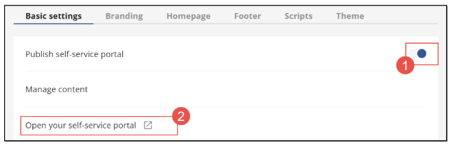
Figure 17. Publishing self-service portal
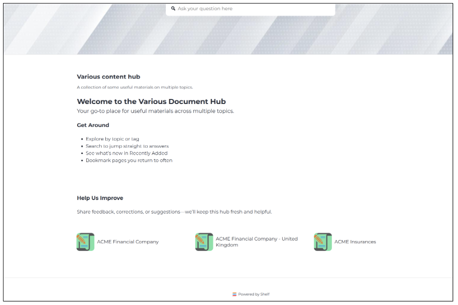
Figure 18. Viewing self-service portal
Configuring custom slugs for your self-service portal
Once you publish your self-service portal (SSP)—for example, “Various content hub”—it becomes available for customers and visitors. By default, SSP URLs are autogenerated and may be long or hard to remember:
https://8ebe50d1-8341-41de-84c2-1a5691152901.example.com/
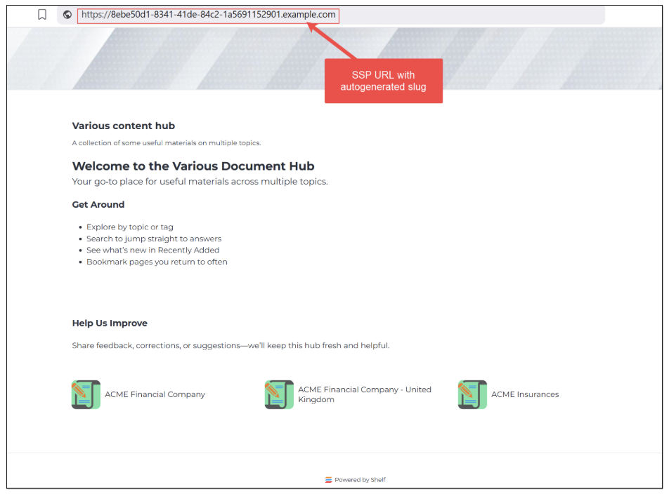
Figure 19. Viewing self-service portal URL with autogenerated slug
Custom slugs let you replace autogenerated paths with clean, descriptive URLs, like:
https://various-content-hub.example.com/acme-financial-company
Benefits:
Improves SEO and link trust
Helps users predict article content
Easier to type, remember, and share
Important ownership note:
Shelf sets up custom slugs inside your SSP.
Domain changes and external redirects (e.g., from your existing help center to your SSP domain) are owned and implemented by you (the customer). Shelf does not configure customer-domain redirects.
How custom slugs and redirects differ
Custom slug: The canonical, friendly path for a Gem (article) or a Folder page in your SSP.
CSV redirects (aliases): Optional alternate paths that should resolve to the same destination as the custom slug once traffic lands on the SSP domain. Use these to catch legacy in-SSP paths or common variants.
External/domain redirects: Redirecting from your old help site/domain to your SSP domain is your responsibility and is separate from Shelf’s slug setup.
You can configure custom slugs before any domain change; no one will be using the new links until you point traffic to the SSP domain.
How to request custom slugs (CSV)
You cannot configure slugs directly in the Shelf Admin panel. Prepare a CSV and send it to Shelf to import.
Required CSV headers (must match exactly):
gemId,slug,redirects,lang |
Example rows (for your ACME articles):
754fa019-136a-496a-80c3-dc49c8755375,%2Facme-financial-company,%2Facme-financial|%2Facme-finance|%2Facme-fc,en |
Field definitions:
gemId: ID of the Gem (article) or Folder. Library IDs are not supported. Folder IDs work; put the FolderID in this column if you are creating slugs for a folder page.
slug (encoded path): The desired canonical path for the Gem/Folder, URL-encoded, starting with "/".
redirects (encoded paths, optional): Up to 23 alternate URL-encoded paths (separated by |) that should resolve to the same destination as the slug, after the request reaches the SSP domain.
lang: Language code of the Gem.
Do not change the header names; they must be exactly: gemId,slug,redirects,lang
CSV fields table (examples)
Article (Gem) | gemId | slug (encoded path) | redirects (encoded; optional) | lang |
|---|---|---|---|---|
ACME Financial Company | 754fa019-136a-496a-80c3-dc49c8755375 | %2Facme-financial-company | %2Facme-financial %2Facme-finance %2Facme-fc | en |
ACME Financial Company - United Kingdom | 71e08e77-d70e-4eb6-a134-e914993636e0 | %2Facme-financial-company%2Funited-kingdom | %2Facme-financial-company-uk %2Facme-financial-uk %2Facme-uk | en |
ACME Insurances | f71bda7f-7ea9-4225-a70e-64f45cf17617 | %2Facme-insurances | %2Facme-insurance %2Facme-ins %2Facme-insurances-overview | en |
Copy-ready CSV lines:
gemId,slug,redirects,lang |
Final public URLs (examples):
https://various-content-hub.example.com/acme-financial-company
https://various-content-hub.example.com/acme-financial-company/united-kingdom
Encoding and formatting rules
Encode the path, not the domain. Include the leading "/".
Common encodings:
"/" → %2F
"?" → %3F
"#" → %23
space → %20
Keep slugs concise, lowercase, and hyphenated where possible.
Slug should be a path only (no domain). Avoid query/fragment in slugs; if you must catch legacy links with query/fragment, put those only in redirects.
Each redirect entry must be URL-encoded and separated by a single "|".
Examples explained:
Friendly slug with common variants captured as aliases:
754f...,%2Facme-financial-company, %2Facme-financial|%2Facme-finance|%2Facme-fc, enPreserve an old knowledge-base style path as an alias to the friendly slug: f71b...,%2Facme-insurances, %2Fhc%2Fen-us%2Farticles%2F30983843090967, en
Constraints and validation
Uniqueness: slug and all redirects must be unique across your SSP.
Max redirects per row: 23.
Disallowed as slug or redirect:
"/" (root)
Paths ending in "/search"
"/favicon.ico".
Slug length: must not exceed 1,795 characters (URL 2,048 max minus domain length safety).
Library IDs are not supported; use Gem or Folder IDs.
If any value contains commas (rare for encoded paths), wrap the field in quotes.
Process to implement
Prepare CSV with the exact headers and encoded paths.
Verify uniqueness, constraints, and IDs (Gem/Folder).
Send the CSV to Shelf for import.
Set up your external/domain redirects (customer responsibility) to route traffic from your old help site to your SSP domain.
Test:
Navigate to your canonical slug.
Try each redirect alias; it should resolve to the canonical slug destination on the SSP domain.
Example: mapping A → B
A (legacy path you want to preserve as an alias): https://various-content-hub.example.com/hc/en-us/articles/30983843090967
B (friendly canonical slug): https://various-content-hub.example.com/acme-insurances
CSV row using a friendly canonical slug with a legacy alias:
f71bda7f-7ea9-4225-a70e-64f45cf17617,%2Facme-insurances,%2Fhc%2Fen-us%2Farticles%2F30983843090967,en |
Note: This alias works only after the request reaches the SSP domain. Pointing your old domain to the SSP domain (301/302, DNS/CDN, etc.) is your responsibility.
Quick checklist
Headers are exactly gemId,slug,redirects,lang
Paths are URL-encoded and start with "/"
Up to 23 redirect aliases per row
No disallowed routes, length within limits
Gem/Folder IDs only (no Library IDs)
External/domain redirects handled on your side.
If, for some reasons, you have no possibility to prepare the Custom Slugs CSV file, contact Shelf and we will instruct you on the needed actions from your side.
Accessing and understanding self-service portal
After publishing your self-service portal you can visit its page either by clicking the Open your self-service portal link button as shown in Figure 17 or by copying and pasting the URL address of your default SSP domain or your custom SSP domain (based on the option you use), shown in Figure 9, in your browser’s address bar, and make sure everything works as expected and as configured by you on the Shelf side.
If your SSP has been successfully published, you are redirected to your self-service portal’s homepage, as described in the section and shown in Figure 21 and Figure 22 below.
Home page
The first thing you see when visiting your published self-service portal is its Home page shown in the figure above. Basically, it is a starting point where your SSP visitors can begin their journey across your self-service portal.
The appearance of the SSP Home page depends on the theme you have selected in the Self-Service Configurator: Classic or Modern. You can also contact the Shelf Support and request any desired Custom theme that is expected to be configured to fully match your wishes and requirements. Or, you can build your own Custom theme per the Shelf SSP Theme Editor Feature Overview Guide available from Shelf upon request.
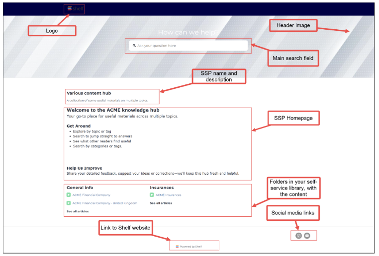
Figure 20. Viewing SSP Home page with Modern theme selected
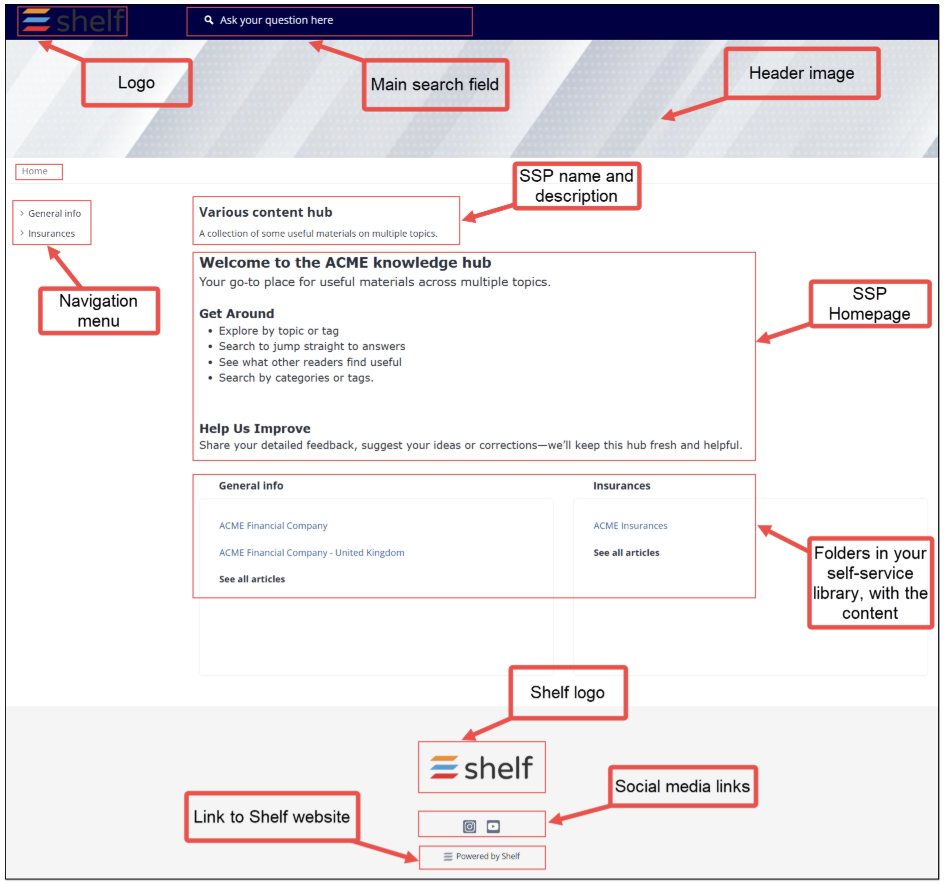
Figure 21. Viewing SSP Home page with Classic theme selected
In Figures 20 and 21 above, you can see the difference between the Modern and Classic themes: general layout of the content on the Home page and presence of the initial sidebar panel and breadcrumbs in the Classic theme. At the same time, all the main functionality remains unchanged: header and footer, social media link buttons, logo, content block with folders and their content, and the link to the Shelf website.
The most important point is that visitors of your self-service portal, regardless of its theme, are able to access the needed content easily by clicking the respective article or folder.
For example, if the Classic theme is selected for your self-service portal, you or your visitors can browse the available content using the sidebar panel in the left part of the Home page. The panel shows folders that contain articles and it is possible to click the folder names to show what is stored in the respective folders.
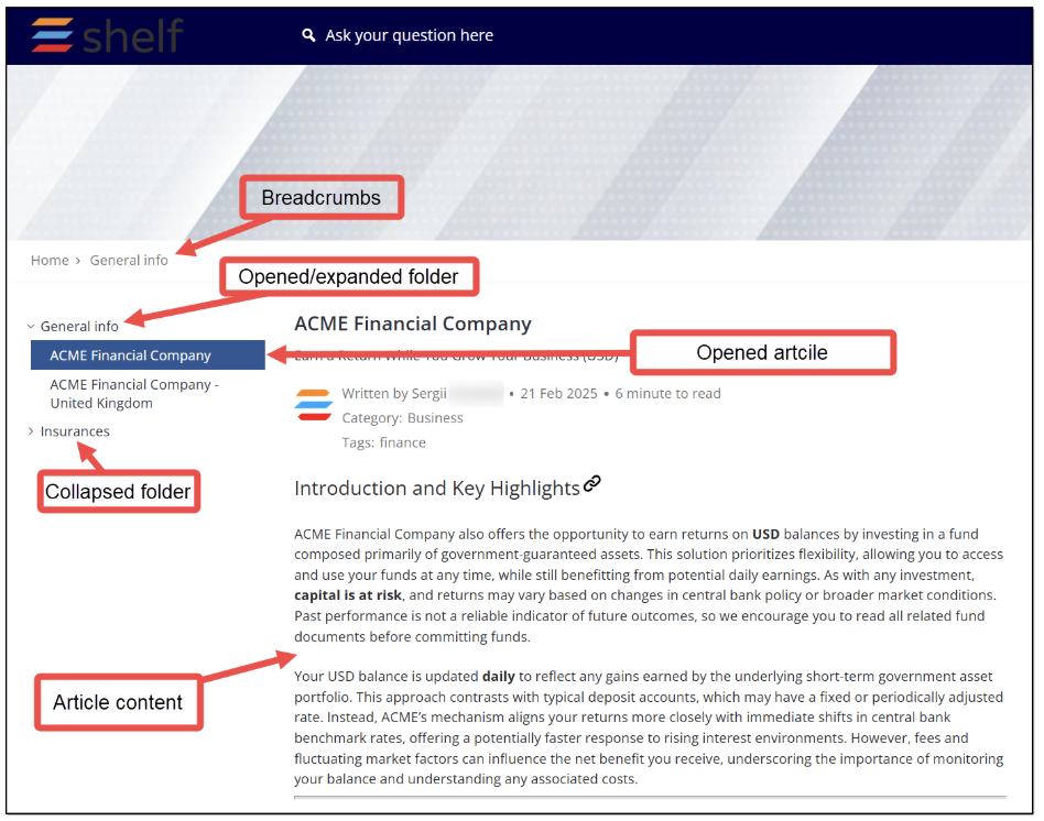
Figure 22. Article’s sidebar panel, breadcrumbs, and search field - Classic theme
For the ease of use, we will discuss the published self-service portal features and elements based on the Classic theme selected for it.
Folder page
In case there are folders in your self-service library that you have configured on the Shelf side, they are displayed on your self-service portal both in the sidebar panel in the left part of the Home page and in the Content block in the bottom of the Home page.
Additionally, each folder has its own page - Folder page - on the self-service portal that is accessible by clicking the folder name in the sidebar panel or the See all articles link button in the Content block at the bottom of the window. Folder names in the Content block in the bottom of the window are not clickable.
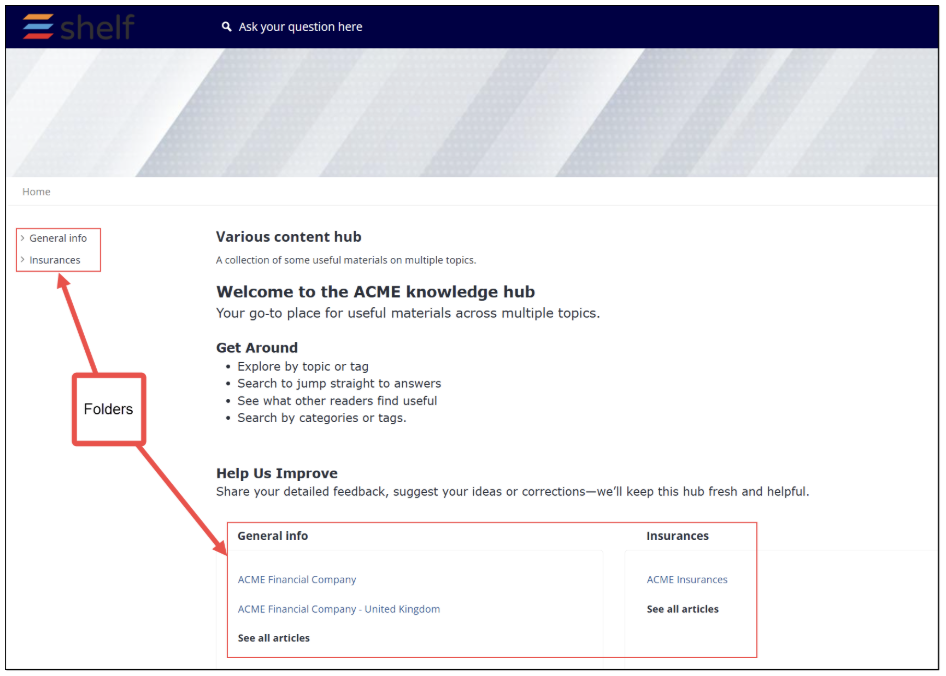 Figure 23. Viewing folders on SSP
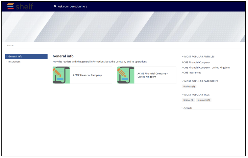
Figure 24. Viewing Folder page on SSP
On the Folder page, you can:
See and access articles contained in the opened folder and the nested folders, if any
View which articles, categories, and tags are most popular across the Self-Service portal among users
Navigate between those articles, categories, and tags by selecting any needed one
See and use additional search field if you have enabled such feature on the Shelf side
Go to the Home page from any other page, by using breadcrumbs.
Search Results page
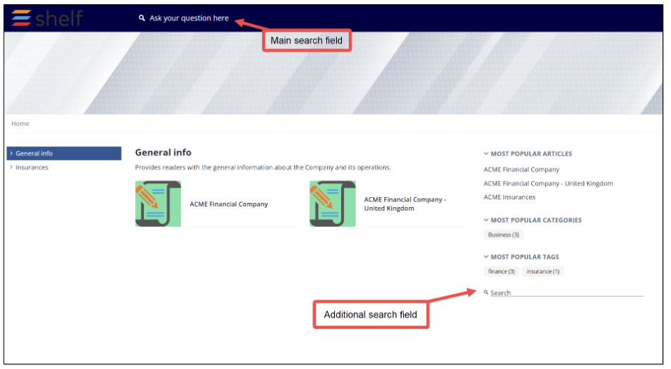 Figure 25. Search fields on self-service portal
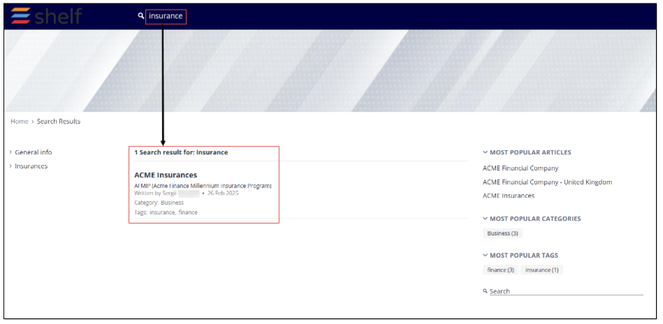 Figure 26. Accessing Search Results page
Article page
One of the most important elements of the self-service portal is its Article page that shows the needed content item where you or your SSP users can get useful information aiding in resolving issues or answering customers’ questions.
The Article page opens when you select any needed article either in the sidebar panel on the Home or Folder pages or in the Content block on the Home page of your self-service portal.
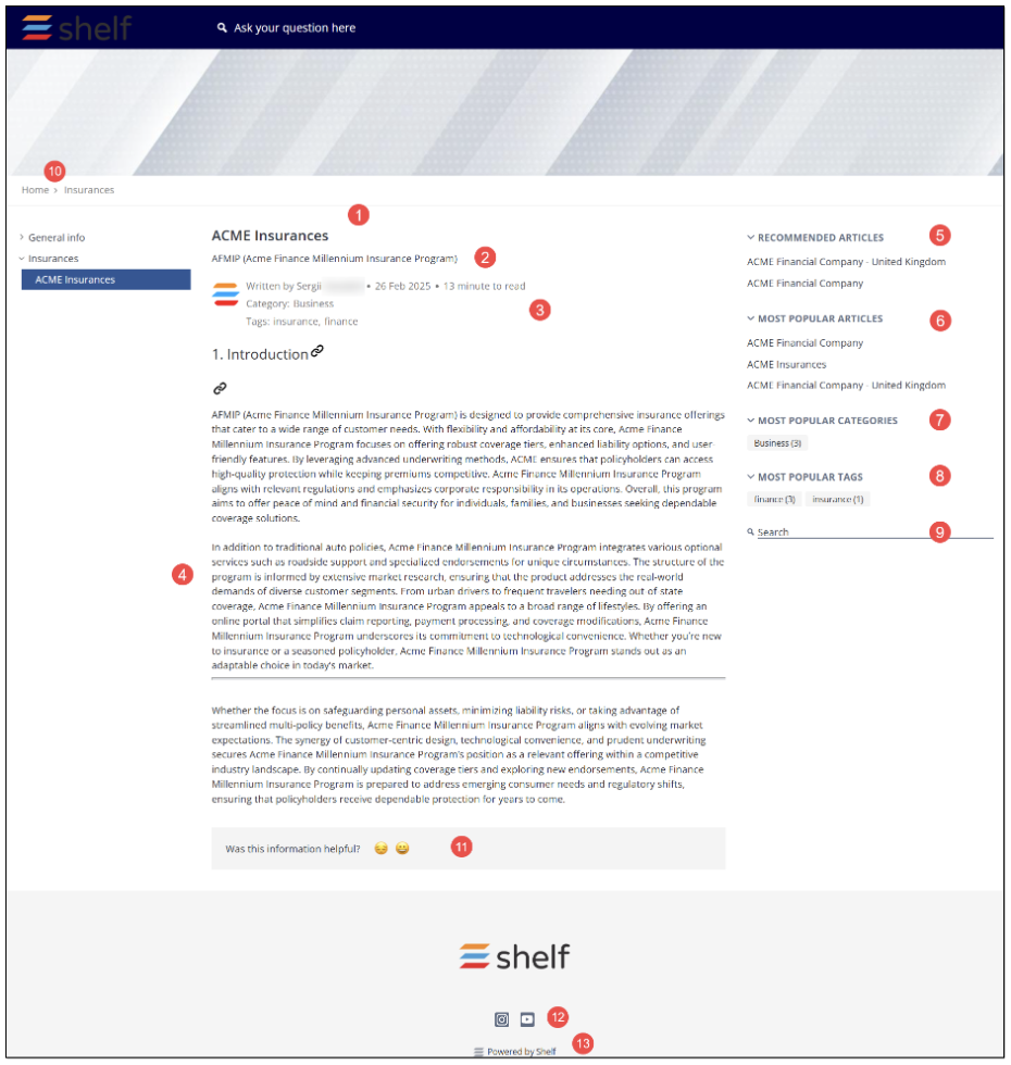
Figure 27. Viewing Article page on SSP
On the Article page, you can:
Read the article’s content (4) in order to get the information that helps resolve your issue or answer your question.
See the article’s brief description as preconfigured for the respective Shelf’s Gem. If you have enabled these options on the Shelf side, you also see the article author, last update time, and reading time, as well as the article categories and tags (3).
Check which articles are recommended to you by the Shelf AI (5).
View which articles (6), categories (7), and tags (8) are most popular across the Self-Service portal among users and navigate between those articles, categories, and tags by selecting any needed one.
If you have enabled the additional search feature on the Shelf side, you are also able to see and use it (9).
Navigate directly to your SSP Home page from any other window/page by using the breadcrumbs feature (10).
Evaluate the article and its content by selecting the respective emoji: happy face emoji if you find the article useful, and sad face emoji if you wouldn’t recommend it to other users (11).
View and use social media link buttons (12) to navigate directly to the respective social media linked to your self-service portal. These links are configured in the Footer settings of the Self-Service Configurator on the Shelf side.
Finally, if you have enabled this option in the Basic Settings of the Self-Service Configurator on the Shelf side, you or your SSP users will be able to go to the Shelf website by clicking on the respective link (13).
404 page
This is the page you are redirected to try to access your default or custom Self-Service Portal domain URL-address without publishing your Self-Service Portal.
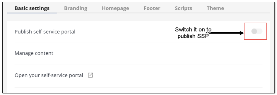 Figure 28. Switching on toggle responsible for SSP publishing
If the switch shown in the figure above is not toggled, the following page will open.
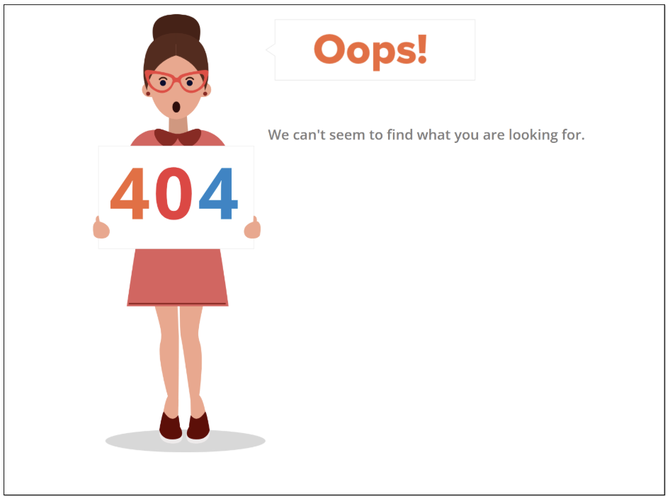
Figure 29. Viewing 404 page on SSP
Using self-service portal
Opening the Articles
- The first option is to open the needed folder from the navigation panel in the left part of the SSP Home page and then find and select the needed article under the relevant folder.
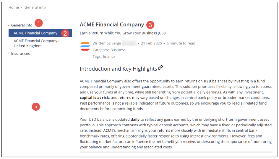
Figure 30. Opening article from navigation panel
- The second way to open the needed article is to navigate to the bottom of the SSP Home page and select the needed article in the respective block there.
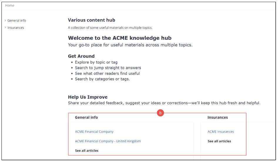 Figure 31. Finding and opening article from Content block on Home page
 - The third way is to open the needed article by selecting it on the Folder page.
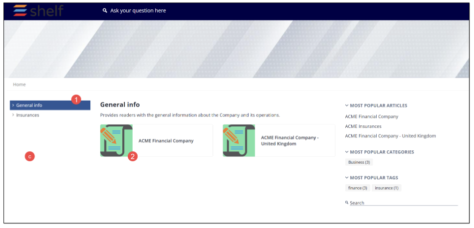
Figure 32. Opening article from Folder page
Navigating across Self-Service Portal
You or your SSP users can easily navigate across the portal using one of the following options:
Navigation panel in the left part of the SSP window
Breadcrumbs on top of the SSP window
Logo in the SSP header
Search field in the SSP header
RECOMMENDED ARTICLES block in the panel in the right part of the SSP window
MOST POPULAR ARTICLES block in the panel in the right part of the SSP window
MOST POPULAR CATEGORIES block in the panel in the right part of the SSP window
MOST POPULAR TAGS block in the panel in the right part of the SSP window
Additional search field in the right part of the SSP window
Content block in the bottom of the SSP window
Shelf website link in the SSP footer
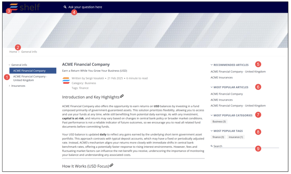
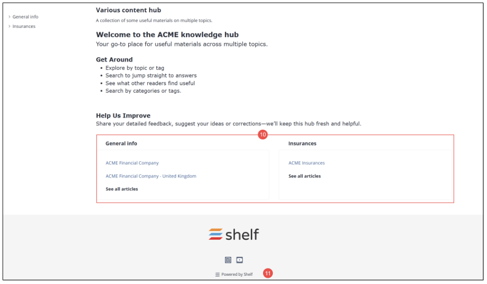 Figure 33. Navigation options in SSP
Navigation panel
Functionality of the navigation panel in the left part of the SSP window is very simple: it is a standard tree panel with items you can expand and collapse to show, access, or hide the needed content.
To expand the item - in our case folder - you need to click it. If it contains any subfolders or articles, they are expected to be shown underneath as a dropdown list. In order to collapse the folder, click it again.
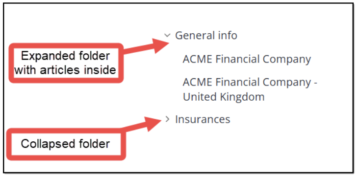
Figure 34. Navigation panel in SSP
Breadcrumbs
Breadcrumbs is a convenient tool to navigate through your self-service portal as it allows for a quick navigation to any needed page of the Portal. To jump to a needed page, click the respective link button in the breadcrumbs.
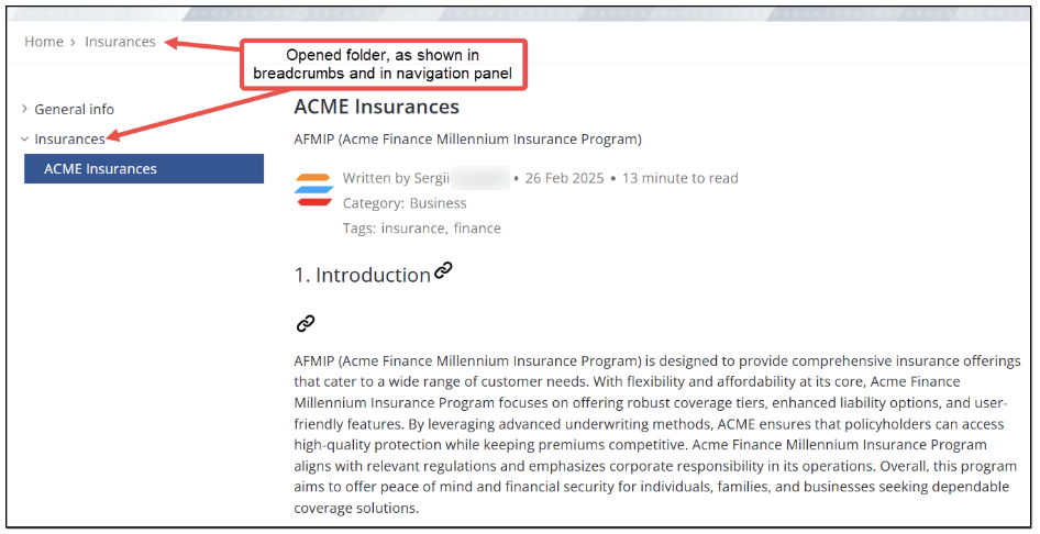
Figure 35. Using breadcrumbs
Logo
Like the breadcrumbs, the logo is a convenient navigation tool. Clicking it allows you to quickly jump to your SSP Home page no matter which page or article you are currently viewing.
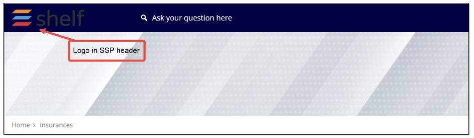
Figure 36. Using logo for navigation
Search field in header
The search field in the SSP header is one of the most important elements of the Portal as it allows users to quickly find the needed information that helps them resolve their problems or answer their questions. To look for the information, place the pointer in the field and then enter your query. The system processes it and displays the search results on the page.
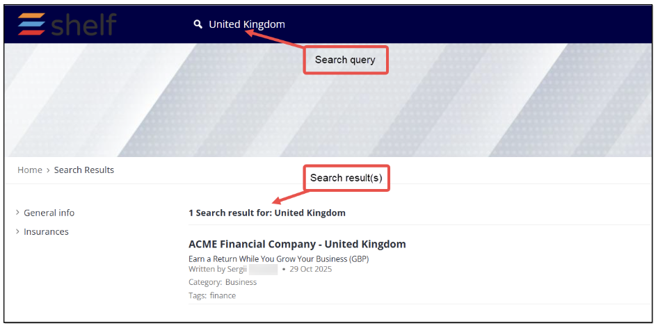
Figure 37. Using main search field and viewing search results
Once the search is complete, you can view the search results and access the matching content by clicking the link hidden in the article name. The system also displays the number of the results found, search query, brief description of the article (Gem), and, if the respective features enabled, the article’s author name, last update time, and categories and tags assigned to the article (Gem) on the Shelf side.
Working with recommended articles
Users of your SSP are able to see recommendations on each Article page in the dedicated RECOMMENDED ARTICLES block in the right part of the window. This feature is not customizable and depends exclusively on the AI-based recommendations. The feature is handled by Shelf’s Recommendations API and displays up to five (5) articles that need to be located within the same self-service library. In case there are no recommendations at the moment, the placeholder text is expected to be shown reading No recommended articles at this time.
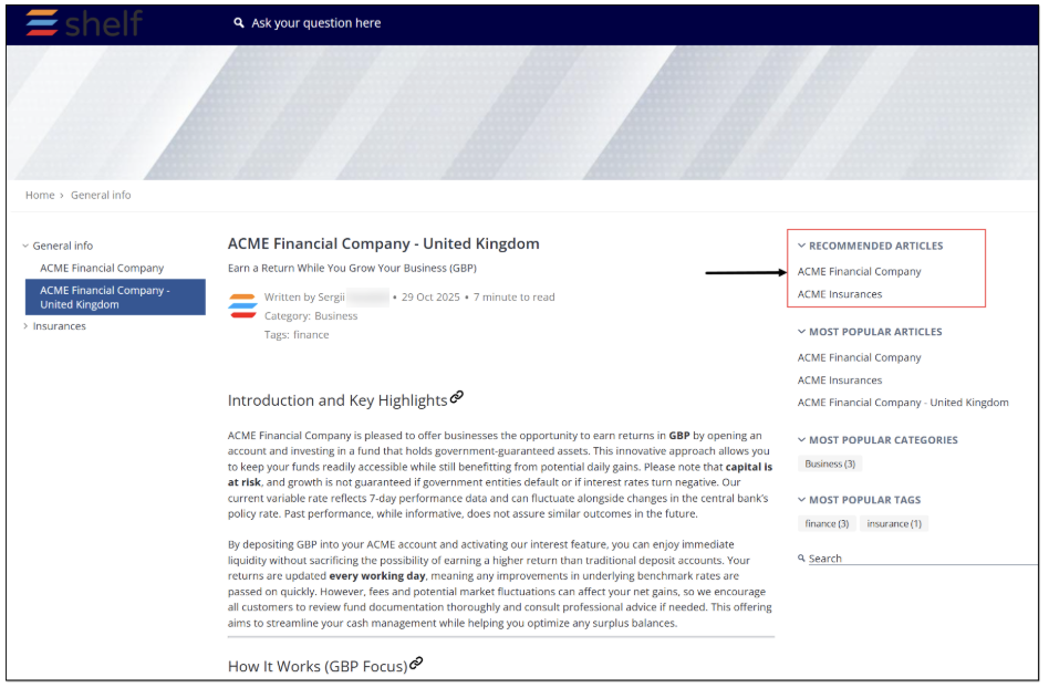
Figure 38. Viewing RECOMMENDED ARTICLES block
Working with most popular articles
The system-offered feature of most popular articles allows you and users of your self-service portal to see which articles are favored by other users. Note that the feature must be first enabled on the Shelf side in the Self-Service Configurator’s Basic settings for your SSP.
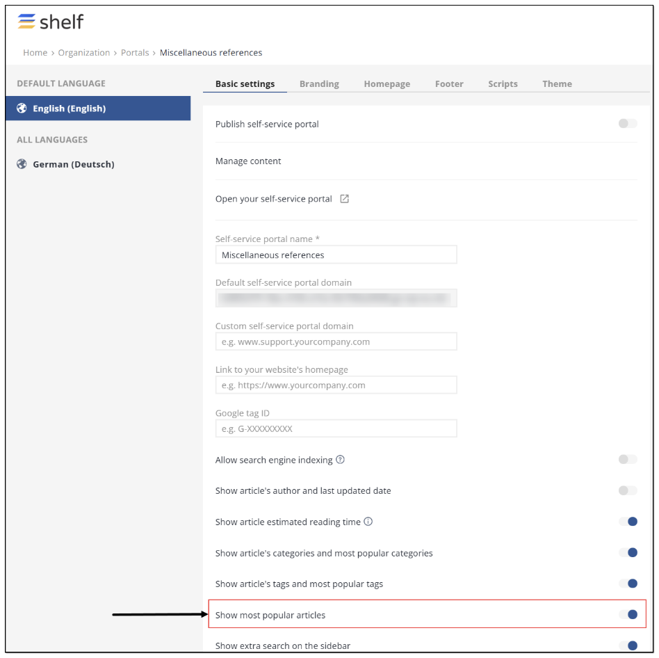
Figure 39. Enabling display of most popular articles for SSP
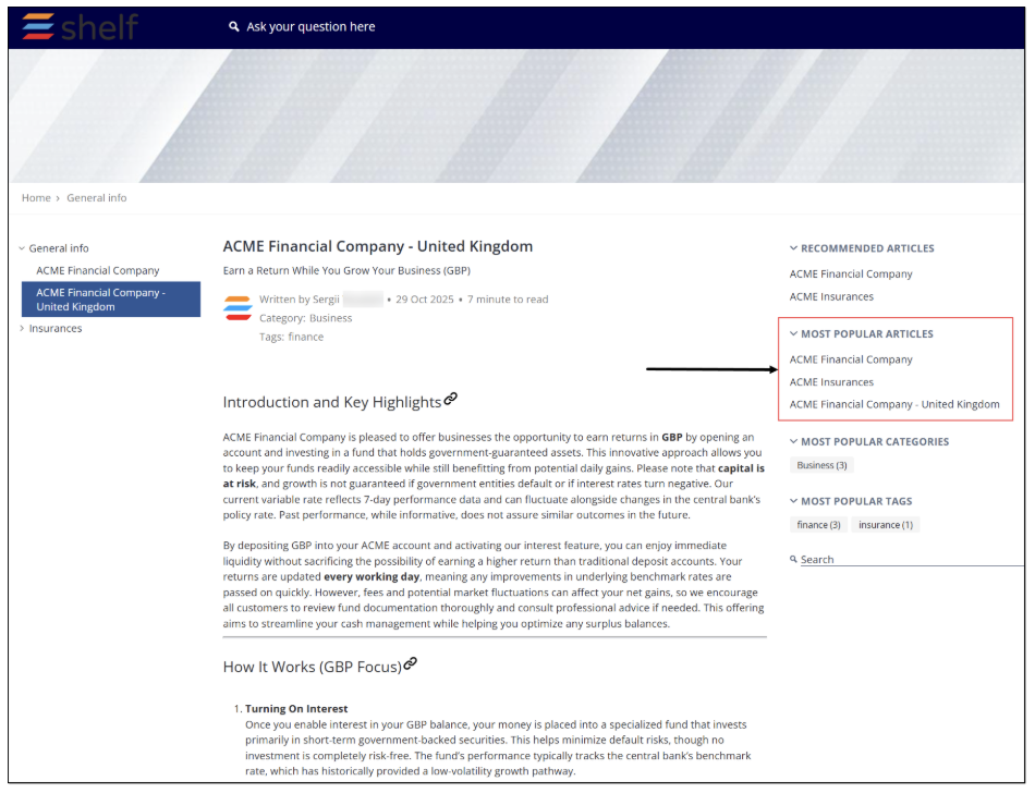 Figure 40. Viewing MOST POPULAR ARTICLES block
Working with most popular categories
Like the MOST POPULAR ARTICLES block, the MOST POPULAR CATEGORIES block is available to you or your SSP users from the Folder, Search Results, Article pages provided it is enabled on the Shelf side in the Self-Service Configurator’s Basic settings for your SSP (see Figures 9 and 39 above). It shows up to 10 (ten) categories assigned to the SSP articles, which are most popular among SSP users during the last 90 days. Each category is clickable and redirects to the Search Results page listing all the matching articles that have the subject category assigned to them. There is also a counter near each category in the MOST POPULAR CATEGORIES block showing the number of articles that have such a category.
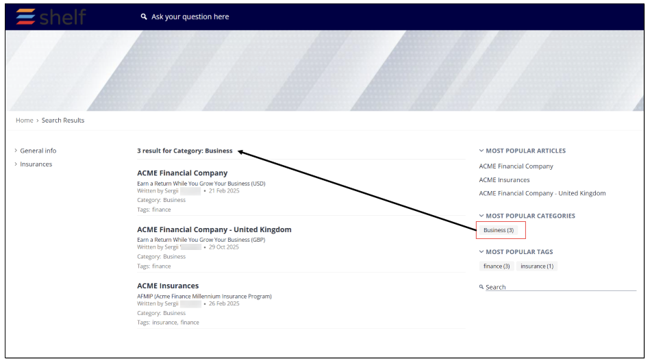
Figure 41. Navigating by category
Working with most popular tags
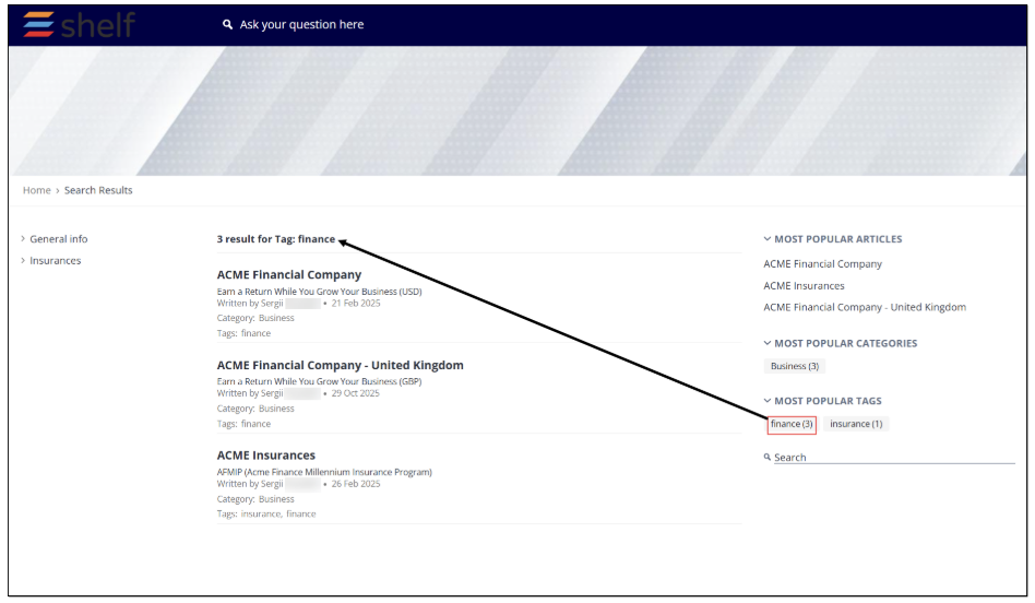 Figure 42. Navigating by tag
Additional Search Field
The additional search field can be enabled on the Shelf side in the Self-Service Configurator’s Basic settings for your SSP and provides a secondary method of looking for the needed information.
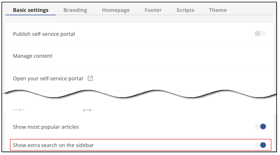
Figure 43. Enabling additional search field
If enabled, it is available in the panel in the right part of the Folder, Search Results, and Article pages.
Both the main search field in the SSP header and the additional search field in the sidebar, as shown in Figure 25, have the same functionality and allow searching by keyword across all articles on SSP. Place the pointer in the field, enter your query, and hit the Enter button on the keyboard. If the search is successful, the results are displayed on the Search Results page as shown in Figure 26.
Working with on-page navigation block
This block simplifies navigation through the articles on your self-service portal and is located at the bottom of the Home page just above its footer.
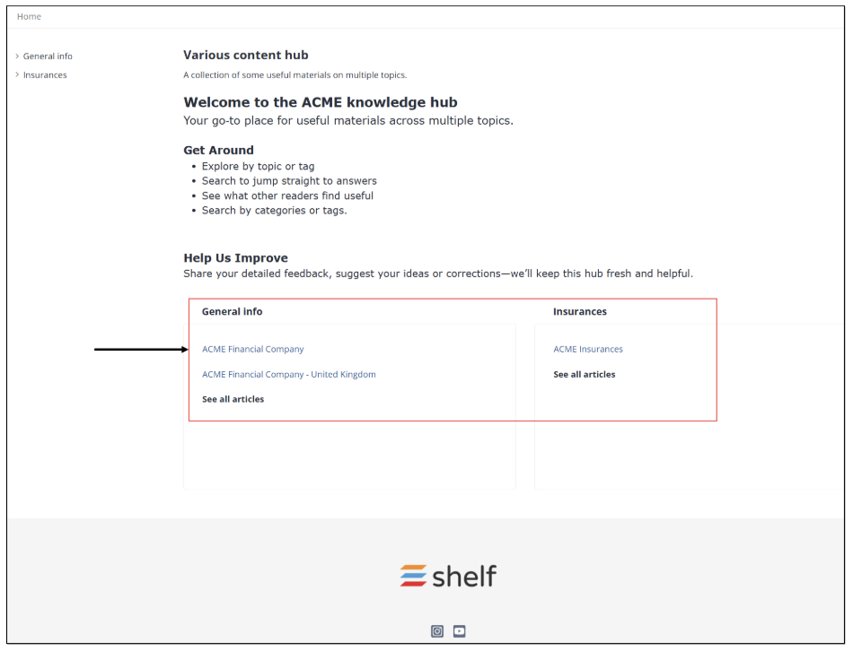
Figure 44. Viewing navigation block on SSP Home page
In this block, you can see folders preconfigured on the Shelf side and, if any, nested folders and articles (Gems) created inside these folders. You can navigate to any needed article by simply clicking its name. Once clicked, you are redirected to the respective Article page. You can also click the See all articles link to get to the respective Folder page listing all articles available in this folder.
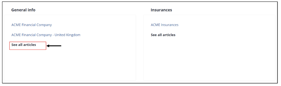
Figure 45. Accessing all articles in folder
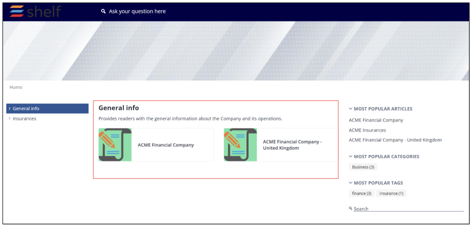
Figure 46. Viewing all articles in folder
Website Homepage Link
As mentioned in Item 7, Table 1, you or your SSP users can make use of the link to your website homepage that is preconfigured in the Basic settings of the Self-Service Configurator on the Shelf side.
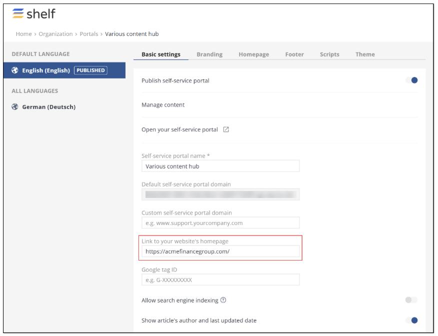
Figure 47. Enabling custom website link display
The display of this link depends on the template and can be either in the form of a clickable logo or a simple text link. Regardless of the form, once clicked, it redirects the user to your website homepage.
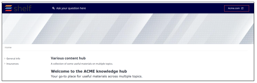
Figure 48. Accessing your website homepage via SSP header link
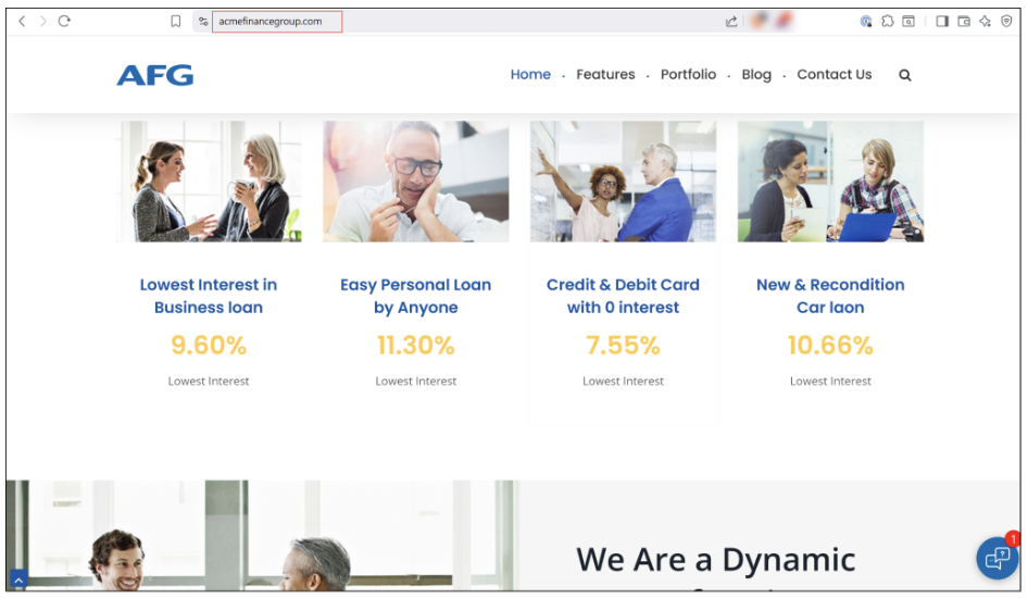
Figure 49. Viewing your website homepage
Language selector
This option is also enabled in the Basic settings of the Self-Service Configurator on the Shelf side. It is only operational when you have the same content in your self-service library but in different languages, and it helps your SSP users select the language of the needed content.
If there is such content, the language selector is displayed in the SSP header as shown in the figure below.
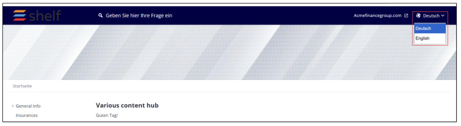
Figure 50. Viewing language selector in SSP header
If there are no articles that have the same content but in different languages, the language selector is not displayed in the SSP header.
Social media link buttons
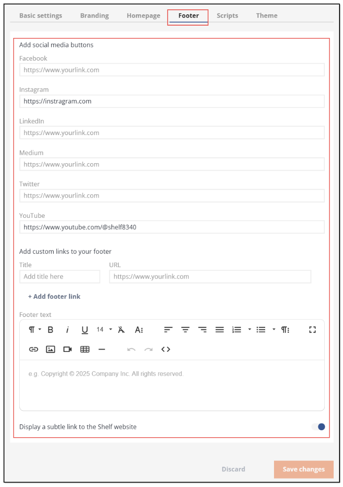
Figure 51. Configuring social media link buttons for SSP footer
Once the links are set and saved, they are displayed in the footer of your self-service portal and clicking them will redirect users to the respective social media pages.

Figure 52. Viewing social media link buttons in SSP footer
Using content feedback feature on self-service portal
One of the most exciting features of self-service portals delivered by Shelf is the opportunity for SSP users to give their feedback on the content, evaluate how useful the SSP content is for them. To make this possible, the user feedback on articles toggle must be enabled in the Basic settings of the Self-Service Configurator.
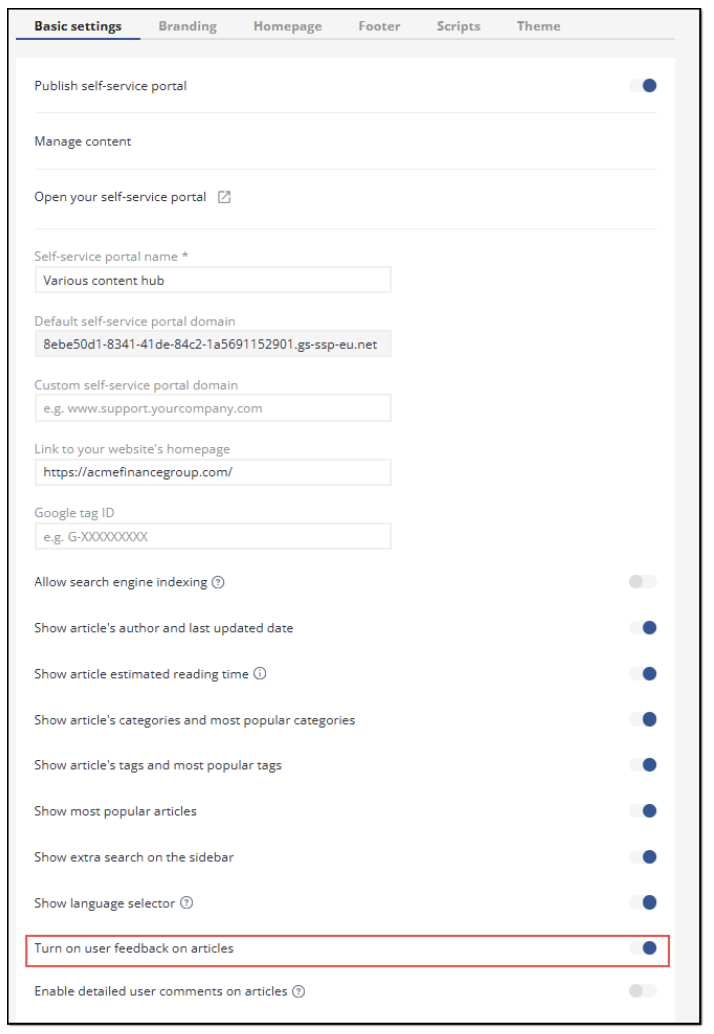
Figure 53. Enabling user feedback feature for SSP content
Once the toggle is enabled, the additional capabilities become available for setting as well. In particular, you can enable SSP users to leave detailed feedback on the articles. As part of this setting, you can create and configure specific reasons the users can select when leaving their opinions.
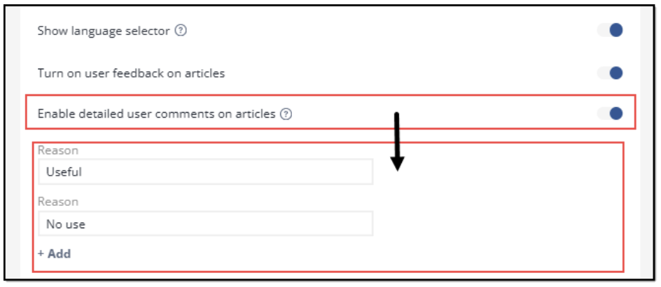
Figure 54. Enabling and configuring detailed feedback for SSP articles
To leave their feedback, SSP users need to open an article, read its content or scroll through it to the end, and then select one of the two available emojis to respond whether they like the content in this article or not.
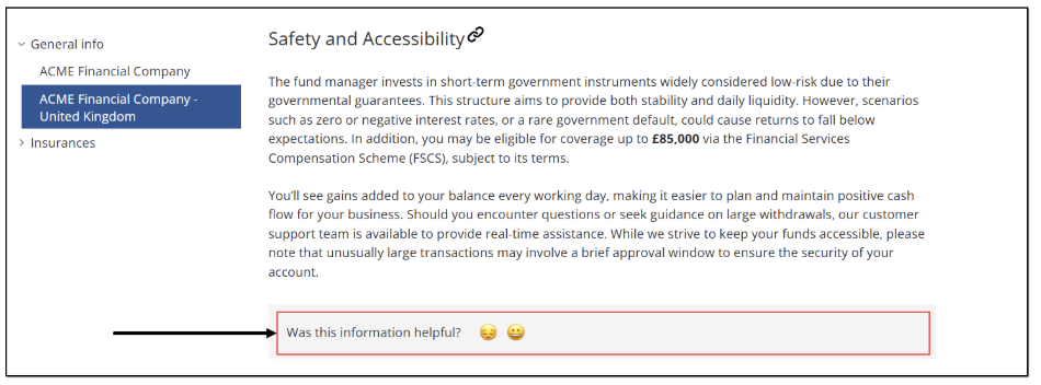 Figure 55. Finding feedback option in SSP article
If they find the article not useful or not very useful, they can select the disappointed emoji, select one of the available preconfigured reasons, then enter the text of their feedback message, and click Send feedback.
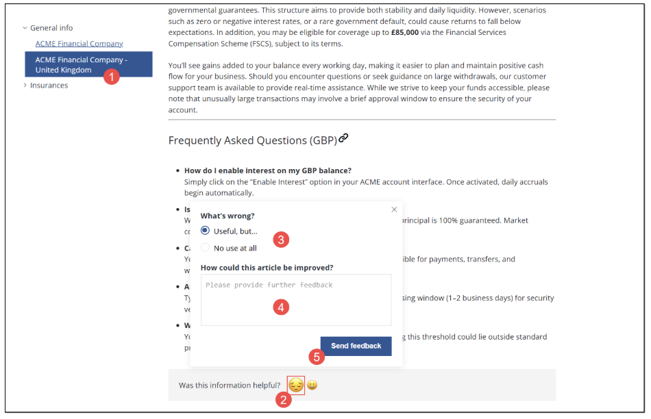
Figure 56. Leaving negative feedback on SSP article
If the user wants to leave the positive feedback, they need to select the happy emoji, respectively.
Once the user has evaluated the article, negatively or positively, the emojis are replaced with the message shown in the figure below.
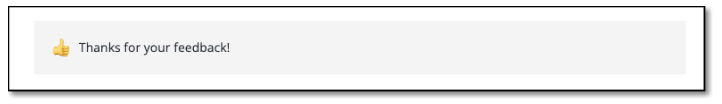
Figure 57. Viewing feedback confirmation message
Self-service portal analytics
In addition to the delivery of the self-service portal product and its Configurator feature, Shelf also provides a functionality to view analytics on the self-service portal usage. This functionality can be extremely useful for your organization as it makes it possible to understand which content (articles) is popular among your SSP visitors by views, what visitors search for, whether there are any unsuccessful searches, and also see how visitors rate the content on your SSP.
Altogether, it can help your organization improve your content health and make it more useful and efficient for your existing and potential customers.
To access the SSP Analytics functionality, you need to use the Shelf Content Intelligence app, in particular - its Content reports components such as Dashboards > Library and Self-Service reports.
To learn about the whole process of accessing Content Intelligence and finding and using the analytics capability, read the sections below.
Accessing Content Intelligence
To access the Shelf Content Intelligence app, once on the Shelf KMS Home dashboard, go to the App drawer and select the respective - Content Intelligence - option.
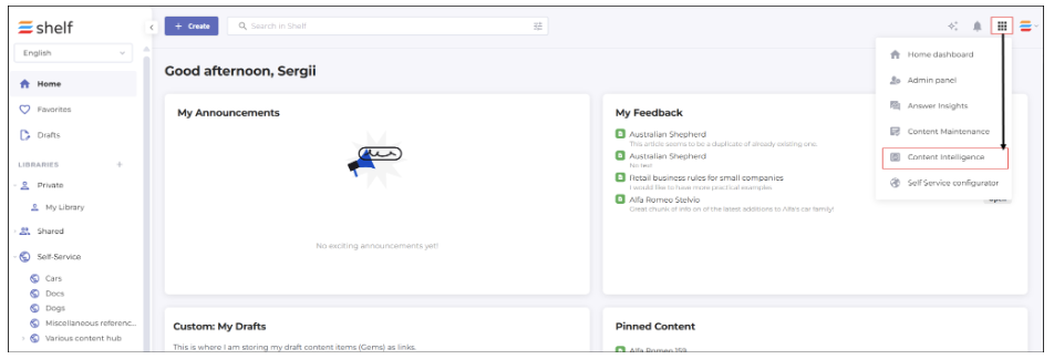
Figure 58. Accessing Shelf Content Intelligence
Viewing dashboard for your self-service library
Once on the Shelf Content Intelligence’s Home page, find the CONTENT REPORTS section in the navigation panel.
Navigate to the Dashboards option and expand it. Then select the Library option from the list that opens.
On the Library page that appears, find and click anywhere in the Location field.
In the modal window that opens, find and select your self-service library - in our case, it is Various content hub. Click Select.
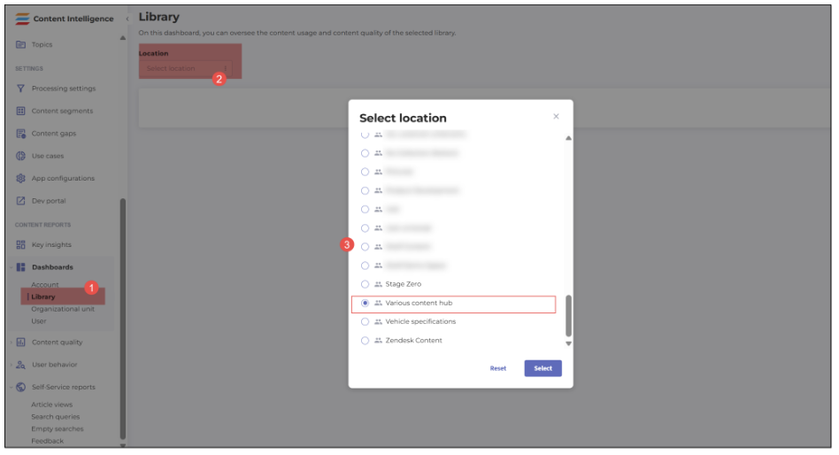
Figure 59. Accessing content analytics dashboard for your self-service library
- On the library-specific dashboard that then appears, you can navigate between the Content usage tab—where you can view statistics such as Content views activity, Most active viewers, Most active contributors, group the data by period (day, week, month, or year), and select the dashboard period using the time picker tool—and the Content inventory tab, where you can have an overview of the number of folders in your self-service library, number of content items in them, as well as counts of content articles broken down by content types.
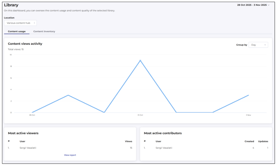 Figure 60. Viewing content usage dashboard for self-service library
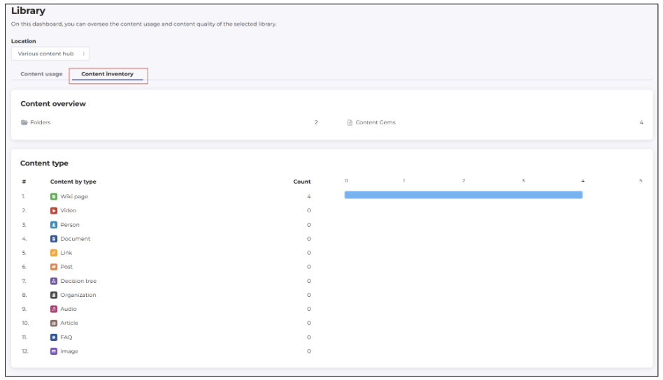
Figure 61. Viewing content inventory dashboard for self-service library
Once you have looked through the charts and numbers on your self-service library dashboard, you can proceed to look for more detailed statistics on your content and its users.
Working with self-service reports
To start working with content-specific reports for your self-service portal, go to the navigation panel and, in the CONTENT REPORTS block, find the Self-Service reports option. It is collapsed by default but you can expand it to view what types of reports you can generate and view.
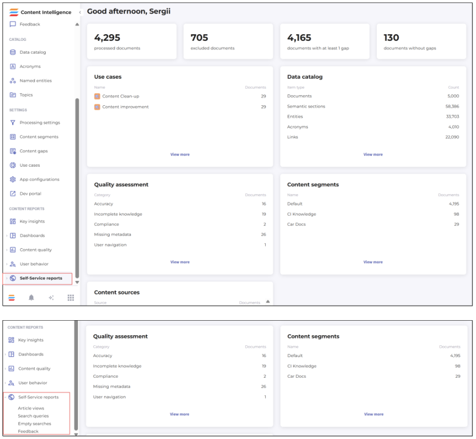
Figure 62. Accessing reports for your self-service library content
Article views report
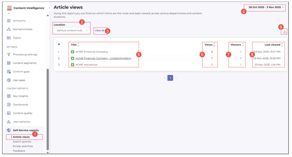
Figure 63. Viewing report on your self-service portal article views
Once you’ve selected the Article views option, this report opens on the page and covers all articles in all self-service libraries on your account. You can narrow down the report by selecting a specific library (portal) from the list that opens when you click on the Location field.
After filtering by the needed library, the report shows:
(4) report period; you can use the date/month/year picker to refine the report
(5) names/titles of content items in the library; you can sort them in alphabetical order from A to Z or vice versa
(6) number of views per each content item; you can sort the views in a descending or ascending order
(7) number of viewers per each content item; you can sort this number in a descending or ascending order
(8) date and time when a specific content item was last viewed; you can sort this column in a descending (from the most recent date and time to the most distant ones) or ascending order.
You can also clear all filters (3) (by library or period) and restore the report to the initial account-wide format. Finally, you are able to download the Article views report to your local file in the CSV format for further use. To do so, click the Download as CSV button (9) and then save the downloaded report to a needed location.
Search queries report
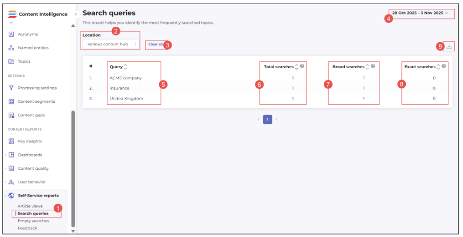
Figure 64. Viewing report on searches on your self-service portal
This report is accessible by clicking the respective option (1) under the Self-Service reports header. The Search queries report page opens where you can:
(2) Select the report on another self-service library’s (portal’s) content
(3) Clear any applied filters (location and/or report period)
(4) Set a new report period
(5) View and sort (from A to Z and vice versa) user search queries submitted on your self-service portal
(6) View and sort (from the largest number to the lowest one and vice versa) the total number of searches per each query
(7) View and sort (from the largest number to the lowest one and vice versa) the number of broad searches, that is not exact searches, when quotes are not used to refine the search by exact word/phrase
(8) View and sort (from the largest number to the lowest one and vice versa) the number of exact searches, that is the searches conducted with the use of quotes around word(s)/phrase(s) to refine the search
(9) Download the configured report to your local storage as a CSV file, for further needs.
Empty searches report
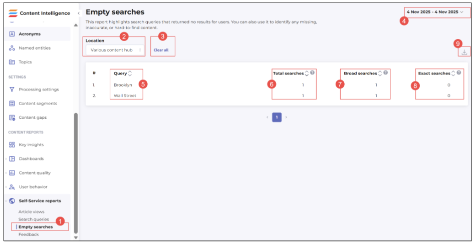
Figure 65. Accessing and viewing report on unsuccessful searches on your self-service portal
This report is accessible by clicking the respective option (1) under the Self-Service reports header.
The Empty searches report page is the place where you can see the detailed statistics on all user searches that returned no results:
(2) Select the report on another self-service library’s (portal’s) content
(3) Clear any applied filters (location and/or report period)
(4) Set a new report period
(5) View and sort (from A to Z and vice versa) what exactly users searched for on your self-service portal
(6) View and sort (from the largest number to the lowest one and vice versa) the total number of empty searches per each query
(7) View and sort (from the largest number to the lowest one and vice versa) the number of broad empty searches, that is not exact empty searches, when quotes are not used to refine the search by exact word/phrase
- 8) View and sort (from the largest number to the lowest one and vice versa) the number of exact empty searches, that is the searches conducted with the use of quotes around word(s)/phrase(s) to refine the search
- (9) Download the configured report to your local storage as a CSV file, for further needs.
If no data on the search queries is available, the relevant message is displayed in the table grid.
Feedback report
This report is very useful to understand how visitors of your self-service portal evaluate the content available on it.
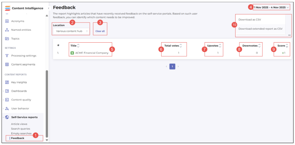 Figure 66. Accessing and viewing report on feedback left by users on your SSP articles
The report opens by selecting the respective option under the Self-Service reports header and allows you to:
(2) Select the report on another self-service library’s (portal’s) content
(3) Clear any applied filters (location and/or report period)
(4) Set a new report period
(5) View and sort (from A to Z and vice versa) names of articles on which users gave their feedback
(6) View and sort (from the largest number to the lowest one and vice versa) the number of votes on articles on the self-service portal
- (7) View and sort (from the largest number to the lowest one and vice versa) the number of positive votes (upvotes) on articles on the self-service portal
- (8) View and sort (from the largest number to the lowest one and vice versa) the number of negative votes (downvotes) on articles on the self-service portal
- (9) View and sort (from the largest number to the lowest one and vice versa) the total feedback scores of articles on the self-service portal; the score is a difference between negative and positive votes. For example, if an article has 3 negative votes and 5 positive votes, its feedback score is +2
- (10) Download the configured report to your local storage as a CSV file, for further needs. You have two options here: download a standard report or an extended one.
Conclusion
If you have read to this point, it means that you have learned what a self-service portal is and what purposes it serves, how it is configured and customized on the Shelf side, how it looks when published, and what its elements are used for. You have also learned how to get essential statistics on your self-service portal and its content using the Shelf Content Intelligence’s Content reports capabilities and use it for improving the health of your content and popularity and usability of your self-service portal.
Shall you have any further questions regarding the Self-service portal feature or any of its settings or elements, feel free to contact Shelf at: https://shelf.io/contact-us.