
Shelf Knowledge Management System
Home Dashboard Overview Guide
Document version history
Version number | Modified by | Modifications made | Date modified | Status |
1.0 | Shelf | Initial release of the document | 25 June 2024 | Expired |
1.1 | Shelf | Multiple amendments to the document: restructuring, replacement and repositioning of texts and graphics, other corrections needed to make the guide more concise and user-friendly. | 04 July 2024 | Expired |
| 1.2 | Shelf | The document has been updated to reflect multiple changes in the Shelf UI/UX. | 05 May 2026 | Active |
- Shelf Home Dashboard
- Navigating the Home Dashboard
- Managing multiple dashboards
- Working with widgets
- Custom widgets
- Managing widgets
- Working with content
Introduction
This document is developed to let you know what Shelf Knowledge Management System Home Dashboard is, how you can use it, and what purposes and needs it can serve.
The guide is architectured so as to cover all user roles in Shelf that can access and work with the Shelf KMS Home Dashboard, which are:
- Admins
- Collaborators
- Members
- View-only users.
In general, the target audience of this guide are Content Editors and Content Managers of organizations that are subscribed to the Shelf Knowledge Management System and use it to manage all their content-related activities.
Shall you need any further assistance or have any questions, feel free to contact your Shelf Account Manager or contact Shelf Support at support@shelf.io.
Prerequisites
There are no prerequisites for you to start using Shelf Home Dashboard as it is the component of Shelf Knowledge Management System and is available out-of-the-box when your organization has subscribed to Shelf KMS.
Shelf user roles
Before leading you to the main part of this Guide, that is to the description of Shelf KMS Home Dashboard and its use, we need to explain to you what user roles Shelf KMS has and how they differ from each other in terms of content management capabilities.
Table 1. Shelf KMS user roles explained
User role name | User role capabilities |
Admin | Admins are users who manage the account. The following default permissions are available for Admins:
|
Collaborator | Collaborators are users who have the following content management permissions:
|
Member | Members are standard users who have to some extent restricted set of content management permissions:
|
View-only | As clear from the user role name, the View-only users have a very limited set of content-related permissions that are limited to viewing and commenting on the content:
|
Shelf Home Dashboard
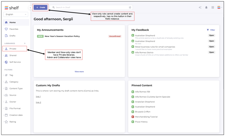
Figure 1. Shelf KMS Home Dashboard
Admins are users who have full permissions to manage content and other users in Shelf KMS. This also includes their permissions within the Shelf KMS Home dashboard.
Collaborators, in regards to the Shelf Home dashboard, can enjoy virtually all the benefits and capabilities of Home dashboard available for the Admin users with the exception of accessing the Admin panel.
Members are ordinary or standard users of the Shelf Knowledge Management System with the limited set of permissions. In particular, the Member role users do not have the Private library which the Admin and Collaborator users have. Members also cannot create structural content items - libraries and folders. In terms of the Home dashboard navigation, Members have no access to the Admin panel.
View-only users have very limited permissions in Shelf KMS. They cannot create any content, either structural or non-structural one, meaning that they cannot create, add, or edit individual Gems or libraries or folders. They also have no Private library and cannot access the Admin panel.
Navigating the Home Dashboard
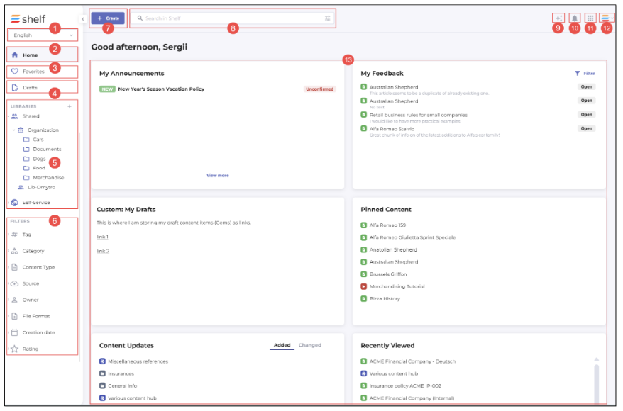
Figure 2a. Navigating Home dashboard user interface - No Dashboard customization permission
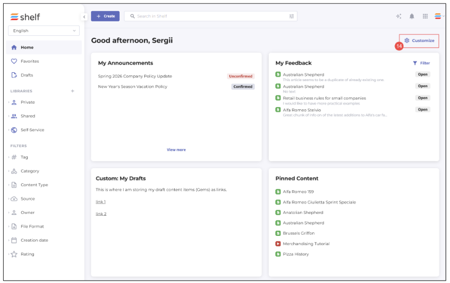 Figure 2b. Navigating Home dashboard user interface - with Dashboard customization permission
Depending on what features are enabled for your account and permissions granted for your user role, your user interface in the Shelf Home dashboard may look like pictured above in Figure 2a or Figure 2b.
Language selector: allows you to switch between content in various languages if the multilanguage feature is enabled for your account.
Home button: makes it possible for you to return to the original home page from anywhere in Shelf KMS.
Favorites: enables you to open the list of content items added to your favorites.
Drafts: opens the list of content items saved as Drafts.
Library and folder navigation: this section allows you to quickly switch between libraries and folders available to you (the Admin and Collaborator roles have the Private library, while the Member and View-only roles do not have it)
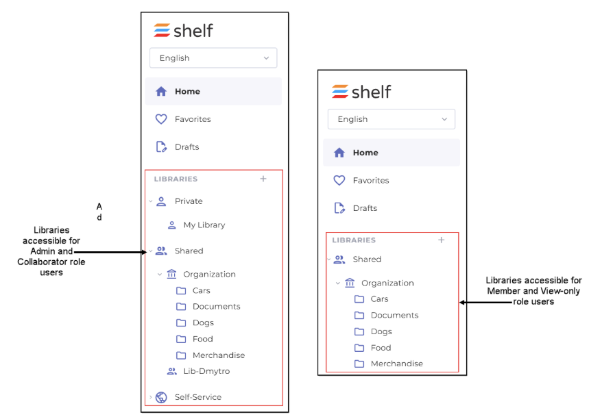
Figure 6. Comparing access to libraries for various user roles
- Filters: here you can apply various filters to narrow down your content searches
Content creation: you can start adding the needed content via +Create (only the Admin and Collaborator role uses can create both structural content (libraries and folders) and non-structural content (individual Gems); Members can create/add only non-structural content and cannot create/add libraries and folders; View-only cannot create any content)
Content search: enables you to look for any Gems and then filter out them
Copilot: if the Shelf Search Copilot feature is enabled for your organization and for your account, use it to get fast and accurate answers to your questions
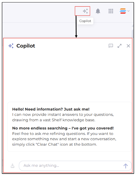
Figure 7. Accessing and using Shelf Copilot
Notifications: this feature allows you to be aware of the content-related events. The small dot indicates new in-app notifications.
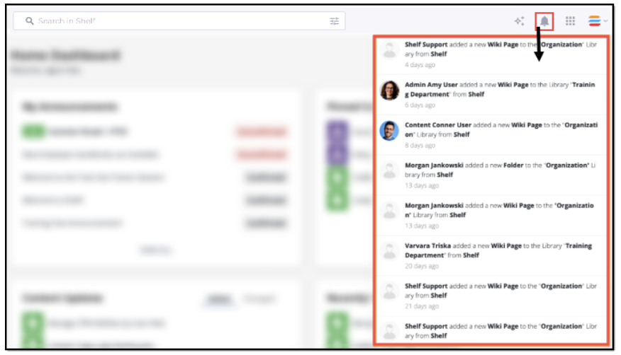
Figure 8. Accessing and viewing notifications
- Drawer menu: with this menu, you can quickly switch between Shelf apps as well as navigate back to Home dashboard from any other page from here
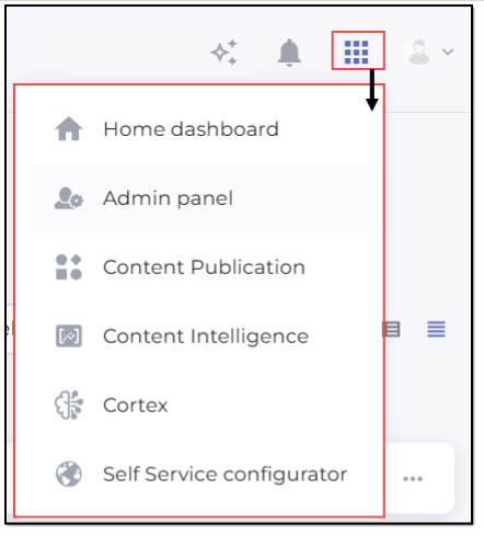
Figure 9. Accessing drawer menu - Admin view
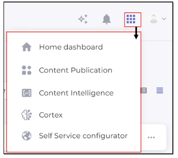
Figure 10. Accessing drawer menu - Collaborator and Member view
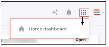 Figure 11. Accessing drawer menu - View-only view
 - Profile: if you open the User profile menu, you see Shelf’s notifications about new features or releases (if the What’s new feature is enabled for you), access your profile settings, log out of your account, as well as access other features if they are enabled on your account: Announcements, Live chat support, and Shelf help (Shelf Academy courses).
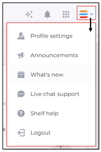
Figure 12. Accessing User profile menu
- Widgets: this is the main capability of the Shelf Home dashboard that allows you to manage content and get insights into content-related activities. See the Working with widgets chapter below for more details.
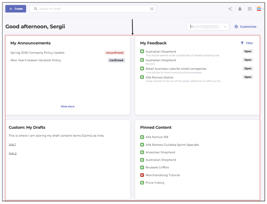 Figure 13. Viewing widgets on Home dashboard
 - Customize menu: using this button, and under condition your user role is a member of a user group specifically permitted to customize Home dashboard, you can manage and customize Home dashboards you have access to, excluding the prebuilt one which cannot be customized and can only serve as a reference.

Figure 14. Viewing Customize button to access and manage Home dashboard(s)
Dashboard selector: if a user role is a member of a user group permitted to customize Home dashboard and if there is at least one custom Home dashboard created and available either for the entire account or for an organization unit the user is assigned to, the Dashboard selector becomes enabled, allowing to switch between these available dashboard(s). If there is only one, default, account/organization-wide Home dashboard, this selector is deactivated. More details about multiple dashboards can be found in the dedicated chapter below.
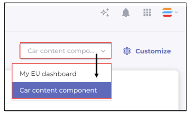 Figure 15. Dashboard selector with account’s dashboard selected
Managing multiple dashboards
Businesses with expansive user bases require a knowledge management system that can be tailored to the unique structures of their various divisions — without segmenting knowledge into isolated accounts. Shelf addresses this need by allowing administrators to create and manage multiple customizable Home dashboards, each of which can be assigned to specific organizational units or made accessible across the entire account. This chapter explains how to open the dashboard customization panel, create dashboards for different audiences, update existing dashboards, and delete dashboards you no longer need. It also covers how the system determines which dashboard a user sees when they return to the Home page.
Understanding multiple dashboards framework
Every Shelf account includes one default dashboard—[YOUR_ACCOUNT_NAME] dashboard—which is always available to all users of the account and cannot be deleted or removed from access. Beyond this default, administrators can create up to 50 dashboards per account, each tailored to a distinct audience. A dashboard can be made visible to the entire organization or restricted to one or more organizational units. When the Organizational Units feature is enabled, users automatically see the dashboard assigned to their organizational unit. If they belong to a unit that has no dedicated dashboard, they fall back to the default account dashboard.
The Dashboards dropdown is always displayed in the header for any user who has the user-group permissions required to manage the Home dashboard. This dropdown allows those users to switch between existing dashboards and navigate to the Customize panel. All other users see only the dashboard or dashboards relevant to their organizational unit membership.
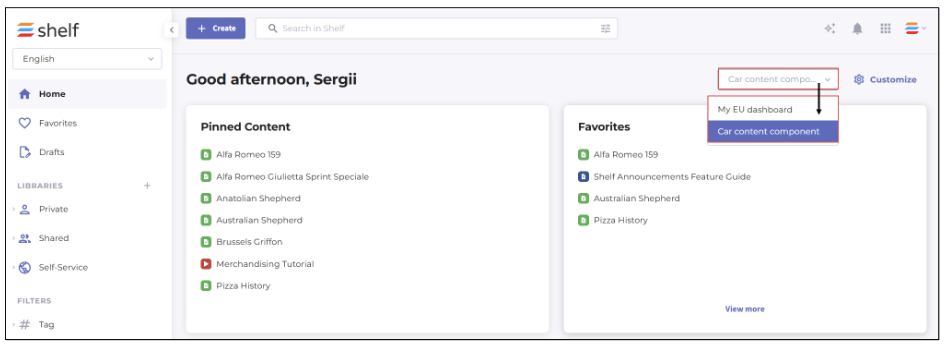
Figure 16. Accessing and viewing Dashboard selector on Home dashboard
The Dashboards dropdown is visible only to users who have been granted permissions to manage the Home dashboard and have more than one dashboard available to them. 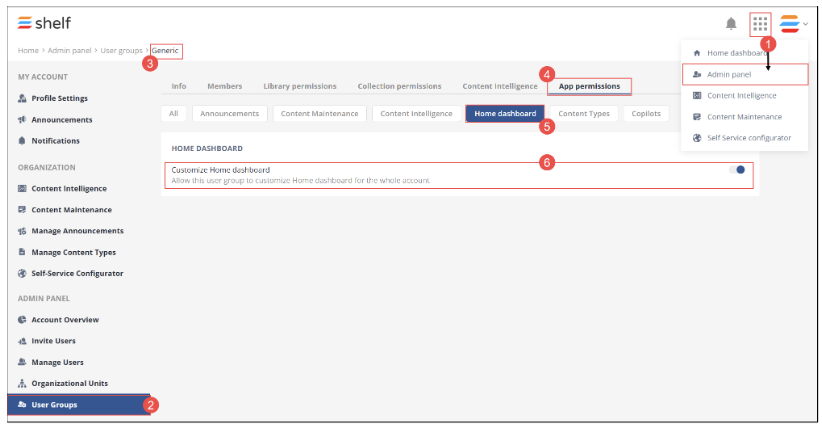 Standard users without this permission will not see the dropdown or the Customize button. |
Opening Customize panel
To begin managing dashboards, you must open the Customize panel. The Customize button is always displayed and active in the header for users with the appropriate permissions (see the Note above). Clicking Customize opens a dedicated editing view that is separate from the live Home dashboard.
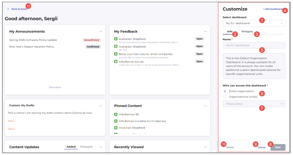
Figure 17. Viewing Customize panel and its elements
Once inside the Customize panel, you will see the following key elements:
(1) Select dashboard dropdown at the top of the panel, pre-populated with the dashboard you were viewing when you clicked Customize.
Two tabs — (2) Info and (3) Widgets — with the Info tab open by default.
(4) Add dashboard button for creating new dashboards.
(5) Name field for entering a name for a new Home dashboard being created or for displaying the name of the default Home dashboard if no other dashboards are available for the user.
(6) Who can access this dashboard block with
Entire organization radio button: if selected, the respective dashboard is enabled for your entire organization.
Organizational unit(s) radio button: if selected, you can further select up to 50 (fifty) organizational units whose members will have access to the respective dashboard; to do this, use the dropdown list (7).
Note that if there are no organizational units on the account and you select the Organizational unit(s) radio button in this block, you are not able to save the Home dashboard you are creating - you first need to create an organizational unit and assign members to it.
(7) Dropdown list to select organizational unit(s) if there is at least one organizational unit available on your account and if you have selected the Organizational unit(s) radio button.
(8) Save button for saving your Home dashboard.
(9) Cancel button that exits the Customize panel and returns you to the Home dashboard, restoring the last dashboard you had selected.
(10) Delete button for removing the currently selected dashboard. Note that you cannot delete the default dashboard.
(11) Back to home button in the top-left corner that takes you directly to the Home dashboard.
The Select dashboard dropdown (1) lists all available dashboards in alphabetical order and supports single-select only — meaning you can view and configure one dashboard at a time.
Viewing default account dashboard in Customize panel
When the default account dashboard is selected in the Customize panel, several controls are intentionally restricted to protect the integrity of the organization-wide baseline experience. The Name field on the Info tab is disabled and displays [YOUR_ACCOUNT_NAME] Dashboard — this name cannot be edited. An informational notice reads:
The Who can access this dashboard block is also disabled. The option Entire organization is shown as selected, and the Organizational unit(s) option is visible but not selectable. These restrictions exist because the default dashboard must remain universally accessible — it serves as the fallback for every user on the account who is not assigned to a dashboard through their organizational unit membership.
| If your account does not have the Organizational Units feature configured, the Who can access this dashboard block and its associated options will be disabled on the Info tab for any dashboard, including the default. |
The Delete button is disabled when the default dashboard is selected. Hovering over the button displays a tooltip that reads: "You cannot delete the default dashboard." This ensures that the account always retains at least one accessible dashboard for all users.
The Widgets tab remains fully functional for the default dashboard. You can add, remove, and rearrange widgets on the default dashboard at any time. For a detailed explanation of available widget operations and the drag-and-drop interface, refer to the Customizing widgets section of this guide.
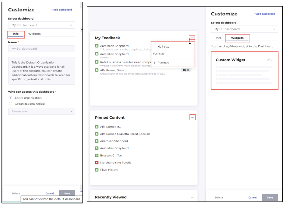
Figure 18. Viewing Customize panel with its tabs for default Home dashboard
Creating new dashboard
To create a new dashboard, click the Add dashboard button in the Customize panel. The button becomes disabled immediately after you click it to prevent duplicate creation requests. The main editing area clears and displays an empty drag-and-drop zone with the prompt "Drag & drop widgets here." The Select dashboard dropdown updates to show Untitled, indicating that you are working on a new, unsaved dashboard.
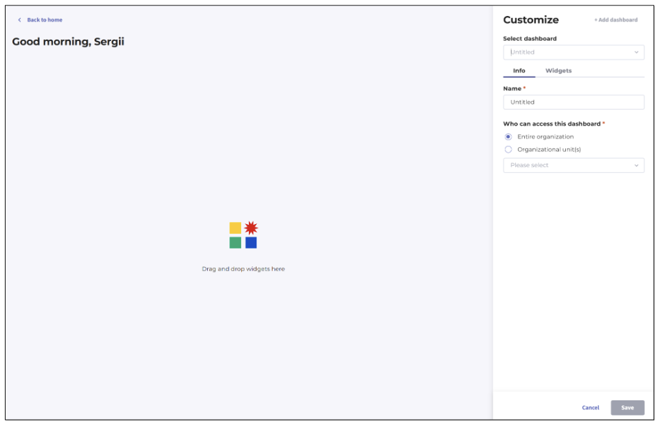
Figure 19. Creating new Home dashboard - start
The Info tab opens automatically. The Name field is active and has the Untitled value prepopulated (you can delete it and replace with your input) — it accepts between 1 and 60 characters. Leading and trailing whitespace is automatically trimmed when the name is processed. If you attempt to exceed 60 characters, a validation message appears inline: "Reached max number of characters (60)." If you attempt to save with a name that is too short or entirely blank after trimming, the validation message reads: "Name is too short, enter at least 1 character."
Creating dashboard for entire organization
When you create a new dashboard, the Who can access this dashboard section defaults to the Entire organization option selected. This means that once saved, the dashboard will be visible to every user on the account, regardless of organizational unit membership.
To create a dashboard for the entire organization, perform the following steps.
Open the Customize panel by clicking the Customize button in the top-right area of the Home dashboard.
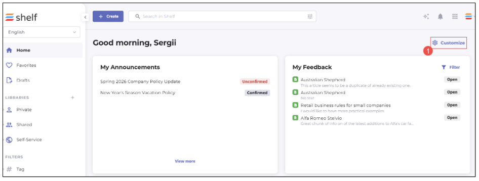
Figure 20. Creating Home dashboard - accessing Customize panel
- Click the Add dashboard button.
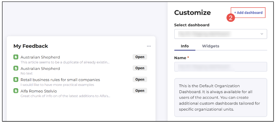
Figure 21. Creating Home dashboard - adding new dashboard
- On the Info tab, enter a descriptive name for the dashboard in the Name field (1–60 characters).
Leave the Who can access this dashboard option set to Entire organization (selected by default).
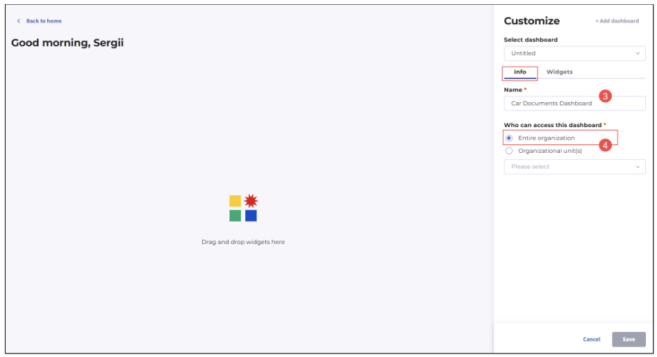
Figure 22. Creating Home dashboard - populating name and setting access level
Switch to the Widgets tab and drag at least one widget from the available widget panel onto the dashboard canvas.
Click Save.
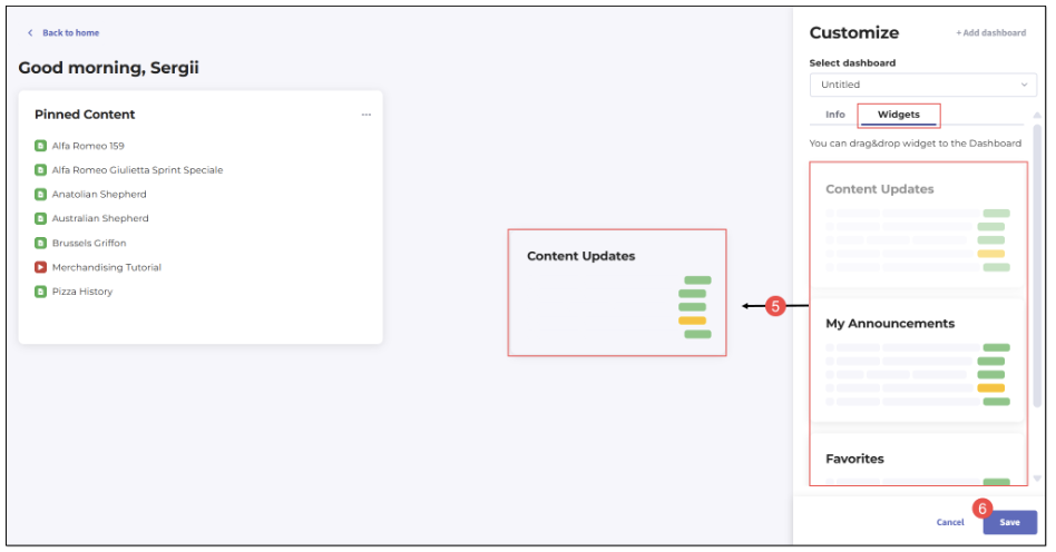
Figure 23. Creating Home dashboard - adding widget(s) to dashboard and saving it
- Confirm saving your new Home dashboard in the modal window that appears.
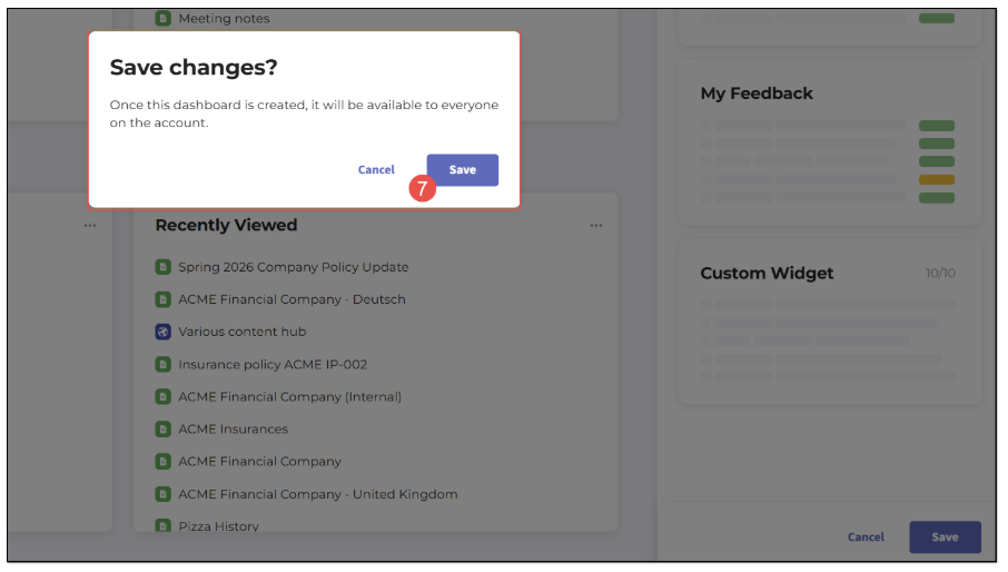 Figure 24. Creating Home dashboard - confirming dashboard saving
Clicking Cancel in the modal window closes it and returns you to the Customize panel without saving.
After creation, the dashboard remains selected in the Select dashboard dropdown, and the Info tab is updated with the display of the created dashboard in the Name field.
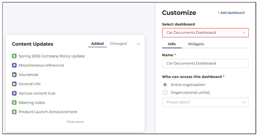
Figure 25. Creating Home dashboard - verifying dashboard is created
A dashboard cannot be saved without at least one widget. Ensure you have dragged at least one widget onto the canvas before clicking Save. Without doing that, the Save button remains disabled. |
If you wish to discard the new dashboard, click Cancel in the Customize panel. If changes have been made, a new dialog will ask you whether you want to leave the page without saving.
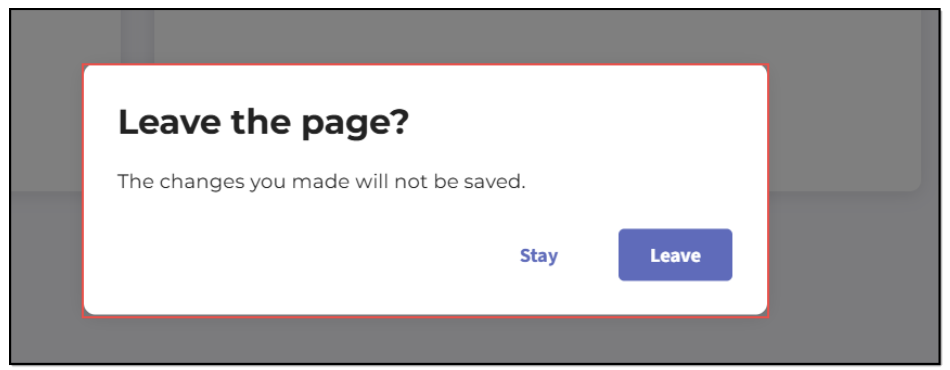
Figure 26. Creating Home dashboard - cancelling dashboard creation
The dialog presents a Leave button and a Stay button. Clicking Leave discards all changes and returns you to the Home dashboard with the last dashboard selected. Clicking Stay dismisses the dialog and keeps you in the editing mode. If no changes have been made, clicking Cancel returns you to the Home dashboard with the last dashboard selected without any confirmation prompt. The same behavior applies to the Back to home button in the top-left corner.
Creating dashboard for organizational units
If your account has the Organizational Units feature enabled and you want to restrict a dashboard to specific divisions or teams, select Organizational unit(s) in the Who can access this dashboard section. Selecting this option activates a dropdown that lists all organizational units configured on your account.
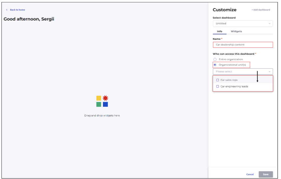
Figure 27. Creating Home dashboard - selecting organizational units
To create a dashboard for specific organizational units, perform the following steps.
Open the Customize panel by clicking the Customize button.
Click the Add dashboard button.
On the Info tab, enter a descriptive name in the Name field (1–60 characters).
Select the Organizational unit(s) option under Who can access this dashboard. The dropdown beneath it becomes active.
Open the dropdown and select the organizational unit(s) that should have access to this dashboard.
Switch to the Widgets tab and drag at least one widget onto the dashboard canvas.
Click Save.
You may select up to 50 organizational units for a single dashboard. If you attempt to select more than 50, an error notification reading "Reached max number of Organizational units (50)." is displayed:
| If you select one or more organizational units and then switch the Who can access this dashboard option back to Entire organization, the organizational unit(s) you have selected will become unselected. |
When saving a dashboard scoped to organizational units, the confirmation modal appears where you need either confirm or disregard saving the dashboard.
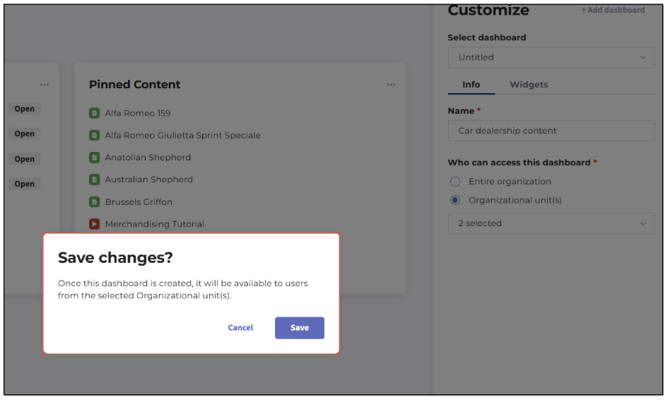
Figure 28. Creating Home dashboard - saving dashboard accessible for selected organizational units
After confirmation, the dashboard is created and the success toast notification is displayed. Only users who belong to the selected organizational units will see this dashboard in their Home dashboard dropdown. The order in which dashboards appear in the dropdown is alphabetical.
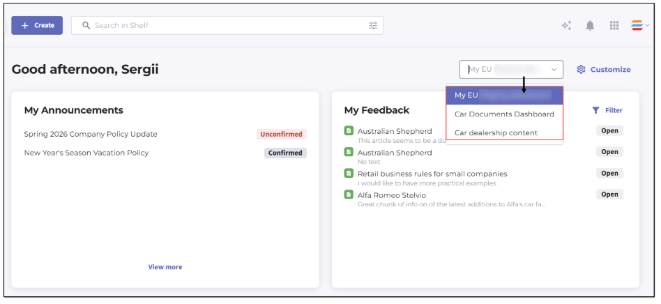
Figure 29. Viewing Home dashboards available for user
| If the Organizational Units feature is later disabled on your account, any dashboards scoped to organizational units will be hidden from the Home page dropdown for all users. When the feature is re-enabled, those dashboards will become visible again according to their original access configuration. |
Updating existing dashboard
To update any dashboard, open the Customize panel and use the Select dashboard dropdown to choose the dashboard you want to edit. All dashboards are listed in alphabetical order, and the dropdown is single-select. Once you select a dashboard, its current configuration is loaded into the Info and Widgets tabs.
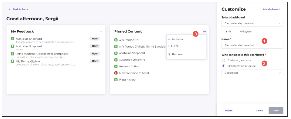
Figure 30. Editing Home dashboard - Customize panel
On the Info tab, you can edit the dashboard's name (1) subject to the same validation rules described in the creation workflow — a minimum of 1 character and a maximum of 60 characters, with whitespace trimmed automatically. You can also change the Who can access this dashboard scope (2), provided the dashboard is not the default account dashboard (whose access options remain disabled, as described in the respective section above).
The Widgets tab allows you to add, remove, resize, or rearrange widgets using the drag-and-drop interface. The same rule applies as during creation: you cannot save a dashboard without at least one widget. More details about widgets can be found in the dedicated chapter below.
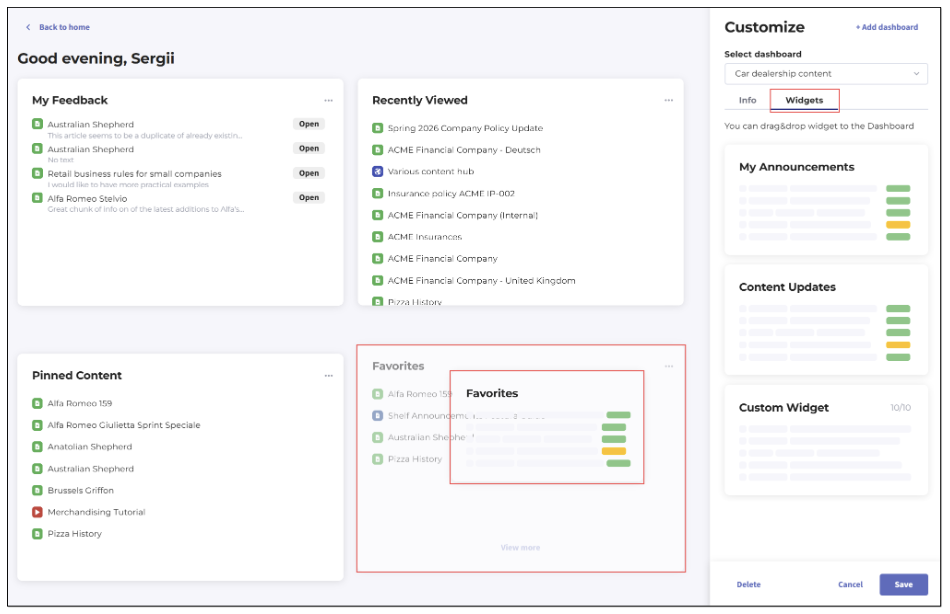
Figure 31. Editing Home dashboard - Widgets tab
When you are ready to save your changes, click Save and then confirm saving in the modal window that appears.
You remain in the Customize panel with the updated dashboard selected. If your update changes the access scope in a way that causes some users to lose access to the dashboard — for example, if you switch from Entire organization to a specific set of organizational units — those users will automatically fall back to the default [YOUR_ACCOUNT_NAME] Dashboard the next time they visit the Home page.
If changes have been made and you click Cancel or the Back to home button, the same leave-page confirmation dialog described in the Creating new dashboard section is displayed. If no changes have been made, clicking Cancel returns you to the Home dashboard without any confirmation prompt.
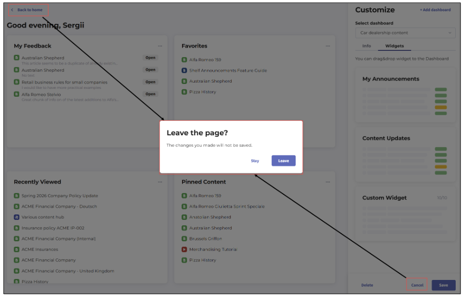
Figure 32. Editing Home dashboard - exiting editing with changes made
Handling deleted organizational units
If one or more of the organizational units that were assigned to a dashboard are subsequently deleted from the account, the dashboard's behavior changes in the following way: the dashboard is hidden from the Home page dropdown for all users, because its assigned units no longer exist. However, the dashboard remains accessible within the Customize panel so that administrators can reassign it. In this state, the Info tab displays the Organizational unit(s) option as selected, with a "Please select" placeholder shown in the dropdown. Once you reassign the dashboard to valid organizational units and save, it will reappear in the appropriate users' Home page dropdowns.
Deleting dashboard
The Delete button is always active in the Customize panel when a non-default dashboard is selected. To delete a dashboard, follow the steps below.
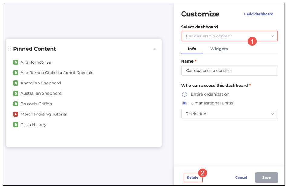
Figure 33. Deleting Home dashboard
Open the Customize panel and use the Select dashboard dropdown to navigate to the dashboard you wish to delete.
Click the Delete button on the Info tab.
In the confirmation modal that appears, click Delete to confirm, or click Cancel to abort.
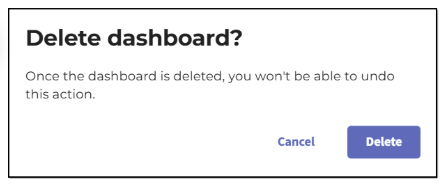
Figure 34. Confirming dashboard deletion
After deletion, you remain in the Customize panel, and the Select dashboard dropdown automatically reverts to the default account dashboard. Any users who had the deleted dashboard selected as their active Home dashboard will automatically fall back to the [YOUR_ACCOUNT_NAME] dashboard the next time they visit the Home page. This fallback behavior ensures that no user is ever left without a Home dashboard experience.
| Deletion is permanent and cannot be undone. Before deleting a dashboard, consider whether any organizational units rely on it as their primary dashboard. You may want to reassign those units to another dashboard before proceeding with deletion. |
| The Delete button is permanently disabled for the default [YOUR_ACCOUNT_NAME] dashboard. Hovering over the disabled button displays the tooltip: "You cannot delete the default dashboard." The default account dashboard cannot be removed under any circumstances. |
Dashboard persistence — Remembering last selected dashboard
Shelf KMS is designed to minimize friction for users who work across multiple dashboards. Whenever you select a dashboard from the Dashboards dropdown on the Home page, that selection is remembered by the system. The next time you navigate to the Home dashboard — whether by clicking the Home icon, returning from another section of the application, or logging in again — the system automatically displays the last dashboard you selected.
This persistence applies per user, meaning that each user's last selection is stored independently. If an administrator selects one dashboard and a team member selects another, each user will see their own last-selected dashboard on their next visit. This behavior helps users maintain their preferred working context without needing to re-select their dashboard on every session.
| If the dashboard that was last selected by a user is subsequently deleted or its access scope is changed so that the user no longer has access to it, the system will automatically fall back to displaying the default [YOUR_ACCOUNT_NAME] dashboard for that user on their next visit. |
Dashboard limits and best practices
Each Shelf account supports a maximum of 50 dashboards, including the default account dashboard. Once this limit is reached, the Add dashboard button in the Customize panel will become disabled until an existing dashboard is deleted.
As your organization grows and you create dashboards for new teams and divisions, it is advisable to periodically audit your dashboard inventory to remove dashboards that are no longer needed or whose corresponding organizational units have been dissolved.
When naming dashboards, choose names that clearly communicate the intended audience — for example, naming a dashboard after the organizational unit it serves makes it easier to identify in the Select dashboard dropdown, which lists all dashboards alphabetically. Clear, descriptive names also reduce the likelihood of administrators accidentally modifying the wrong dashboard during updates.
For guidance on which widgets to include on dashboards for different organizational units, refer to the Working with widgets section of this guide. For information on how user group permissions govern who can manage dashboards, refer to the Shelf user roles section.
Working with widgets
Widget is an element in a graphical user interface (GUI) that acts as a mini app that displays a small amount of information on screen at all times and interacts with the user. |
- My Announcements
- My feedback
- Favorites
- Content Updates
- Recently Viewed
- Pinned Content
- My Tasks
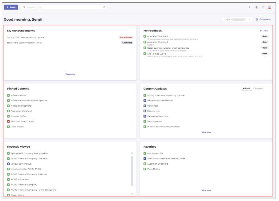
Figure 35. Default set of widgets on Home dashboard
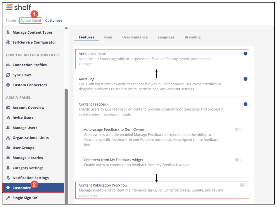
Figure 36. Enabling Announcements and CPW for Shelf KMS account
My Announcements
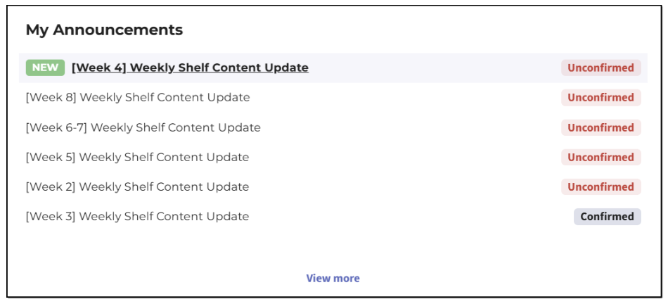
Figure 37. Viewing Announcements widget in Shelf KMS Home dashboard - Half size
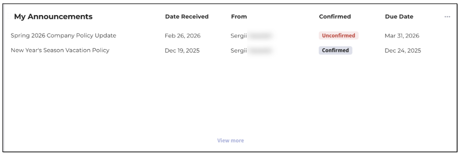
Figure 38. Viewing Announcements widget in Shelf KMS Home dashboard - Full size
The My Announcements widget allows you to see up to 7 most recent announcements on which you are specified as a recipient.
The announcements not yet read are displayed on top of the list; the entire list is sorted from the newest (most recent) to the oldest announcements. The metric here is the announcement’s submission date and time. In the full-size mode, the widget also shows who sent the announcement and when it was received.
You can easily see what announcements are new, as there is the respective label - New - near such. The new, unread announcements are shown in bold as well, for your convenience.
The status of an announcement is shown as well: CONFIRMED, if the announcement requires your confirmation and has been confirmed, and UNCONFIRMED, if the announcement requires your confirmation and has not been confirmed. If no confirmation is required, no status is displayed.
The widget shows the announcement title in a single row and if the title is too long, it is trimmed. However, you can see the whole title as a tooltip that pops up when you hover over the trimmed title.
You can open and work with any announcement - confirm, read the attached Gems (documents etc.) - directly from the Announcements widget. If you click any desired announcement, it opens in its respective modal window.
Clicking the View more button redirects you to the Announcements page where the list of all the available announcements is located.
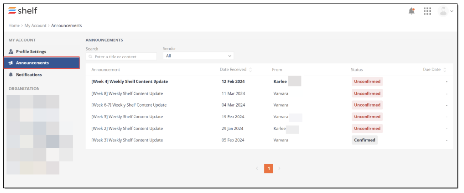 Figure 39. Viewing all announcements on Announcements page
Figure 40. Viewing Announcements widget with no announcements on account
More details about the Announcements feature and its usage can be found in the respective Announcements Feature Overview Guide available upon request.
Favorites
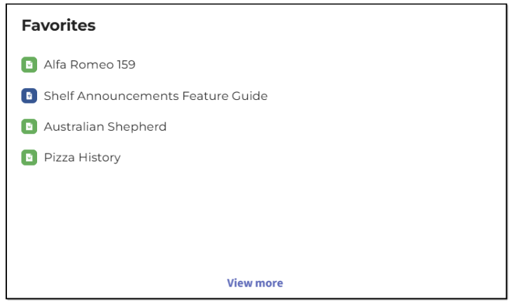 Figure 41. Viewing Favorites widget in Shelf KMS Home dashboard - Half size
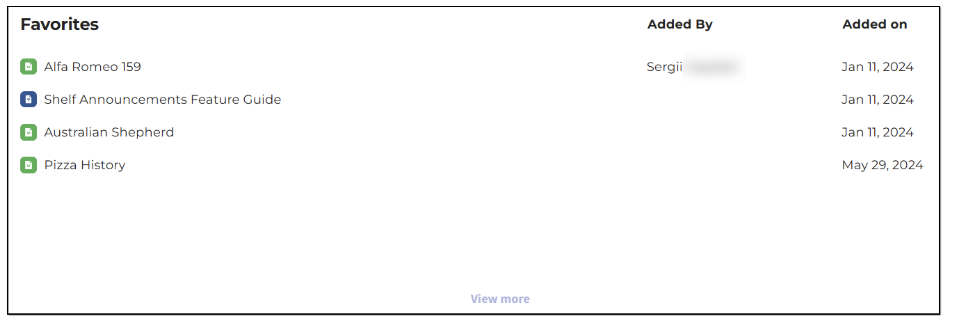 Figure 42. Viewing Favorites widget in Shelf KMS Home dashboard - Full size
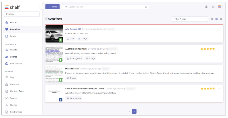 Figure 43. Viewing dedicated Favorites page in Shelf
If you have no content items added to favorites, the widget is empty and shows the respective message. The VIEW ALL button is hidden as well in this case.
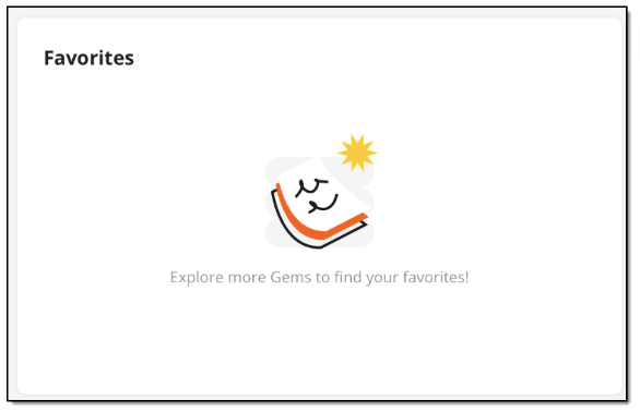 Figure 44. Viewing Favorites widget if no Gems have been added to favorites
To add a Gem to favorites, you need to open it and click the dedicated Favorite icon.
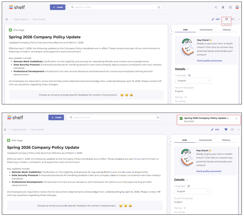 Figure 45. Adding Gem to favorites from Gem page
If you no longer need the document in Favorites, you can unfavorite it from its Gem page or directly from the Favorites page.
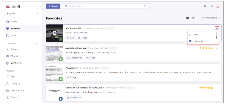 Figure 46. Unfavoriting Gem from Favorites page
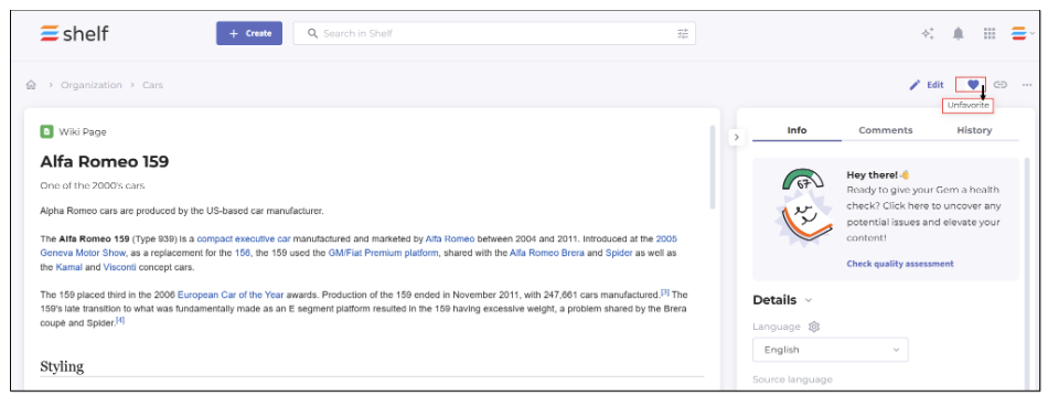
Figure 47. Unfavoriting Gem from Gem page
Content Updates
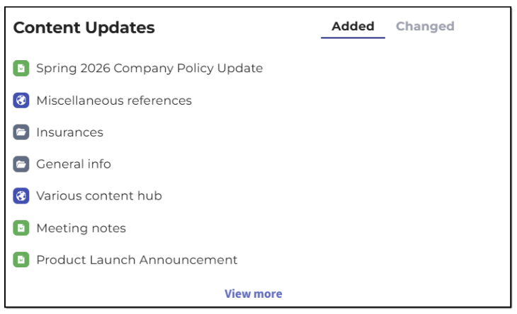
Figure 48. Viewing Content Updates widget in Shelf KMS Home dashboard - Half size
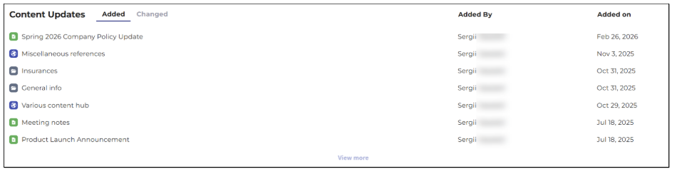 Figure 49. Viewing Content Updates widget in Shelf KMS Home dashboard - Full size
The list under the Added tab contains up to 7 Gems sorted by their creation date, with the most recent on top of the list. If you click the View more button, you are directed to the Search results page where the Gems are sorted by the Created on value, with the most recent on top.
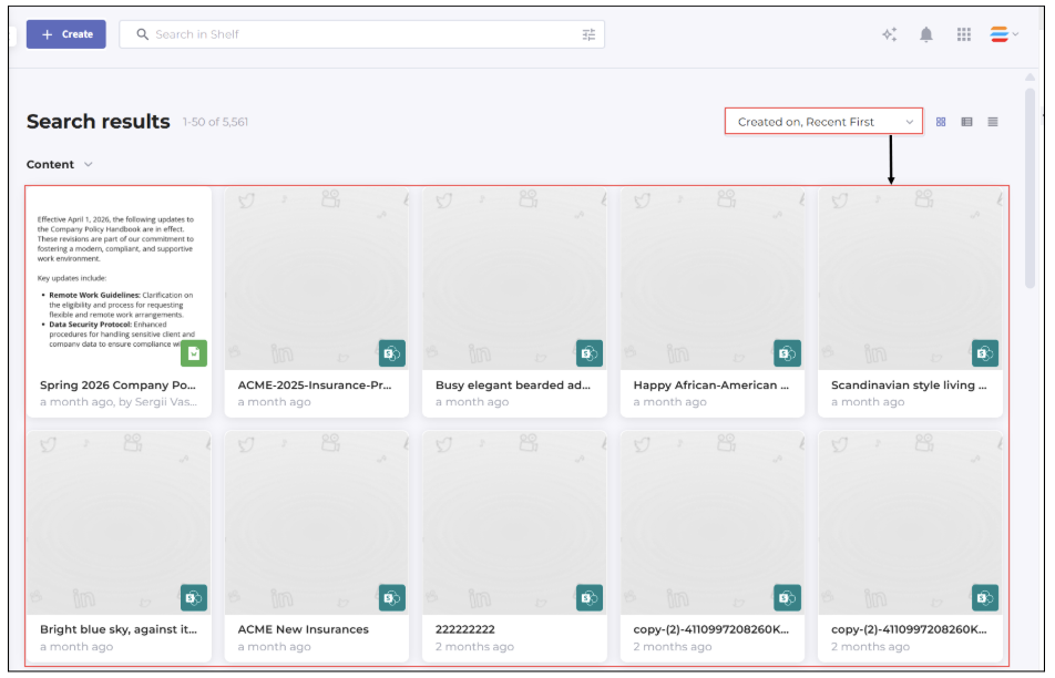 Figure 50. Viewing Search results page with content items sorted by their creation date
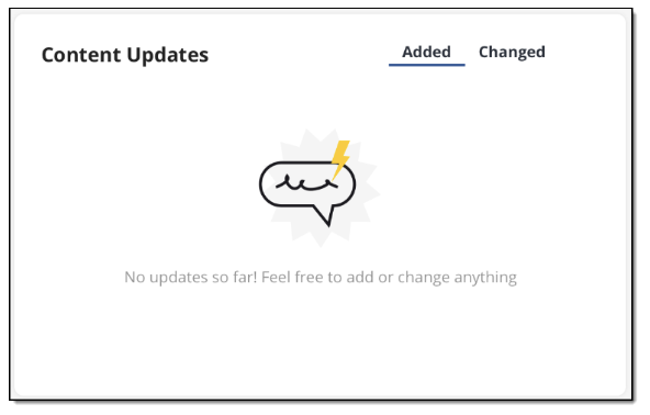
Figure 51. Viewing Content Updates widget if no Gems have been updated
The list under the Changed tab contains up to 7 Gems sorted by their change date, with the most recent on top of the list. If you click the View more button, you are directed to the Search results page with Gems sorted by the Changed on value, with the most recent on top.
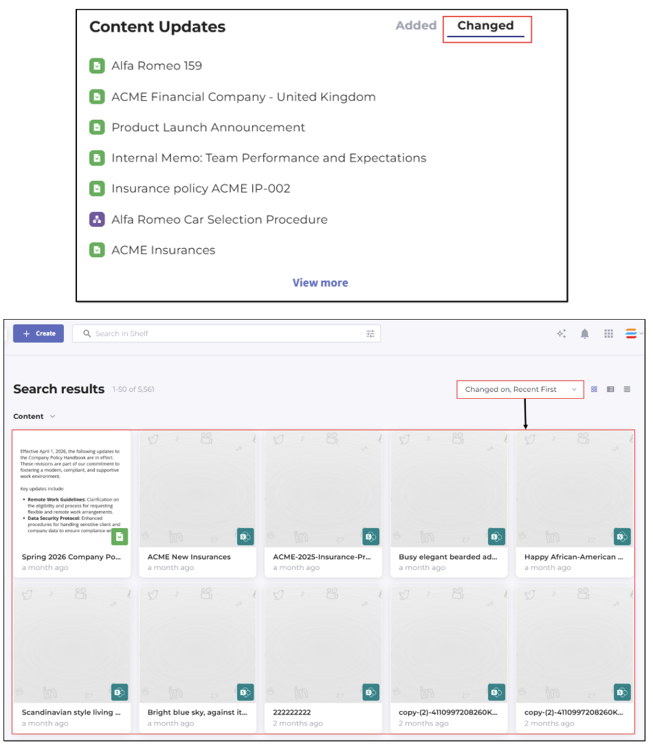
Figure 52. Viewing recently changed Gems from Content Updates widget
If no Gems have been recently changed, the tab is empty and shows the message reading You have no recently changed Gems. The View more button is hidden as well.
The widget shows the Gem title in a single row and if the title is too long, it is trimmed. However, you can see the whole title as a tooltip that pops up when you hover over the trimmed title. The Gem type icon is also displayed, making it possible for you to understand what Gem it is—Document, Image, Link, Post, Video, Decision Tree, or even a structural Gem, that is a library or a folder.
In addition to the above mentioned details, you can also see who added or changed the specific Gem. It is only possible when the widget is in the full-size mode.
In the Content Updates widget, you can click any Gem to open it on its dedicated Gem page. If the Gem is a structural one—a library or a folder—you are directed to the prefiltered Search Results page.
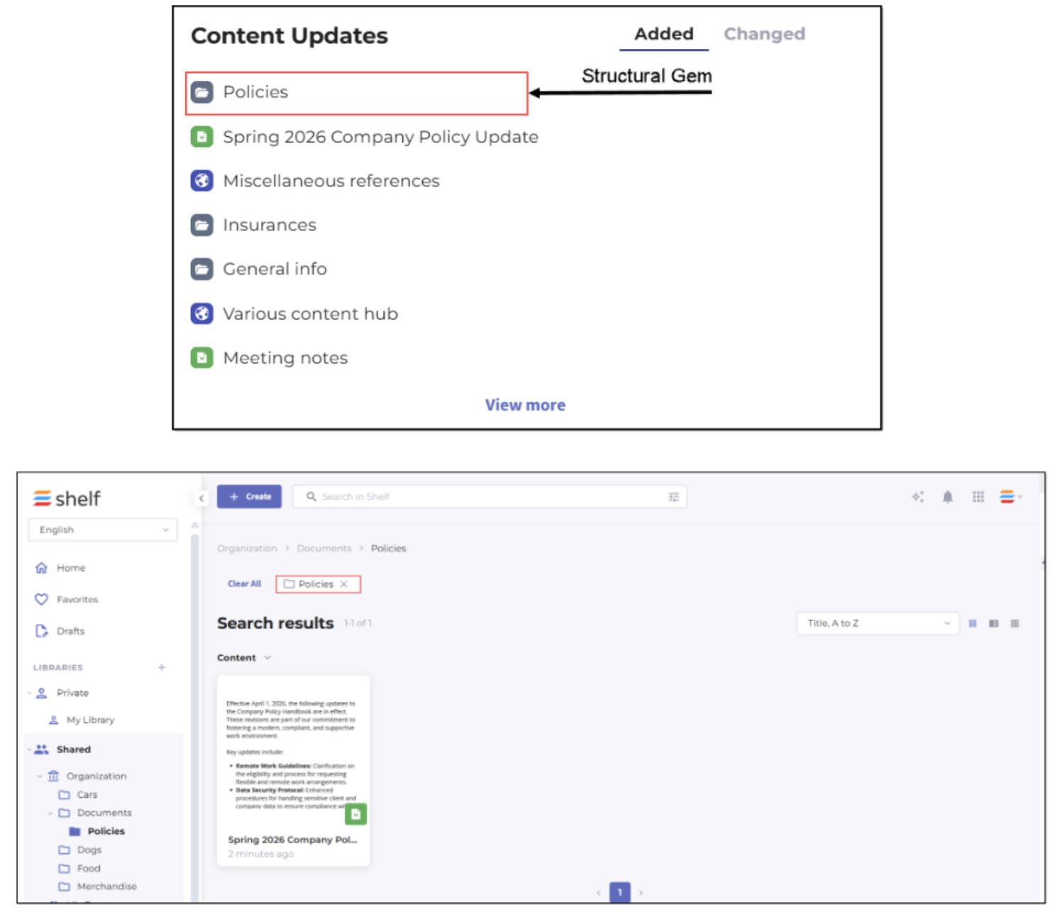
Figure 53. Viewing structural Gem opened from Content Updates widget
Recently Viewed
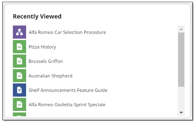
Figure 54. Viewing Recently Viewed widget in Shelf KMS Home dashboard - Half size
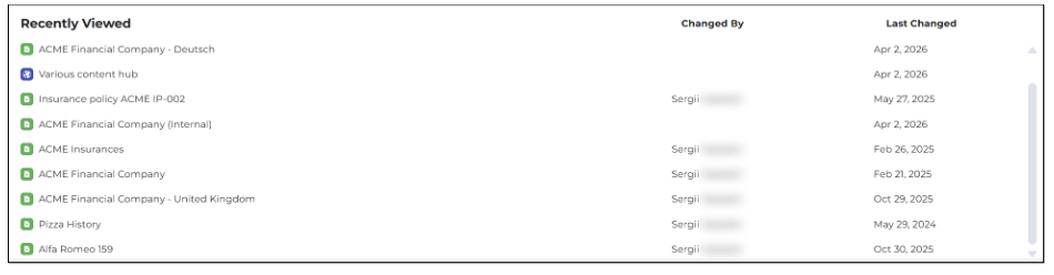
Figure 55. Viewing Recently Viewed widget in Shelf KMS Home dashboard - Full size
The widget shows the Gem title in a single row and if the title is too long, it is trimmed. However, you can see the whole title as a tooltip that pops up when you hover over the trimmed title. The Gem type icon is also displayed, making it possible for you to understand what Gem it is—document, image, link, post, video, Decision Tree, or even a structural Gem, that is a library or a folder. In addition to that, if the widget is in the full-size mode, you can see who changed the specific Gem and the date the Gem was last changed.
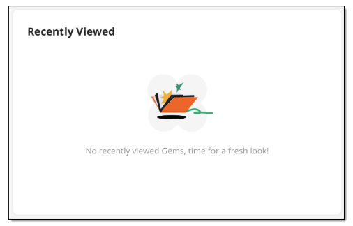
Figure 56. Viewing Recently Viewed widget if no Gems have been viewed
Pinned Content
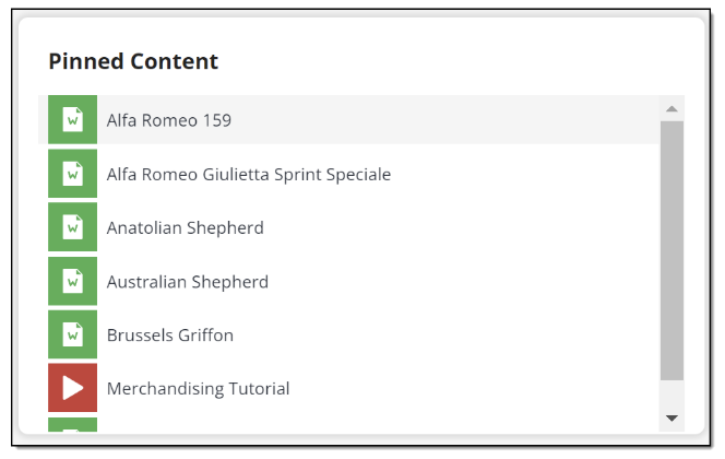
Figure 57. Viewing Pinned Content widget in Shelf KMS Home dashboard - Half size
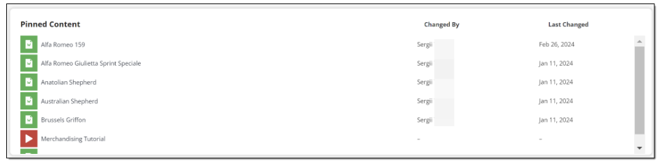
Figure 58. Viewing Pinned Content widget in Shelf KMS Home dashboard - Full size
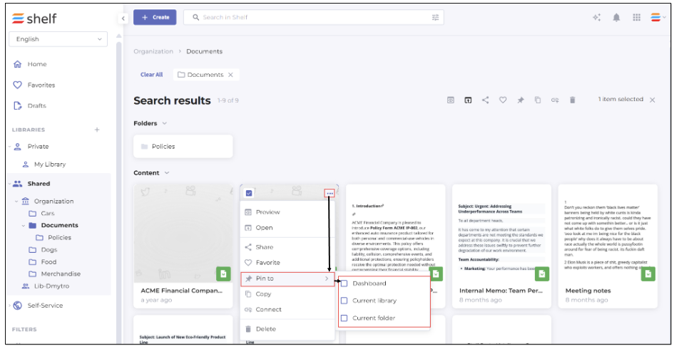 Figure 59. Pinning Gem to Home dashboard from Search results page
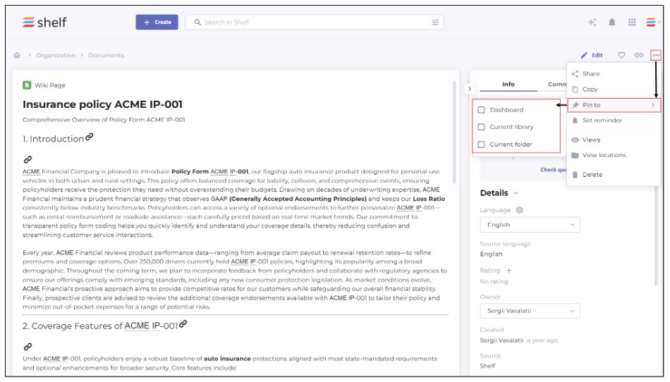 Figure 60. Pinning Gem to Home dashboard from Gem page
My Tasks
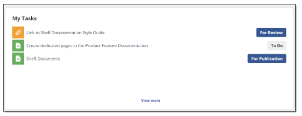
Figure 61. Viewing My Tasks widget in Shelf KMS Home dashboard - Half size
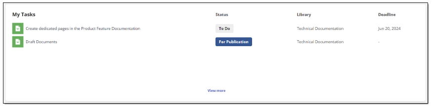
Figure 62. Viewing My Tasks widget in Shelf KMS Home dashboard - Full size
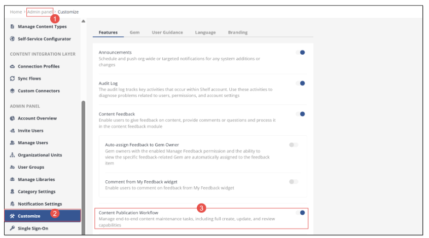
Figure 63. Enabling CPW for Shelf KMS account
The My Tasks widget allows you to have quick access to the content-related tasks assigned to you via CPW. The widget shows up to 7 most recent tasks, sorted by their creation date, with the most recent tasks on top of the list. Note that tasks that have the DONE, ARCHIVED or DELETED status are not displayed in the widget. However, the other statuses are indicated next to their respective tasks. More details about CPW tasks and their status can be found in the respective Shelf Content Publication Workflow Overview Guide available upon request.
The widget shows the task title in a single row and if the title is too long, it is trimmed. However, you can see the whole title as a tooltip that pops up when you hover over the trimmed title. The icon of your task’s content item is also displayed, making it possible for you to understand what content (Gem) your task is related to—document, image, link, post, video, Decision Tree, etc. In addition to that, if the widget is in the full-size mode, you can also see the specific library for the task, as well as the deadline for the task completion if set.
All tasks listed in the widget are clickable and open on their respective Task pages.
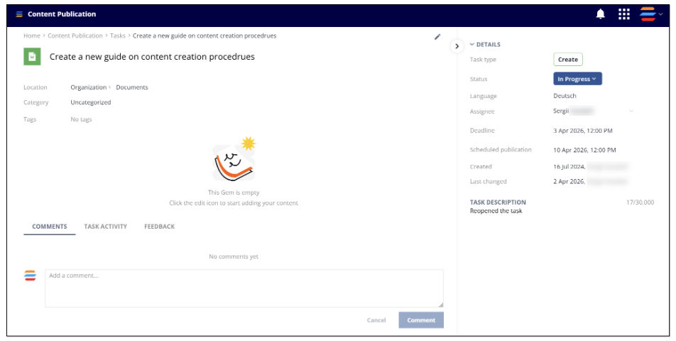
Figure 64. Viewing open task from My Tasks widget on dedicated task page
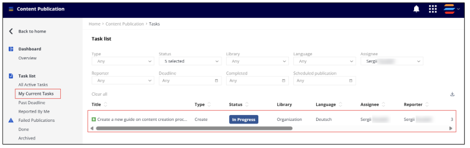
Figure 65. Viewing My Current Tasks page by clicking My Tasks widget’s View more button
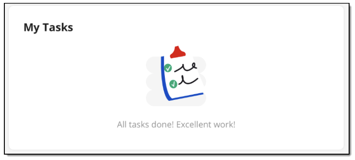 Figure 66. Viewing My Tasks widget with no tasks assigned
My Feedback
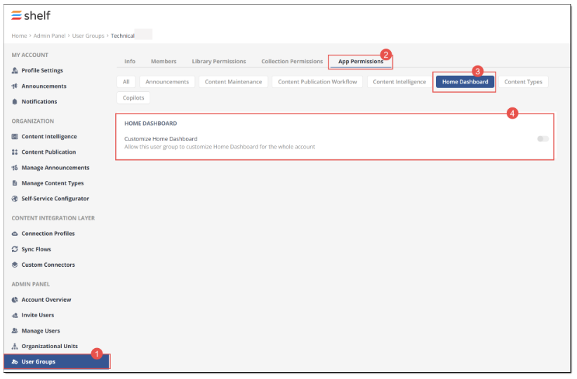
- The Content Feedback feature is enabled for your organization
- The Content Feedback option is enabled for your account
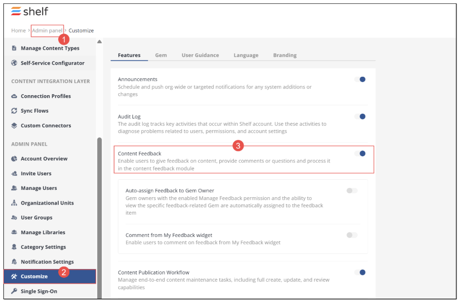
Figure 67. Enabling Content Feedback for Shelf KMS account
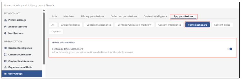
- Your user role in Shelf KMS is Admin or you belong to a User Group for which the permission Allow this user group to customize Home Dashboard for the whole account has been granted.
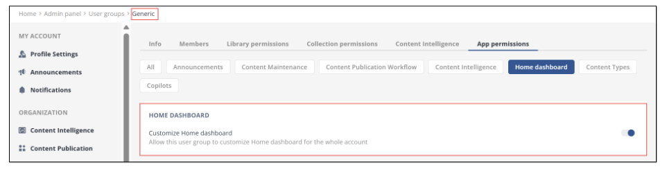
Once the preconditions are satisfied and Content Feedback is enabled, you can add the My Feedback widget to the Home dashboard. Note that you must be an Admin role user or a member of a user group specifically permitted to customize the Home dashboard.
To do so, follow the below steps.
When on the Home dashboard page, find and select the Customize icon in the upper right part of the window.
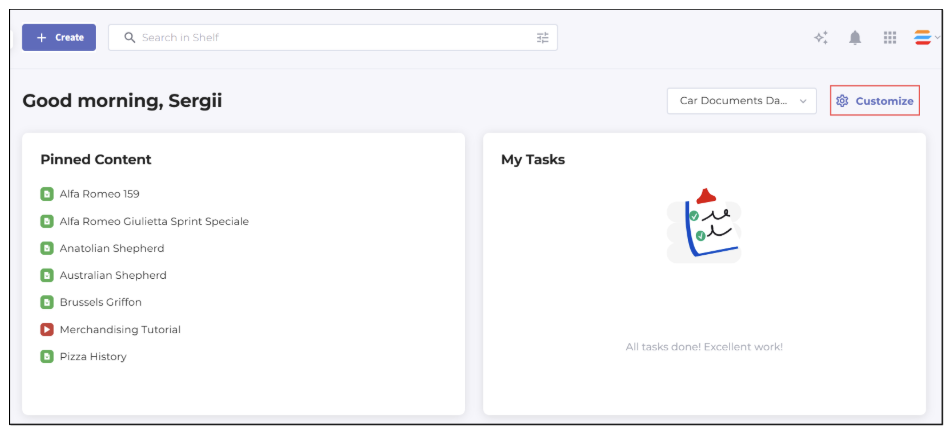
Figure 68. Adding the My Feedback widget to Home Dashboard
In the Customize panel that appears in the right part of the window, navigate to the Widgets tab, find and select the My Feedback widget. Drag it to any desired location on the Home dashboard layout. If needed, change its size - half-size or full-size. Once done, click Save.
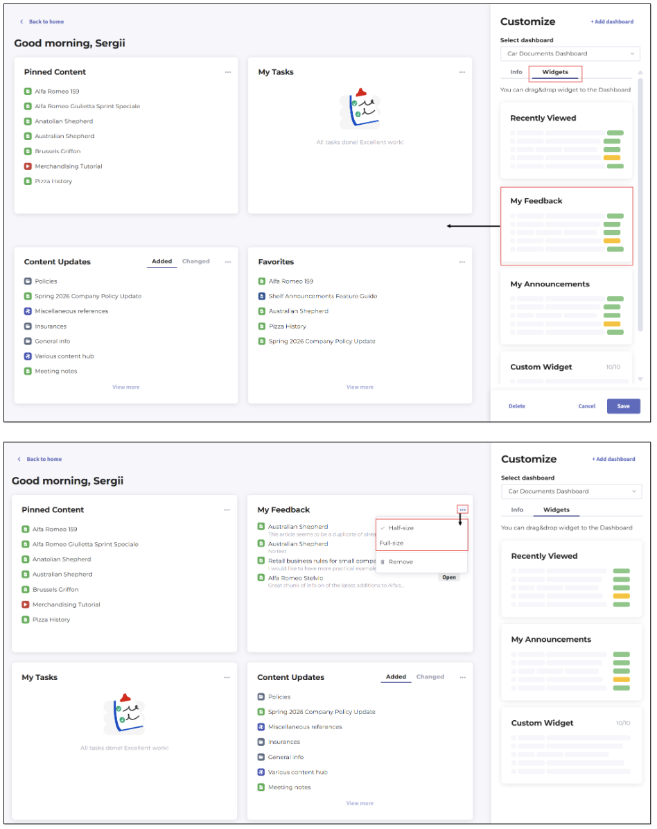
Figure 69. Adding My Feedback widget to Home dashboard - Dragging onto dashboard canvas and resizing widget
Once done, the My Feedback widget now appears on your Home dashboard.
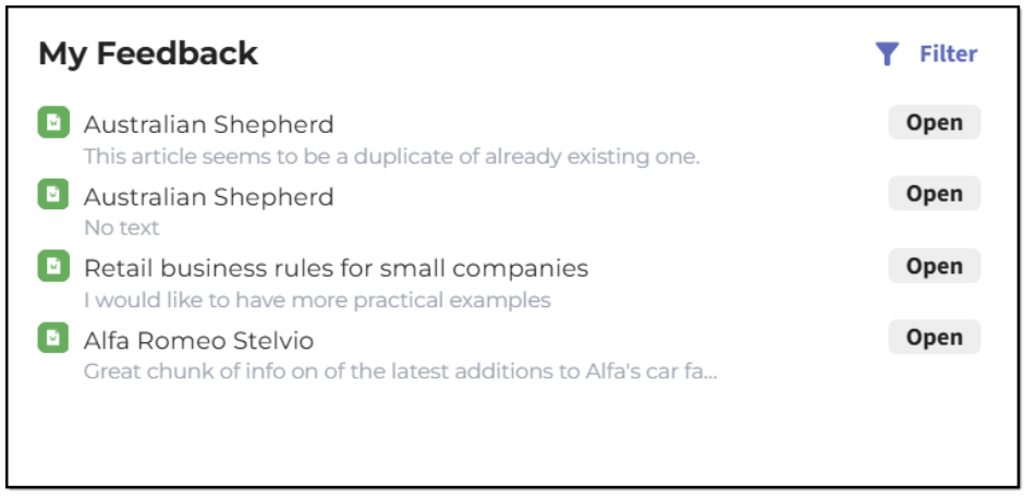
Figure 70. Viewing My Feedback widget in Shelf KMS Home dashboard - Half size
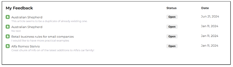
Figure 71. Viewing My Feedback widget in Shelf KMS Home dashboard - Full size
The My Feedback widget, once added to Home dashboard, allows you to keep track of how feedback you have reported on specific content is getting addressed and also allows you to check its status.
The widget displays feedback items as a scrollable list. Feedbacks are sorted by their submission dates, with the most recent on top.
The widget shows the title of the content item (Gem) to which the feedback has been left, in a single row and if the title is too long, it is trimmed. However, you can see the whole title as a tooltip that pops up when you hover over the trimmed title. The icon of your task’s content item type is also displayed, making it possible for you to understand what content (Gem) your task is related to—Document, Image, Link, Post, Video, Decision Tree, etc.
In addition to the content item (Gem) title and type, the widget also shows the feedback text if entered by the user. If no feedback text has been entered, nothing is displayed. Also, the feedback processing status is displayed—Open, Accepted, Rejected, Done. If the widget size is in the full-size mode, it additionally shows the date when the feedback has been submitted.
Each feedback in the widget is clickable and opens in the respective modal window where you can see details of the feedback such as its submission date, type (negative, positive, or neutral), status, text (if any), reason, content item it has been left for, as well as comments on such a feedback.
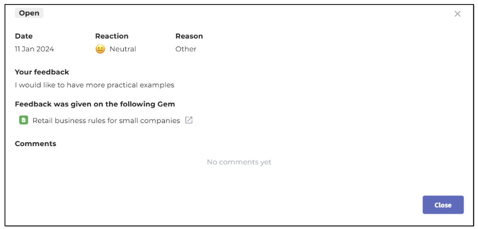
Figure 72. Viewing content feedback opened from My Feedback widget in Home dashboard
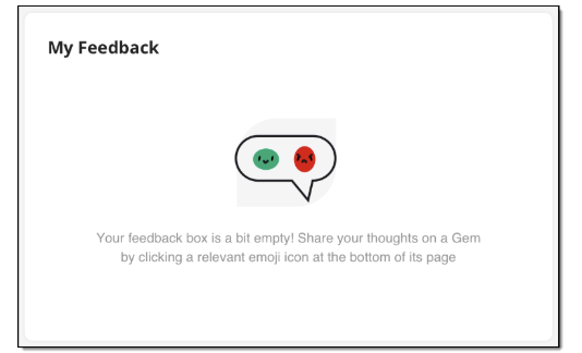
Figure 73. Viewing the My Feedback widget with no feedback added on content items
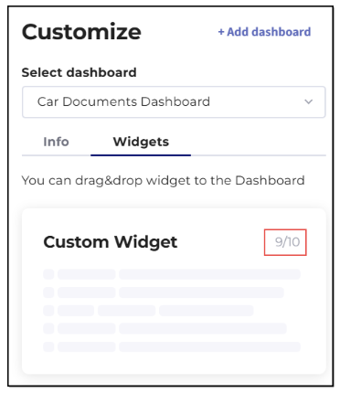
Custom widgets
Adding custom widget
- When on the Home Dashboard page, find and select the Customize icon in the upper right part of the window.
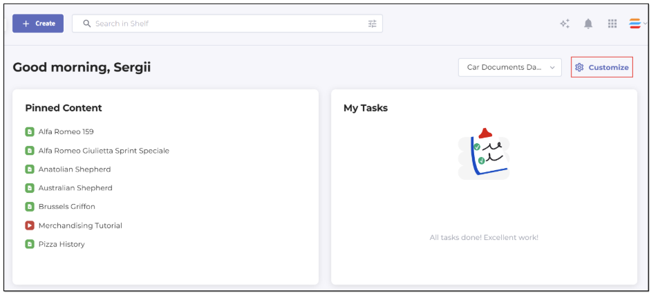
Figure 74. Adding custom widget to Home dashboard
- In the Customize panel that appears in the right part of the window, navigate to the Widgets tab, then find and select the Custom Widget option. Drag it to any desired location on the Home dashboard layout.
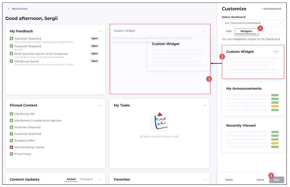
Figure 75. Placing custom widget on Home dashboard
- By default, custom widgets are displayed in their half size on the Home dashboard like all other widgets.
Figure 76. Viewing half-sized custom widget on Home dashboard
However, you can always change it to the full size in the Customize mode. Click the Customize icon and then open the widget’s context menu by clicking the respective (...) icon, and select the Full-size option there.
Figure 77. Changing widget size via context menu
Deleting custom widget
If you no longer need any of your custom widgets, you can always delete it from the Home dashboard. To do so, go to the Customize mode, find the needed widget, open its context menu, and select the Remove option there. Confirm your choice by clicking Save and then additionally confirm in the popup confirmation window. Following that, the widget is deleted from the Home dashboard.
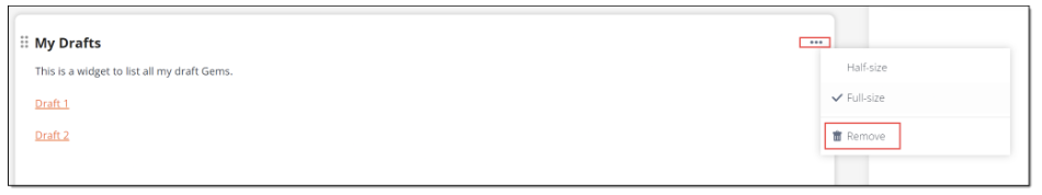
Figure 78. Deleting custom widget from Home dashboard
Using and editing custom widget
When you add a custom widget to your Home dashboard, you can give it a title and enter any desired information into it - text, images, links, etc. If you for some reason failed to do that during the widget addition, you can make it later in the widget editing mode. To access the editing mode, just click anywhere in the widget when you are in the Customize mode.
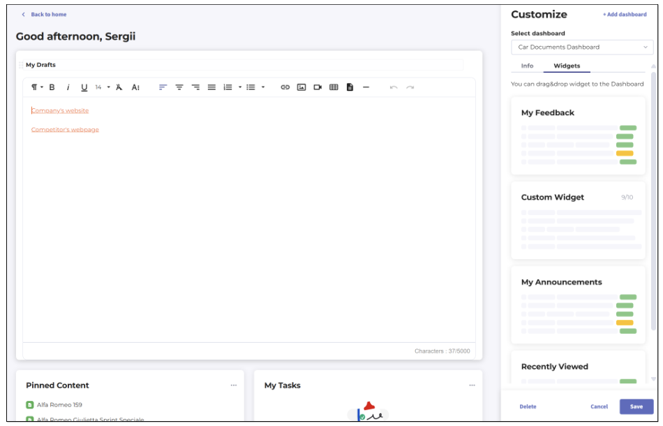
Figure 79. Editing custom widget

Figure 80. Viewing empty custom widget
Managing widgets
Viewing widgets
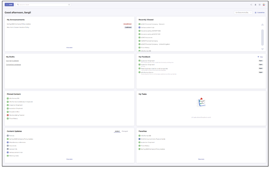
Figure 81. Viewing standard and custom widgets on Home dashboard
Customizing widgets
Resizing widgets
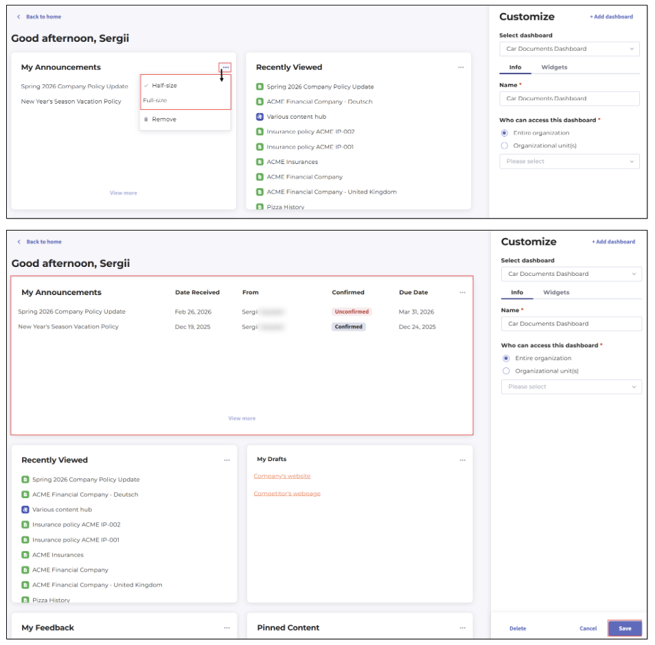
Figure 82. Resizing widgets on Home dashboard
Repositioning/reordering widgets
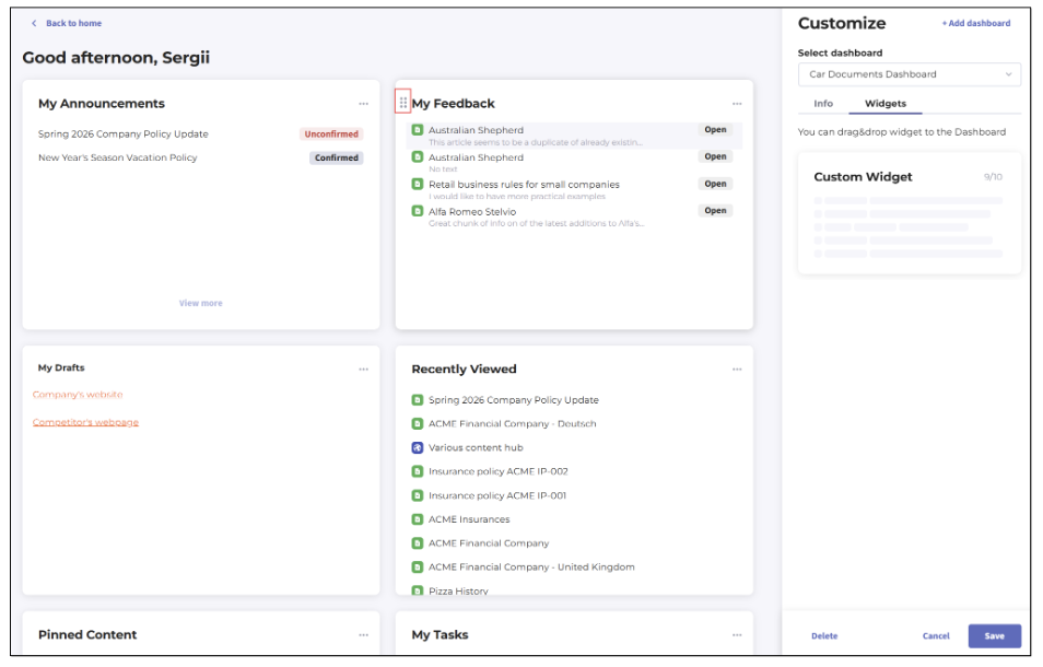 Figure 83. Reordering widgets on Home dashboard
Deleting widgets
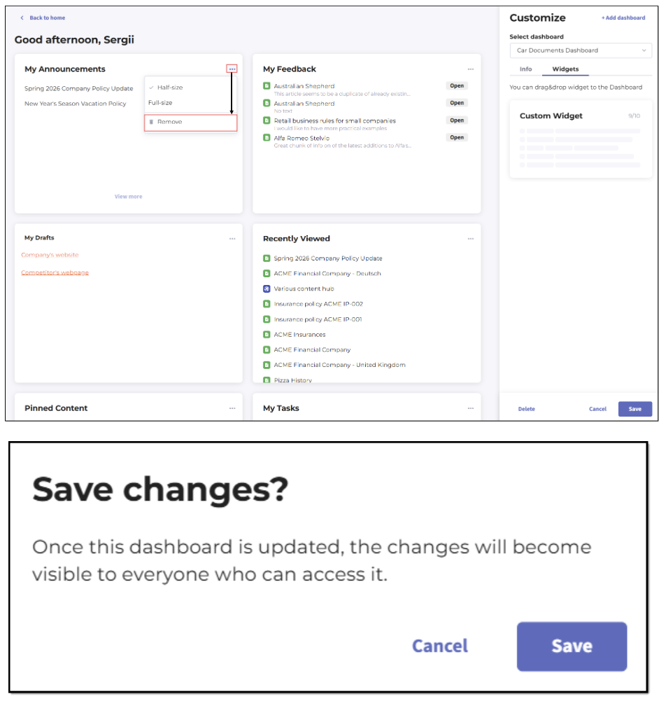 Figure 84. Deleting widget from Home dashboard
Working with content
Accessing and creating libraries
- Private Library and its folders
- Shared Libraries such as Organization Library and its folders
- Self-Service libraries and their folders, if any and if the Self-Service Portals option has been purchased by the user’s organization.
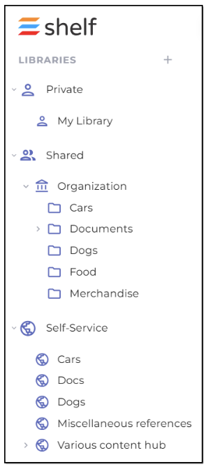
Figure 85. Libraries accessible to Admins from Home dashboard
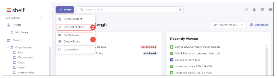
Figure 86. Creating folders and libraries directly and via CPW in Home dashboard
Creating and uploading Gems
The Admin and Collaborator role users can create and upload non-structural content items, that is Gems, in any library (Admin) or in any permitted library (Collaborator). You can do it either directly (1) via +Create > create Content, or via the CPW task (2), that is through requesting new content (+Create > Request content). In the latter case, CPW must be enabled for your organization and on your account.
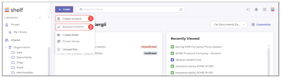
Figure 87. Creating and requesting content from Home dashboard
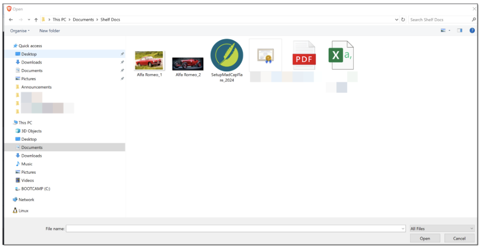 Figure 88. Uploading content to Shelf KMS
Searching and filtering content
From the Shelf KMS Home dashboard, you can easily search for the needed content (Gems) using Keywords, Exact Phrases, or even a random word or word combination since the semantic search is supported. Enter the word/phrase etc. and hit Enter on your keyboard to run the search. To narrow your search, apply filters. The filters are both available from the navigation sidebar panel (1) on the left and from the advanced search menu (2) that pops up by clicking on the advanced search icon. You can apply various filters such as Collection, Source, Tag, Category etc.
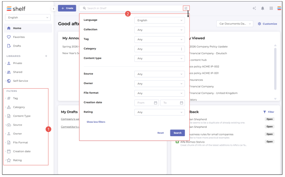 Figure 89. Searching and filtering content in Home dashboard
Multilanguage content
All user roles—Admin, Collaborator, Member, and View-only—can also work—manage and search for—with multilanguage content in Shelf KMS Home dashboard. The prerequisite is that the multilanguage content support is enabled for your account. Once it is enabled, the content language selector becomes available in the Home dashboard. Click it and select the needed language.
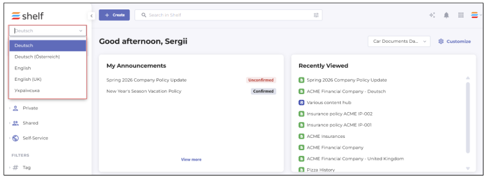
Figure 90. Filtering and viewing the content by language
Note that the following widgets—My Announcements, Pinned Content, Favorites, and Recently Viewed—are language-agnostic, meaning that the content in these widgets is not filtered by the language you select.