
Salesforce Community Cloud
Shelf Components Setup Guide
Document Version History
Version number | Modified by | Modifications made | Date modified | Status |
1.0 | Shelf | Upgrade from a beta version of the document; new structure arranged; new graphics added; existing verbiage fixed and improved. | 16 Feb 2022 | Expired |
1.1 | Shelf | The guide was updated to incorporate deployment of new Shelf components on the Salesforce Community Cloud platform; respective new sections added. | 16 Mar 2022 | Expired |
1.2 | Shelf | The guide was updated to incorporate deployment of a new Shelf component - Shelf Group List. | 24 Mar 2022 | Expired |
1.3 | Shelf | Updated the Salesforce package version in the document | 24 Mar 2022 | Expired |
1.4 | Shelf | Adjustments and corrections were made to Shelf API description. New text was added to the Shelf Group List component section. | 30 Mar 2022 | Expired |
1.5 | Shelf | New section - Heading Content Filtering - added to describe how the content to be displayed on the published Community page is filtered by various parameters; new package link added. | 05 Apr 2022 | Expired |
1.6 | Shelf | Updated the Shelf Group List component section: Folder ID > Filtering Category | 07 Apr 2022 | Expired |
1.7 | Shelf | The guide was updated to add information about unique URL feature enablement for several Shelf components for Salesforce; added information about Shelf Folder name translation capability and about the possibility to assign categories to Shelf Folders. The guide verbiage was fixed to match renaming of certain Shelf components. | 29 Apr 2022 | Expired |
1.8 | Shelf | The guide was updated to add information about new properties implemented on some of the Shelf components, as well as about the localization feature for static text labels in the Shelf components. Relevant changes were made both to the verbiage and figures. | 23 May 2022 | Expired |
1.9 | Shelf | The guide was updated to include changes to the properties of the Shelf Search Results component. The respective figure was updated. | 15 Jun 2022 | Expired |
1.10 | Shelf | Link to the new version of the Salesforce installation package has been added. Document version has been updated. No other major changes. | 22 Jun 2022 | Expired |
1.11 | Shelf | Folder component items are sorted by title. | 6 Jul 2022 | Expired |
1.12 | Shelf | Checkboxes for two Shelf components have been added, and the respective changes have been made to the document. | 12 Jul 2022 | Expired |
1.13 | Shelf | Default values for API Page Names have been changed for several Shelf components; the document has been changed accordingly, both in terms of text and graphics. | 19 Jul 2022 | Expired |
1.14 | Shelf | Wide tables have horizontal scroll and sticky header on mobile devices. Default font color for gem titles and descriptions is black. | 1 Aug 2022 | Expired |
1.14 | Shelf | Link to the new version of the Salesforce installation package has been added. Document version has been updated. No other major changes. | 12 Aug 2022 | Expired |
1.17 | Shelf | Link to the new version of the Salesforce installation package has been added. Document version has been updated and brought to compliance with the Shelf installation package version. No other major changes. | 11 Oct 2022 | Expired |
1.18 | Shelf | Gem detail page styles are updated to reflect Shelf rich text editor styles | 15 Dec 2022 | Expired |
1.19 | Shelf | Added Datadog logger for events | 13 Feb 2023 | Expired |
1.20 | Shelf | Updated the guide to include new properties for the Search Results, Folder List, and Group List components. New figures and verbiage added. | 24 Feb 2023 | Expired |
1.22 | Shelf | Updated styles and improved support for mobile devices | 20 Mar 2023 | Expired |
2.0 | Shelf | Updated text and graphics for virtually all components due to their update (image and video embedding capabilities, switching between old and new design, etc.). Guest user enablement described. Multiple other fixes made. | 22 Sep 2023 | Active |
Salesforce Package Version
Package | Download link |
V.1.0 | https://login.salesforce.com/packaging/installPackage.apexp?p0=04t7Q000000PtAR |
V.1.1 | https://login.salesforce.com/packaging/installPackage.apexp?p0=04t7Q000000Puvo |
V.1.2 | https://login.salesforce.com/packaging/installPackage.apexp?p0=04t7Q000000PxLK |
V.1.3 | https://login.salesforce.com/packaging/installPackage.apexp?p0=04t7Q000000Pz7P |
V.1.4 | https://login.salesforce.com/packaging/installPackage.apexp?p0=04t7Q000000Q0XE |
V.1.5 | https://login.salesforce.com/packaging/installPackage.apexp?p0=04t7Q000000Q0cK |
V.1.6 | https://login.salesforce.com/packaging/installPackage.apexp?p0=04t7Q000000Q2FM |
V.1.7 | https://login.salesforce.com/packaging/installPackage.apexp?p0=04t7Q000000Q6SV |
V.1.8 | https://login.salesforce.com/packaging/installPackage.apexp?p0=04t7Q000000Q9TV |
V.1.9 | https://login.salesforce.com/packaging/installPackage.apexp?p0=04t7Q000000QDMu |
V.1.10 | https://login.salesforce.com/packaging/installPackage.apexp?p0=04t7Q000000QEJW |
V.1.11 | https://login.salesforce.com/packaging/installPackage.apexp?p0=04t7Q000000QGqx |
V.1.12 | https://login.salesforce.com/packaging/installPackage.apexp?p0=04t7Q000000QHHL |
V.1.13 | https://login.salesforce.com/packaging/installPackage.apexp?p0=04t7Q000000QIr8 |
V.1.14 | https://login.salesforce.com/packaging/installPackage.apexp?p0=04t7Q000000QLPi |
V.1.15 | https://login.salesforce.com/packaging/installPackage.apexp?p0=04t7Q000000QMt6 |
V.1.16 | https://login.salesforce.com/packaging/installPackage.apexp?p0=04t7Q000000QQ8Q |
V.1.17 | https://login.salesforce.com/packaging/installPackage.apexp?p0=04t7Q000000QWo5 |
V.1.18 | https://login.salesforce.com/packaging/installPackage.apexp?p0=04t7Q000000QXtN |
V.1.19 | https://login.salesforce.com/packaging/installPackage.apexp?p0=04t7Q000000QYaT |
V.1.20 | https://login.salesforce.com/packaging/installPackage.apexp?p0=04t7Q000000QYzn |
V.1.21 | https://login.salesforce.com/packaging/installPackage.apexp?p0=04t7Q000000QZ0C |
V.1.22 | https://login.salesforce.com/packaging/installPackage.apexp?p0=04t7Q000000QZ7i |
V.2.0 | https://login.salesforce.com/packaging/installPackage.apexp?p0=04t7Q000000Z3Q1 |
v2.1 | https://login.salesforce.com/packaging/installPackage.apexp?p0=04t7Q000000Z3Q6 |
v2.2 | https://login.salesforce.com/packaging/installPackage.apexp?p0=04t7Q000000dMZy |
v2.3 | https://login.salesforce.com/packaging/installPackage.apexp?p0=04t7Q000000dMar |
v2.4 | https://login.salesforce.com/packaging/installPackage.apexp?p0=04t7Q000000dMbG |
v2.5 | https://login.salesforce.com/packaging/installPackage.apexp?p0=04t7Q000000dMdv |
v2.6 | https://login.salesforce.com/packaging/installPackage.apexp?p0=04t7Q000000dMe0 |
Introduction
- Community Creation: Salesforce Community Cloud serves as an interactive extension of a user’s brand through its easy-to-use environment. It enables users to customize the solution matching their brand for their online community experience. Integration with business data from any system centralizes customers, workers, and partners to get their work done.
- Community Experience: Automatic recommendations according to individual needs, behaviors, and interests connect groups, content, and experts for deeper community participation. Users can access the community anywhere using the Salesforce mobile app or any mobile browser for delivering branded, device-responsive collaboration.
- Rich, Self-Service Experience for Customers: Easy access to FAQs and articles empowers customers to find solutions independently and frees agents to work on more crucial tasks. Community Cloud gives users an overview of their agents on who’s more active and they can also endorse each other based on expertise and skills. Other features include case escalation, e-commerce and community engagement.
- Accelerate Sales Channels for Partners: Directly connecting partners, distributors, and resellers help users drive sales. It streamlines sharing of records, leads and contacts, integrating with third-party systems, and avoiding channel conflicts. Users can immediately take action in lead conversion and marketing funds approval right in the feed. It also has data sharing and dashboards and reports to ensure alignment of goals.
- Drive Employee Productivity and Engagement: Teams can be grouped according to events, campaigns, or projects to access relevant information with structure. By syncing files into a centralized location, user’s employees can easily access the right files they need in a context that’s embedded with their core business processes. Through Chatter, collaboration is empowered for fostering an innovative workplace and contributing ideas.
Software Requirements
Prerequisites
- Metadata deployment from non-certified package versions via Apex is enabled in the Apex Settings on Salesforce.
For this purpose log in to the Salesforce Community Cloud and navigate to the Setup Home page by clicking the Setup icon. Then in the search field, enter “Apex” to find the Apex Settings option. Once found, select it to navigate to the Apex Settingspage. Figure 1. Accessing Setup Home and Apex Settings
When in the Apex Settings page, locate and select the respective checkbox as shown in the figure below and click the Savebutton to confirm.
Figure 2. Enabling metadata deployment from non-certified package versions
- The latest version of the Salesforce package has been installed on your computer. Please see the Salesforce Package Version table for the download link.
- Shelf API token has been created in the Admin Panel of the Shelf platform and is available for use.

Figure 3. Creating and copying Shelf API token
- The needed users have been added to the relevant permission set for the Shelf Community Components Access.


Figure 4. Adding users to the Shelf Community Components Access
- Your site has been already created on the Salesforce Community Cloud platform.

Figure 5. Existing site built on the Salesforce Community Cloud platform
- Make sure that the appropriate URLs are added in CSP and Remote Site Settings: e.g. https://api.shelf-eu.com or https://api.shelf.io.
Salesforce Community Setup
- Copy the previously created Shelf API token and set it for your community via the Shelf Community Configuration application. For this purpose click on the App Drawer icon and look for the Shelf Community Configuration option in the search field as shown in the figure below. Then in the form that opens, select the Community you have previously created, fill in the Token field by pasting the previously created Shelf API token, and select the needed Shelf environment from the dropdown pick list of options. Note that the required fields are marked with an asterisk.
Note:
Each community must have its unique token in order to ensure proper content access rights distribution and protection.
Note:
Shelf environments vary depending on the region you are assigned to. As of now, Shelf is presented in the United States, Canada, and Europe. Therefore, each of these regions has their own Shelf environment, which are as shown in the figure below:
Figure 5. Region-based Shelf environments
Production means that this environment is for a commercially operating instance of your Salesforce Community. Staging, respectively, is an environment for testing and/or bugfixing purposes.

Figure 7. Setting API token, name, and base URL address for your Community
Shelf Components Setup
- To access the Shelf Components Setup page, click the Settings icon in the upper right part of the application header and then select the Setupoption.

Figure 8. Accessing the Setup functionality
- On the page that opens, start typing Digital Experiences in the Quick Find search field. Then simply select this option that appears under the search field and select the All sitesoption from the dropdown list.

Figure 9. Accessing the All Sites element
- In the All Sites contents panel that opens in the right part of the window, find and click the Builderbutton.

Figure 10. Accessing the Shelf Components Builder
- On the page that opens, you can configure the layout of the Shelf components on your Community site. For this purpose, click the Componentsicon in the left-side toolbar and find the needed Shelf components in the list that opens.

Figure 11. Accessing the Shelf Components
- Then simply select and drag the needed Shelf component to a required location of the Community page template that appears in the right part of the window.

Figure 12. Placing the Shelf components on the Community page
Note:It is not recommended to position the Shelf Gem Page or Shelf Search Results component in either header or footer of your Community page. The most appropriate option is to place the Shelf Search Bar component in the header.
Once done with positioning the needed Shelf components on your Community page, you can click the Previewbutton to see how they are displayed on your page.
Figure 13. Previewing the Community page with Shelf Components positioned
Unique URL for Shelf Gem Page and Shelf Group Gem Page
- Your Community visitors can now navigate to a specific article page via its unique direct link
- The needed article pages are now open for indexing by search engines such as Google etc.
- Your Community visitors can now bookmark the respective article pages for further needs.
Shelf Gem Page
This component, when placed on your Community page, is expected to display the content of the Shelf Gem. In case the Gem does not have it, this Shelf component displays nothing.
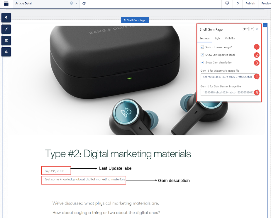
Figure 14. Shelf Gem Page component and its properties (new design)
- Switch to new design? checkbox (optional): allows you to switch between the old and new designs of the Gem Page component. The new design is shown in Figure 14 above, while the old one can be found in the figure below.

Figure 15. Viewing Shelf Gem Page component with the old design enabled
- Show Last Updated label checkbox (optional): allows you to switch between hiding and showing the information about when the Gem has been last updated.
- Show Gem description checkbox (optional): allows choosing whether to display the description added to a Gem when creating that Gem or not.
- Gem Id for Watermark Image file: this property allows you to use customized graphics for other (in accordance with Shelf NextGen KMS terminology - recommended Gems or recommendations) Gems preview for this template.
There can be three options of the recommended Gem preview images:- If you leave this field blank, default preview images are used, unless the Gem has its own custom preview image.

Figure 16. Viewing default preview images for recommended Gems in Gem Page template
- If you leave this field blank and the Gem has its own custom preview image, then that custom image is used.

Figure 17. Setting Gem’s custom preview image in Shelf NextGen KMS
- If you have, in the Shelf NextGen KMS, some Image type Gem which you want to use as a preview image for the recommended Gems in this template, you can put such Gem’s ID in this field. To do so, open the Imagetype Gem in Shelf NextGen KMS, go to the URL address bar of the browser, find and copy the Gem’s ID as shown below.Paste the copied Gem ID into the Gem Id for Watermark Image filefield. Wait for the component to refresh automatically or refresh the page manually. The image from the Gem will be displayed as the preview for the recommended Gems.

Figure 18. Finding and copying Gem ID in Shelf NextGen KMS
 Figure 19. Viewing preview images - both set from the Gem Page properties and retrieved from Shelf’s Image type Gem
- If you leave this field blank, default preview images are used, unless the Gem has its own custom preview image.
- Gem Id for Static Banner Image file: this property allows you to use customized graphics for the Gem inside the Gem.

Figure 20. Viewing the Gem with the preconfigured banner image in Gem Page component
This property also has three options:- The Gem has its own, preconfigured banner image: in this case when syncing, this image is fetched to your Community site’s Gem Page component and displayed on it as shown in Figure 20 above.
To set this image, you need to perform the following steps:
- Go to Shelf NextGen KMS, find and open the needed Gem.

Figure 21. Opening and viewing the Gem in Shelf NextGen KMS
- Click anywhere in the Gem to enter the Editing mode. The editing toolbar will appear. Find and click the image insert icon.
- In the popup window, upload any desired image from your computer, wait to see the results and then save the edited Gem.
 Figure 22. Viewing the inserted image in the Gem in Shelf NextGen KMS
 - Now click the <> button to switch to the Code View/Editing mode.
- Find the code string responsible for the inserted image.

Figure 23. Finding the image code string in the Gem’s Code View/Editing mode
- Add the new class - hero-image - to the string. The modified string should look like this:
<p><img src="https://s3.amazonaws.com/gemshelf-stag/eb1541e7-ce1a-4d76-865d-f184468b3544%2Fgems%2F82adf5f3-566e-4fe5-a48f-2e71de394a26%2Fwiki%2Fimages%2F1695974492929-Beoplay-EX-Anthracite-Oxygen-Hero.png" style="width:300px;" class="fr-fic fr-dib hero-image"></p> - Save your changes to the Gem and you are done with the configurations on the Shelf side.
- Go to your Community site and the page where you placed the Gem Page Component. Clear Local storage cache and Session storage cache. Refresh the page and check the result. The Gem should display the static banner image as shown in Figure 20.
- The Gem does not have the image configured as the static banner image as described in paragraph a) above, and you do not need such an image. In this case, leave the Gem Id for Static Banner Image file field blank. The Gem is displayed with no static banner image.
 Figure 24. Viewing the Gem without Gem’s own static banner image and without setting any image as such via the Gem Page properties
 - The Gem already has an image expected to be used as the static banner image in the Gem Page component and you put any Gem ID in the Gem Id for Static Banner Image file field to set your own image. In this case the Gem’s own image will prevail.In addition to the ability to display images embedded in the Shelf NextGen KMS Gems, the Shelf Gem Page component is also capable of displaying video footage. It works almost the same as embedding an image, with a little difference in classes.Here is the template of the code strings to be added to the Gem’s source code on the Shelf side:
<div class="slds-grid">
<div class="slds-col video-container">{iframe}</div>
<div class="slds-col">
<h1>{title}</h1>
<p>{description}</p>
</div>
</div>
- The Gem has its own, preconfigured banner image: in this case when syncing, this image is fetched to your Community site’s Gem Page component and displayed on it as shown in Figure 20 above.
- Go to the Youtube website in your browser, find the relevant video, and click the Share button under the video.
- In the popup window that appears, select the Embedoption.

Figure 25. Sharing a Youtube video as an embedded object
- In a new popup window, click the Copybutton, and the video embedding code will be copied to your clipboard.
 Figure 26. Copying the video embedding code to clipboard
 Now go to Shelf NextGen KMS, find and open the needed Gem, enter its code editing mode.

Figure 27. Entering the Gem’s code editing mode
Scroll the code down to its end and in the new line paste the template code snipped provided above.

Figure 28. Pasting the video embedding code template in the Gem’s code
- After pasting the code, replace the {iframe} parameter with the video embedding code you have previously copied from Youtube.
<iframe width="560" height="315" src="https://www.youtube.com/embed/bixR-KIJKYM?si=3sEIoaG-G2FAiayl" title="YouTube video player" frameborder="0" allow="accelerometer; autoplay; clipboard-write; encrypted-media; gyroscope; picture-in-picture; web-share" allowfullscreen></iframe>Adjust it by deleting width and height values - these parameters will be taken from the Components package settings.
Figure 29. Modifying the video embedding code template according to user’s needs
- After the modification is done, click Save to save changes to the Gem.
- Now go to your Salesforce Community page, clear the Local Storage and Session caches and check the results.

Figure 30. Checking the video embedding results in the Shelf Gem Page Component
Shelf Search Bar
This component, when placed on your Community page in its header, is expected to be displayed on each page thus enabling your Community users and visitors to search for the needed information on any page.
The component has both mandatory and optional properties for configuring.
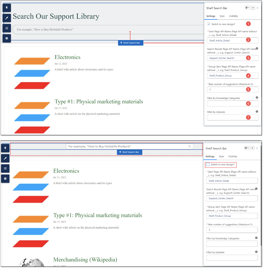
Figure 31. Shelf Search Bar component and its properties (new design and old design)
- Switch to new design? checkbox (optional): Allows you to switch between the old and new designs of the Search Bar component. Both designs are shown in Figure 31 above.
- Gem Page API Name property (mandatory): It shows the API name of the page where the user is expected to be redirected to after choosing the relevant Shelf Gem from the suggestion list.
- Search Results Page API Name property (optional): This field contains the API name of the page to which the user is expected to be redirected after the search. If this property is not blank, it is assumed that the Shelf Search Result component is located on the same page as the Shelf Search Bar component.
- Group Gem Page API Name property (mandatory): It shows the API name of the page to which the user is expected to be redirected if the selected Gem belongs to the groupGem category.
- Max number of suggestions property (optional): This field is for setting the maximum number of suggested Gems. The system-set limit is 5, so you cannot exceed this value.
- Filter by Knowledge Categories property (optional): This field is used to streamline the search and display of the needed Gems by specific Knowledge Categories such Gems belong to. In order to allow for it, indicate the respective Knowledge Category. You can indicate multiple Knowledge Categories, in which case you need to use a comma (,) as a separator.
- Filter by Libraries property (optional): This field is used to streamline the search and display of the needed Gems by specific libraries. In order to allow for it, enter the respective Library ID.
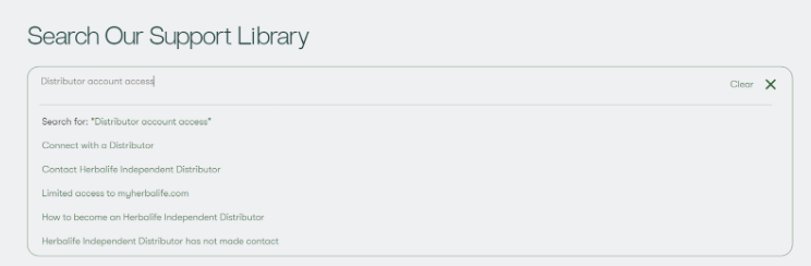
Figure 32. Search Bar component’s autosuggestion and query deletion capabilities
Shelf Search Results
- fetched as custom preview images via the Gem’s menu on the Shelf side
- system default images
- set via the component properties - for instance, Gem Id for Searchresult thumbnail image file - same as described in paragraph c) of the bullet 4 in the Gem Page section above.
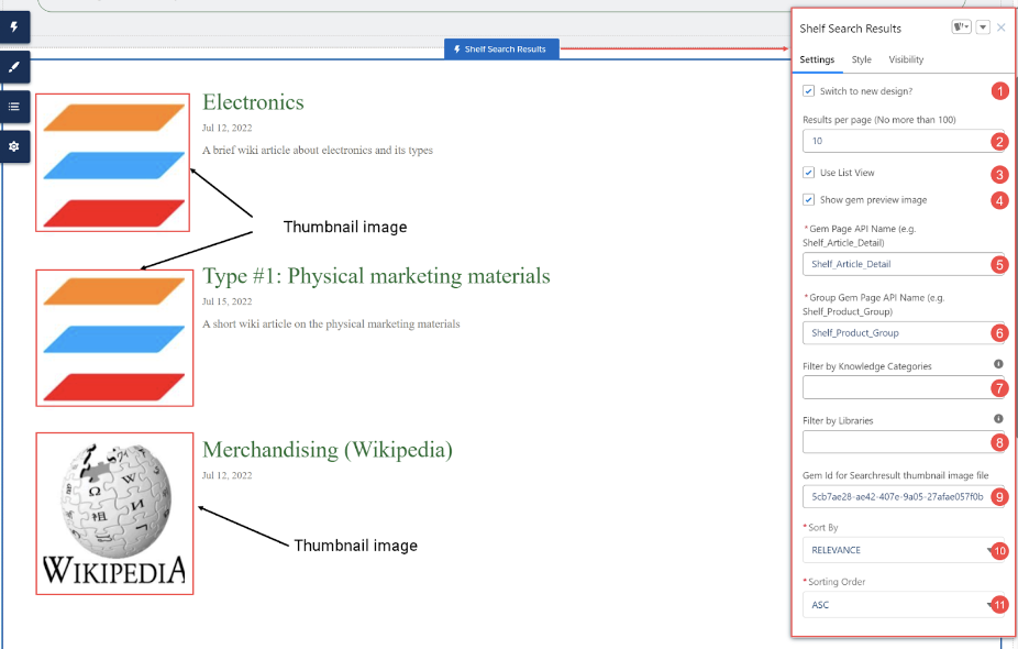
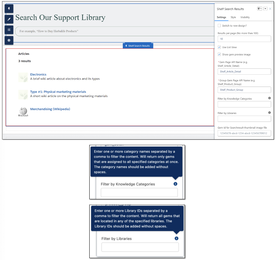
Figure 33. Shelf Search Result component and its properties (new design and old design)
- Switch to new design? checkbox (optional): Allows you to switch between the old and new designs of the Search Results component. Both designs are shown in Figure 33 above.
- Results per page property (optional): Using this property, you can configure how many results your Community users will see on a page after the search. The maximum number is limited to 100.
- Use List View check box (optional): You can choose how the search results are to be displayed on your Community page - as list items or as tiles. By default, the search results are displayed in the list form.
- Show gem preview image checkbox (optional): You can choose whether or not you want to see images in the search results block in either view mode: List View or Tile View.
- Gem Page API Name property (mandatory): It shows the API name of the page where the user is expected to be redirected to after choosing the relevant Shelf Gem from the suggestion list.
- Group Gem Page API Name property (mandatory): It shows the API name of the Group Gem Page where the user is expected to be redirected to after choosing the relevant Shelf Gem from the suggestion list.
- Filter by Knowledge Categories property (optional): This field is used to streamline the search and display of the needed Gems by specific Knowledge Category(-ies) such Gems belong to. In order to allow for it, indicate the respective Knowledge Category(-ies). You can indicate multiple Knowledge Categories, in which case you need to use a comma (,) as a separator. Note that by default this field is empty. If you intentionally leave it blank, no filtering by Knowledge Category is applied and the content returned in the search results block will come from all Knowledge Categories.
- Filter by Libraries property (optional): This field is used to streamline the search and display of the needed Gems by specific library(-ies). In order to allow for it, enter the respective Library ID(s). Note that by default this field is empty. If you intentionally leave it blank, no filtering by Library is applied and the content returned in the search results block will come from all libraries within your organization.
- Gem Id for Searchresult thumbnail image file (optional): This field allows you to set a custom thumbnail image for Gems preview. Read Bullet 4, paragraphs a)-c) in the Shelf Gem Page section above for more details.
Tooltips for the Filter by Knowledge Categories and Filter by Libraries properties: these tooltips help you understand what these properties serve for and how their values need to be entered. - Sort By property (mandatory): This field is used to sort the fetched search results either by title or by relevance. If sorting by title (TITLE) is selected, the sorting order needs to be selected as well - ASC (ascending) or DESC (descending). By default, sorting by relevance (RELEVANCE) applies, in which case the sorting order doesn’t matter.

Figure 34. Selecting the sorting option
- Sorting Order (mandatory): Using this dropdown field, you can select the sorting order for the fetched search results. There are two options - ASC (ascending) or DESC (descending). If the ASC option is selected, the search result titles will be sorted alphabetically from A to Z. If the DESCoption is picked up, the titles are sorted from Z to A.

Figure 35. Selecting the sorting order option

Figure 36. Sorting search results by title, from A to Z
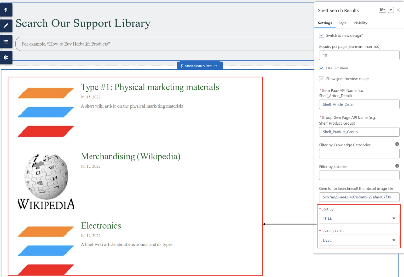
Figure 37. Sorting search results by title, from Z to A
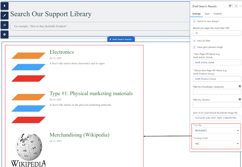
Figure 38. Sorting search results by relevance
Shelf Group Gem Page
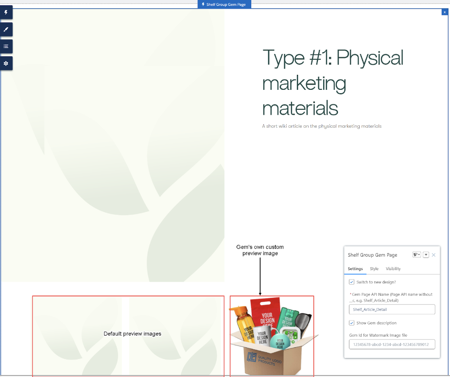
Figure 39. Viewing preview images (default and Gem’s own custom) of the connected Gems
- The Gem’s category must be “groupGem” (on the Shelf side).

Figure 40. Setting the Shelf’s category to “groupGem”
- Some connections must be added to the Gem in order to shape a Product Group (on the Shelf side).

Figure 41. Assigning connections to the needed Shelf Gem
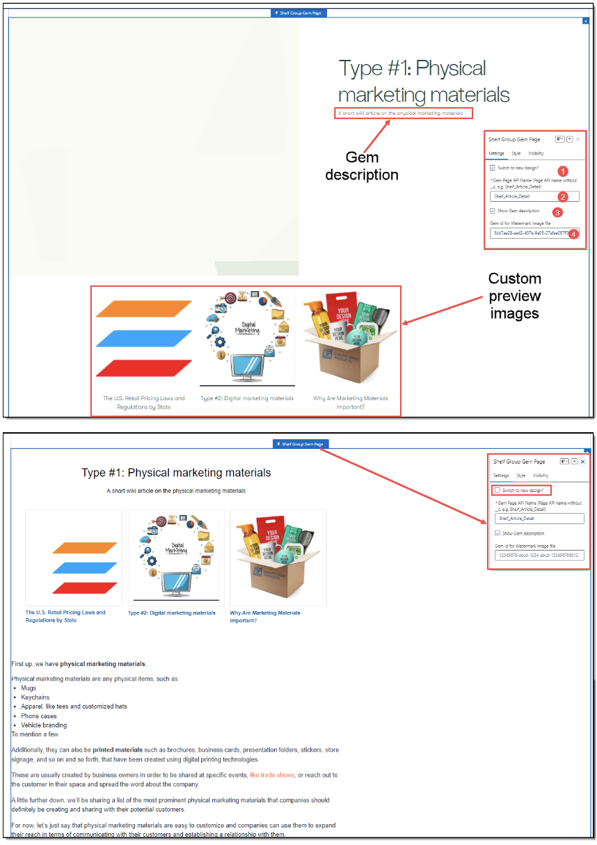
Figure 42. Shelf Group Gem Page component and its properties (new design and old design)
- Switch to new design? checkbox (optional): allows you to switch between the old and new designs of the Group Gem Page component. Both the new and old designs are shown in Figure 42 above.
- Gem Page API Name property (mandatory): It shows the API name of the page where the user is expected to be redirected to after choosing the relevant Shelf Gem displayed on the Salesforce Community page. By default and for the page setting simplification purposes, this field is prepopulated with the Shelf_Article_Detail value. If needed, you can replace it with the value that is relevant for your needs.
- Show Gem description checkbox (optional): It allows choosing whether to display the description added to a Gem when creating that Gem or not.
- Gem Id for Watermark image file (optional): this property allows you to use customized graphics to label the connected Gems. To set your custom graphics as the preview image(s) for the connected Gem(s) copy the Gem ID of the relevant Image type Gem that contains the needed graphics, and insert it in this field. Read more about it in paragraph c) of the bullet 4 in the Gem Page section above. Refresh the page and check the result.
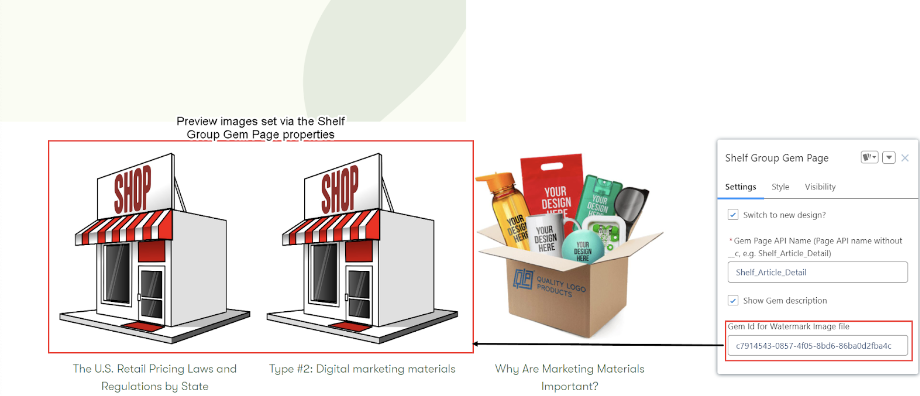
Figure 43. Viewing preview images for the connected Gems set via the Group Page Gem properties
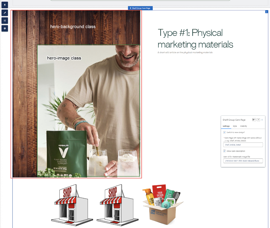 Figure 44. Viewing the Group Gem Page component with images preconfigured on the Shelf side
- Go to Shelf NextGen KMS, find and open the needed Gem (with the groupGem and Publiccategories).
 Figure 45. Opening and viewing the Gem in Shelf NextGen KMS
 - Click anywhere in the Gem to enter the Editing mode. The editing toolbar will appear. Find and click the image insert icon.
- In the popup window, upload any desired image from your computer, wait to see the results and then save the edited Gem. Repeat the step to insert the second image.
- Now click the <> button to switch to the Code View/Editing mode.

Figure 46. Entering the Gem’s Code View/Editing mode
- Find the code strings responsible for the inserted images.

Figure 47. Viewing the source code for two inserted images in the Gem
- In the code editor, for the first image which you want to be the main image (image shown on the front) add the new class - hero-image - to its string.
<p><img <p><img src="https://s3.amazonaws.com/gemshelf-stag/eb1541e7-ce1a-4d76-865d-f184468b3544%2Fgems%2Fac78ddf3-c47f-46cb-bad9-641345dd09ee%2Fwiki%2Fimages%2F1695996899705-HeroImage.png" style="width:300px;" class="fr-fic fr-dib hero-image"></p>
<p><br></p>
- For the second image - the image you want to be the background one - add the new class as well - hero-background - to the string.
<p><img src="https://s3.amazonaws.com/gemshelf-stag/eb1541e7-ce1a-4d76-865d-f184468b3544%2Fgems%2Fac78ddf3-c47f-46cb-bad9-641345dd09ee%2Fwiki%2Fimages%2F1695996886674-Background.jpg" style="width:888px;" class="fr-fic fr-dib hero-background"></p> - Once done, go to your Community site and the page where you placed the Group Gem Page Component. Clear Local storage cache and Session storage cache. Refresh the page and check the result. The Gem should display both images as shown in Figure 44.
Shelf Folder List
- Create a library in Shelf and copy its ID.

Figure 48. Creating your library in Shelf
 Figure 49. Locating and copying your new library ID
 - Add folder(s) and assign custom preview image(s) for the folder(s). Each folder will contain product Gems.

Figure 50. Creating folder(s) and assigning custom preview image(s)
- If needed, you can rename any folder you have created. This option enables you to not only change the name of the created folder but also to translate it to any supported language for any needed geography. To do it, select the needed folder in the left-side tree and right-click it.

Figure 51. Starting folder renaming/translation
- In the dialog that appears, fill in fields pertaining to the needed languages and then click the SAVE button.
 Figure 52. Renaming/translating folder
 - When the folder name translations are saved, you can now choose for which localization you want to see the folder. For this purpose, on the Shelf Main Page, go to the left-side tree and select the needed library. On the library page that opens, navigate to the language field and click it. In the dropdown list that opens, select the needed language.Once done, you will see that names of the folder(s) you have renamed/translated are displayed in the selected language.

Figure 53. Switching the language

Figure 54. Viewing the translated folders
- On the Shelf Main Page, go to the left-side tree and select the needed library. On the library page that opens, find and navigate to the needed folder.
- Right-click on the folder and select the View folderoption from the menu that opens.

Figure 55. Opening folder
- On the folder page that appears, find and navigate to the DETAILSpanel in the right part of the window.

Figure 56. Finding the folder category settings
- Make sure that the category of the folder is set to Public. If it is not, click the Edit button and then, in the Manage Category window that opens, select the Public category’s checkbox and click the SAVEbutton.Once no error messages are displayed, you have successfully set your folder’s category to Public and so enabled it to be properly operational on your Salesforce Community page.

Figure 57. Setting folder category
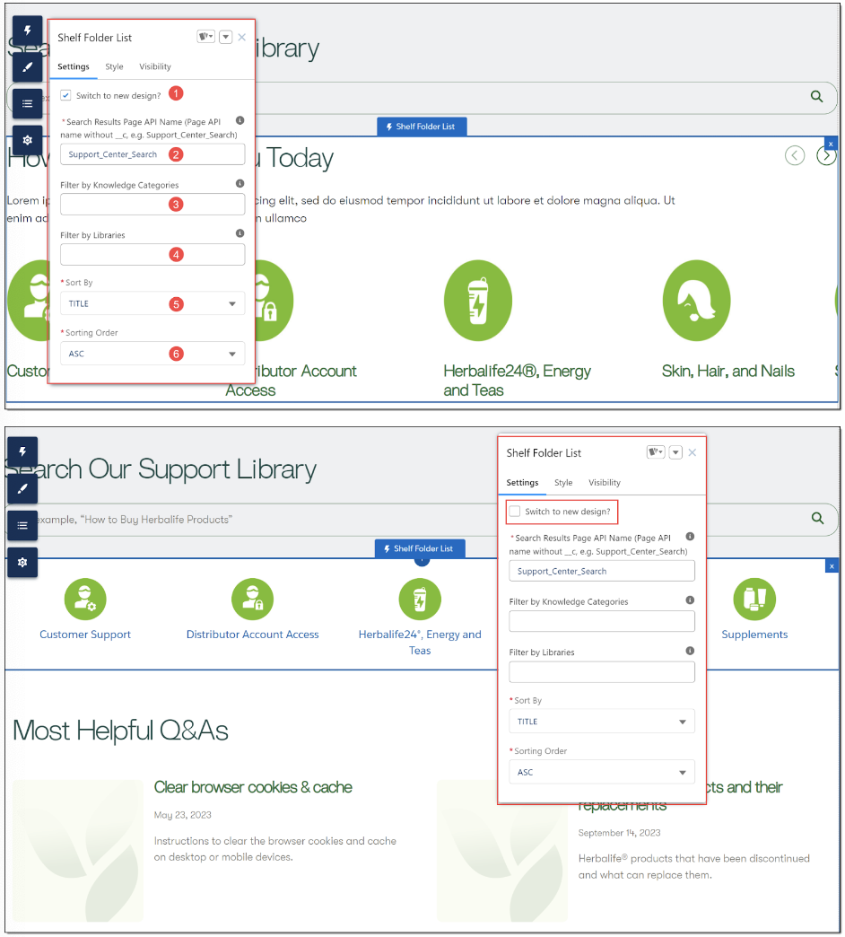 Figure 58. Configuring the Shelf Folder List component properties (new and old design)
- Switch to new design? checkbox (optional): allows you to switch between the old and new designs of the Folder List component. Both the new and old designs are shown in Figure 58 above.
- Search Result Page API Name (mandatory): It shows the API name of the Search Result page where the user is expected to be redirected to when selecting the displayed category. By default and for the page setting simplification purposes, this field is prepopulated with the Support_Center_Search value. If needed, you can replace it with the value that is relevant for your needs.
- Filter by Knowledge Categories property (optional): This field is used to streamline the search and display of the needed Gems by specific Knowledge Categories such Gems belong to. In order to allow for it, indicate the respective Knowledge Category. You can indicate multiple Knowledge Categories, in which case you need to use a comma (,) as a separator.
- Filter by Libraries property (optional): This field is used to streamline the search and display of the needed Gems by specific libraries. In order to allow for it, enter the respective Library ID.
- Sort By property (mandatory): This field is used to sort the displayed folders either by title or by relevance. By default, sorting by title (TITLE) applies. If sorting by title (TITLE) is selected, the sorting order needs to be selected as well - ASC (ascending) or DESC (descending). If sorting by relevance (RELEVANCE) is selected, the sorting order doesn’t matter.

Figure 59. Selecting the sorting option
- Sorting Order (mandatory): Using this dropdown field, you can select the sorting order for the displayed folders. There are two options - ASC (ascending) or DESC (descending). If the ASC option is selected, the folder titles will be sorted alphabetically from A to Z. If the DESCoption is picked up, the titles are sorted from Z to A.

Figure 60. Selecting the sorting order option
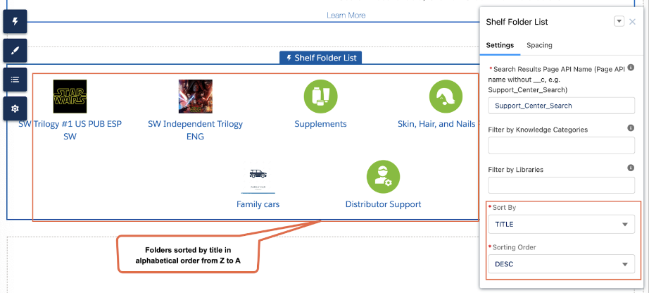
Figure 61. Sorting folders by title in alphabetical order, from Z to A (old design)
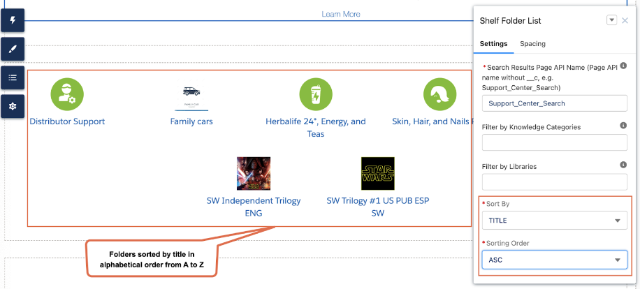
Figure 62. Sorting folders by title in alphabetical order, from A to Z (old design)
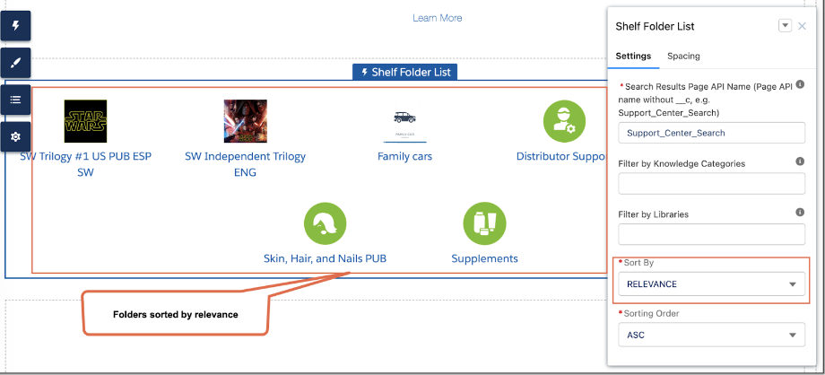
Figure 63. Sorting folders by relevance (old design)
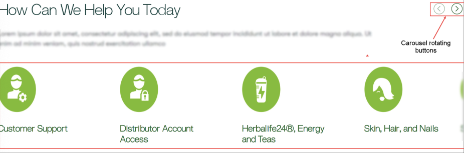
Figure 64. Carousel and its control buttons in the new design of the Folder List component
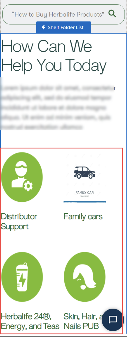
Figure 65. Viewing folder labels in the Folder List component on a mobile device
Shelf Most Popular Articles
This Shelf component serves as a tool that displays articles (Gems) with most views in the respective Shelf library (or category). The articles are displayed in the list form.
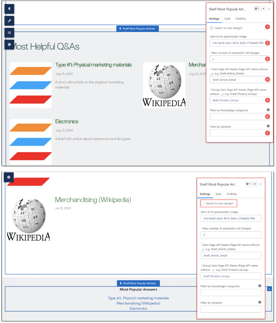
Figure 66. Shelf Most Popular Articles component and its properties (new and old design)
- Switch to new design? checkbox (optional): allows you to switch between the old and new designs of the Folder List component. Both the new and old designs are shown in Figure 66 above
- Gem Id for placeholder image (optional): this property allows you to either use the default image to identify the displayed Gems or set your own image for this purpose. Details on how to set your own image can be found in paragraph c) of the bullet 4 in the Gem Page section above.
- Max number of articles value (mandatory): This is the field where you can specify how many articles need to be displayed by this Shelf component.
- Gem Page API Name property (mandatory): It shows the API name of the page where the user is expected to be redirected to after choosing the relevant article (Shelf Gem) by this Shelf Component.
- Group Gem Page API Name property (mandatory): This field contains the API name of the page where the user is expected to be redirected to after selecting the relevant article (Gem) if this page is a group page.
- Filter by Knowledge Categories property (optional): This field is used to streamline the search and display of the needed Gems by specific Knowledge Categories such Gems belong to. In order to allow for it, indicate the respective Knowledge Category. You can indicate multiple Knowledge Categories, in which case you need to use a comma (,) as a separator.
- Filter by Libraries property (optional): This field is used to streamline the search and display of the needed Gems by specific libraries. In order to allow for it, enter the respective Library ID.
Shelf Group List
- When logged in to Shelf, find, navigate, and click the ADD button in the upper part of the window. Once the dropdown list appears, select the Create Content option.

Figure 67. Starting content creation in Shelf
- On the page that appears, locate and select the Wiki Page card to start creating the appropriate Gem.

Figure 68. Selecting the Wiki Page type
- On the Gem page that opens, enter the relevant title for your new Gem. You can use standard text editing tools to add the needed content to the Gem, add links, insert pictures, etc.

Figure 69. Adding content to Gem
- Once done, you can navigate to the right-side panel and set the needed category - groupGem in our case - for the Gem you are creating. To do so, click the Edit button in the Category block of the panel.

Figure 70. Accessing Gem category settings
- In the Manage Categories window that appears, find and select the groupGem category by selecting the respective checkbox. Then click the SAVE button to confirm the category setting.

Figure 71. Confirming the category setting
- Once the window is closed, you get back to the Gem page and, unless any other changes to the Gem content are needed, can finish its creation by clicking the CREATE button

Figure 72. Finishing the Gem creation
- Once you have set this Gem’s category to groupGem, or to any other category additionally, you can verify it by refreshing the Gem page and navigating to the DETAILS panel.

Figure 73. Verifying Gem’s category
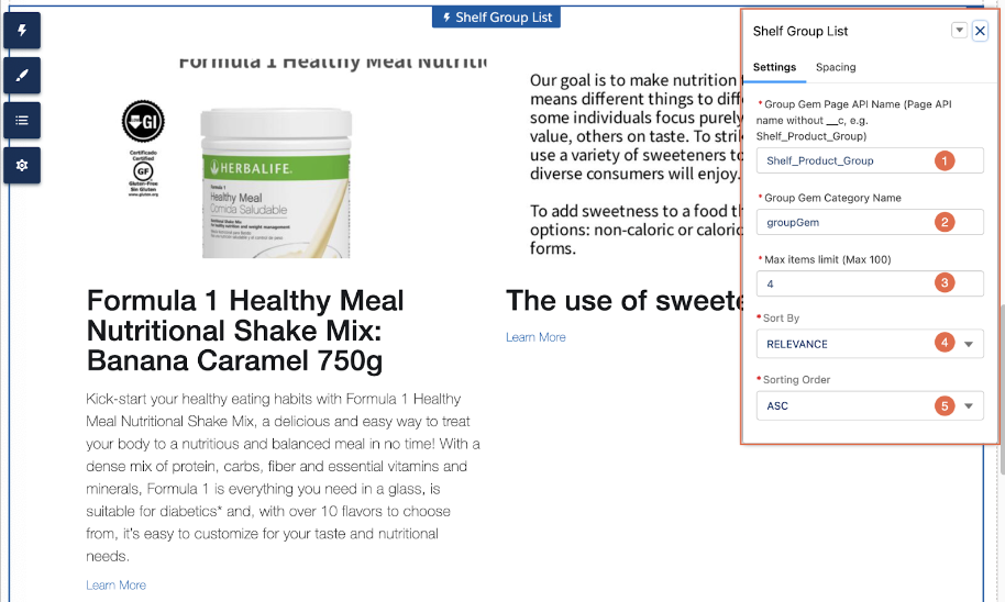
Figure 74. Shelf Group List component and its properties
- Group Gem Page API Name property (mandatory): It shows the API name of the page where the user is expected to be redirected to after choosing the relevant Shelf Gem displayed on the Salesforce Community page. By default and for the page setting simplification purposes, this field is prepopulated with the Shelf_Product_Group value. If needed, you can replace it with the value that is relevant for your needs.
- Group Gem Category Name property (mandatory): It contains a value configured for a set of group Gems (Gems that have the groupGem category) and is used to create different sets of group Gems for different products. The default value is groupGem.
- Max items limit (Max 100) property (optional). This value shows the number of items to be displayed in the component. The maximum allowed number is 100.
- Sort By property (mandatory): This field is used to sort the displayed Gems either by title or by relevance. By default, sorting by relevance (RELEVANCE) applies, in which case the sorting order doesn’t matter. If sorting by title (TITLE) is selected, the sorting order needs to be selected as well - ASC (ascending) or DESC (descending).

Figure 75. Selecting the sorting option
- Sorting Order (mandatory): Using this dropdown field, you can select the sorting order for the displayed Gems. There are two options - ASC (ascending) or DESC (descending). If the ASC option is selected, the Gem titles will be sorted alphabetically from A to Z. If the DESC option is picked up, the titles are sorted from Z to A.

Figure 76. Selecting the sorting order option
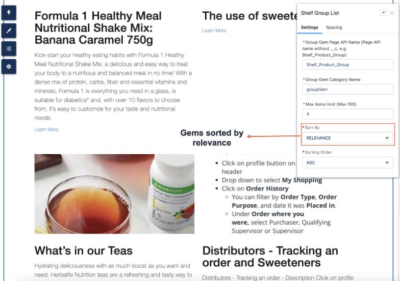
Figure 77. Sorting Gems by relevance
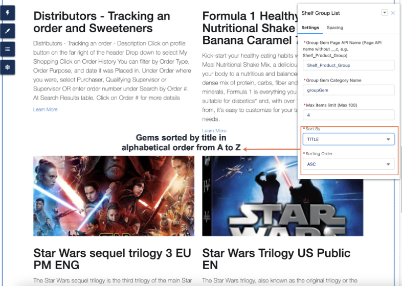
Figure 78. Sorting Gems by title in alphabetical order, from A to Z
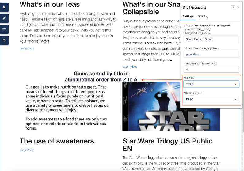
Figure 79. Sorting Gems by title in alphabetical order, from Z to A
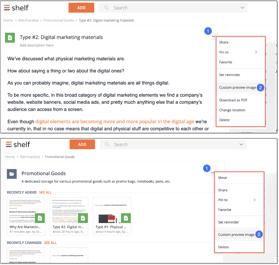
Figure 80. Setting custom preview image for Gem and Folder in Shelf
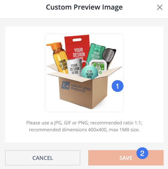
Figure 81. Uploading custom preview image
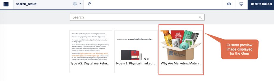
Figure 82. Checking Gem’s custom preview image on Salesforce
Checking Community Page Properties
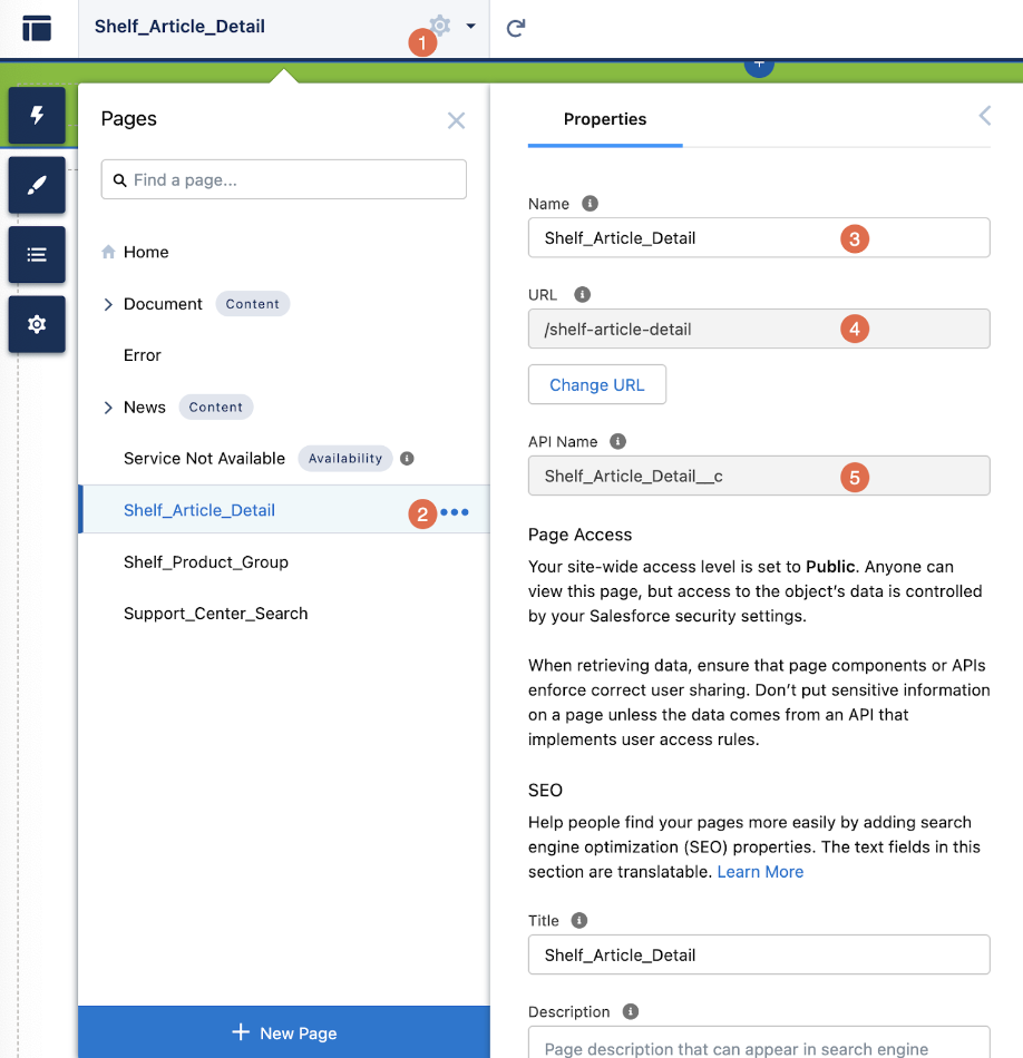
Figure 83. Viewing the Community page properties
Localization Feature for Shelf Components with Static Text Labels
Component localization example
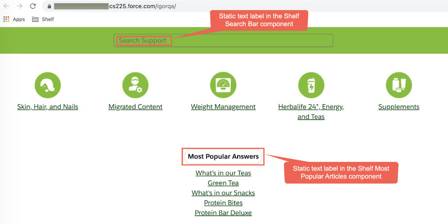
Figure 84. Viewing the Community page in the default localization
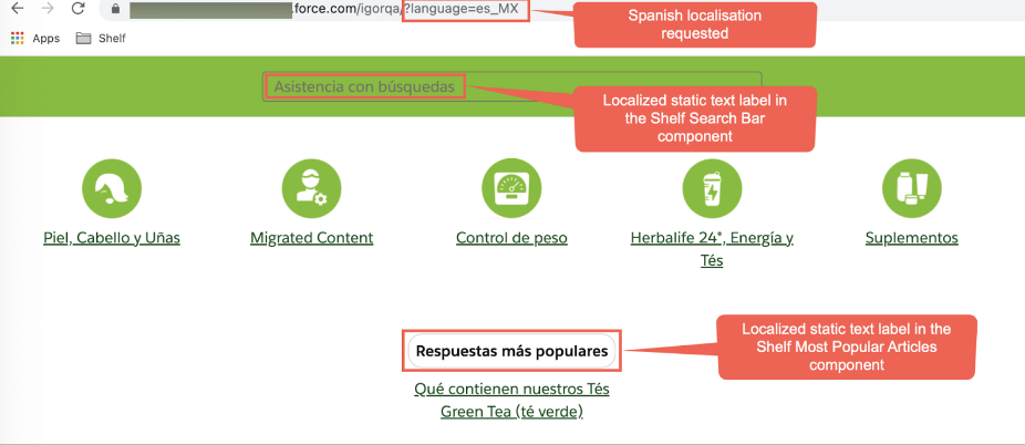
Figure 85. Checking your Community page localization change
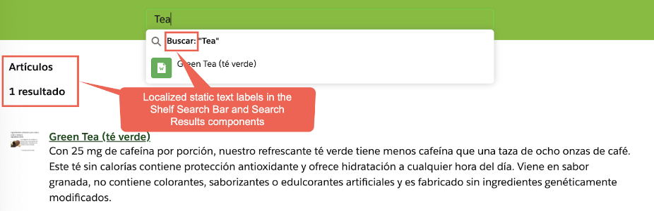
Figure 86. Checking other static text labels localization
- Go to the Setup page of your Salesforce Community instance, the search field enter Custom Metadata Types and hit search.

Figure 87. Searching and selecting the Custom Metadata Types option in Setup
- Select the Custom Metadata Types option found in the tree menu and open it.
 Figure 88. Opening Shelf Custom Label Localization option
 - In the form that appears, find and select Manage Shelf Custom Label Localization.
 Figure 89. Starting to work with the label localization feature
 - From the list that appears, select the needed component label you want to edit (change/replace/or localize). For example, we want to edit the label for the Most Popular Articles component.

Figure 90. Viewing the list of available labels
- In the new window, make sure this is the label you want to edit, and click the Edit button.

Figure 91. Starting the Shelf Most Popular Articles component label editing
Before editing the label, let’s first check how it looks in the component before editing.
 Figure 92. Viewing the component label before editing
- Now, go back to the label editing window and change the label text as needed.
en;Absolutely awesome questions and answerses;Preguntas y respuestas más útilesAll new localization label texts you add should follow the above pattern - identification of language (ISO format), semicolon, label text. New localization label text (for another language) must start from the new line. For example, if you want to add the German localization label to the existing two labels (English and Spanish), the setup for all three labels is expected to be as follows:en;Absolutely awesome questions and answerses;Preguntas y respuestas más útilesge;Absolut geniale Fragen und Antworten
Once done, click Save to finish editing and save changes.
Figure 93. Editing and saving the label
- Now, go to your Community page and check whether the label text has changed on the Most Popular Articles component.The same applies to all labels of all Shelf components - you can edit them as needed for your business purposes.

Figure 94. Viewing the component with the edited label
Heading Content Filtering
- Shelf Search Bar,
- Shelf Search Results,
- Shelf Most Popular Articles,
- Shelf Group List
Prerequisites
- To enable the possibility to assign multiple categories to Gems, go to the main page of Shelf, open the Admin Panel and get to the Category Settings submenu there. Then locate and select the relevant Multiple checkbox in the Category Settings window.

 Figure 95. Enabling multiple categories for Gems
 - In order to create new categories for future assignment to Gems, in the Category Settings window, select the Categories tab and follow the steps in the below figure to create and save a new category. Repeat as many times as needed.

Figure 96. Creating new categories
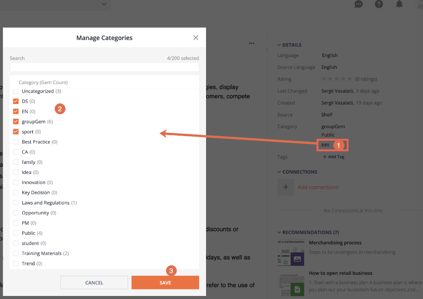
Figure 97. Assigning categories to Gem
How the Heading Content Filtering Works
- dsType - filters the content for a specific audience
- knowledgeCategory - filters the content by catalog (in Shelf’s terminology - by category)
- language - filters the content by language and language variant.(eg. en_US, es_US, es_MX)
Content Filtering by Audience
- Shared - for authorized audience, such as distributors (DS) or preferred members (PM)
- Public - for all customers.
Content Filtering by Category
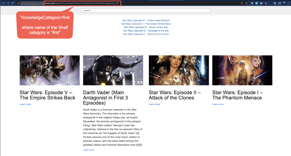 Figure 98. Filtering content by category
Content Filtering by Language and Area
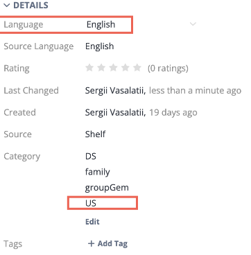
Figure 99. Checking Gem’s language
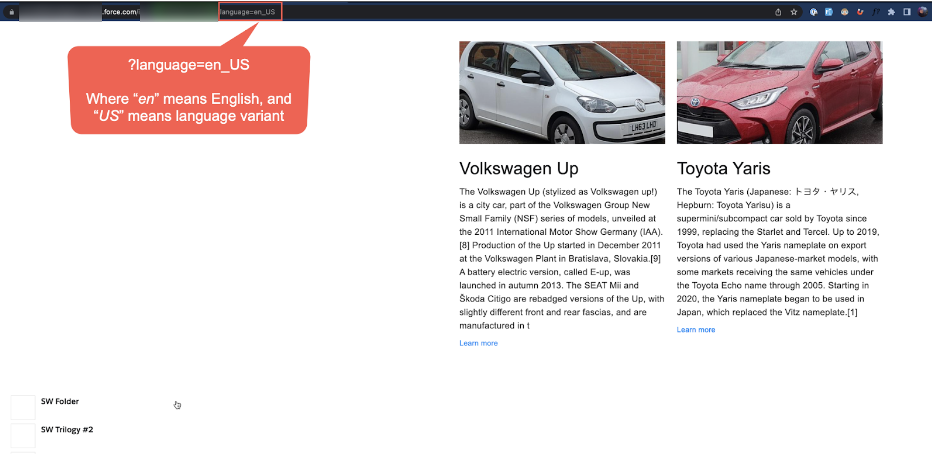
Figure 100. Filtering content by language and locale
Salesforce Community Page Preview and Publishing
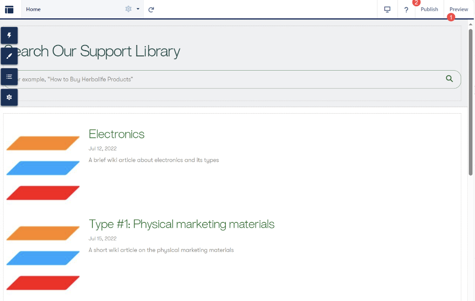
Figure 101. Previewing and publishing the Salesforce Community page with Shelf components
Figure 102. Viewing the published Community page if not logged in
To enable guest views of your published Salesforce Community site, perform the following steps.
In your Community page builder, go to your site settings. In the General tab, find and select the Public Access checkbox: it allows guest users to interact with your published site without login.

Figure 103. Enabling public access to your Community site
- Then, go to the Salesforce Community Cloud homepage and search for Profiles. When found, select the needed profile and on its page that opens, click View Users.

Figure 104. Selecting the profile and viewing its users
- In the profile window, select the Site Guest User option to edit it.

Figure 105. Finding and opening the Site Guest User settings
- In the Site Guest User window, find and click Edit Assignments.

Figure 106. Editing Site Guest User’s permission assignments
- In the next window, find in the left list the Shelf Community Components Access permission set and select it. Then click the Add button (>) to move it to the Enabled Permission Sets list. Click Save to finish and save changes.

- Once done, republish your site and wait for the link to be sent to your email address. This link you can share with outside people who now are able to view the site without logging in.

Figure 108. Checking the published Salesforce Communities page as a guest user